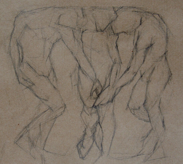
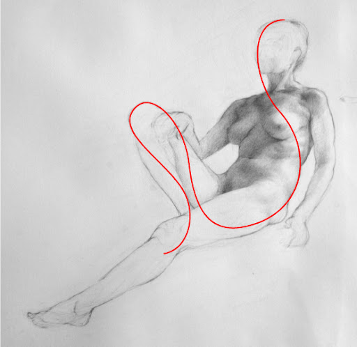
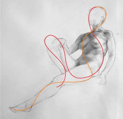
Showing posts with label drawing. Show all posts

Saturday, February 21, 2009

Master Copy: Guido Reni's Nessus & Deianeira

Sketch after Guido Reni's Nessus & Deianeira
9 x 12 inches, pencil on paper

block-in stage

This one I did primarily with block-in just to break it down and simplify it, and because it was hard to see the gesture of the kidnapped Deianerira as so much of her body is obscured by drapery. But I also cross-checked my block-in by visualizing the major curves and modifying the block-in where I had made errors that disrupted the overall lines of movement.

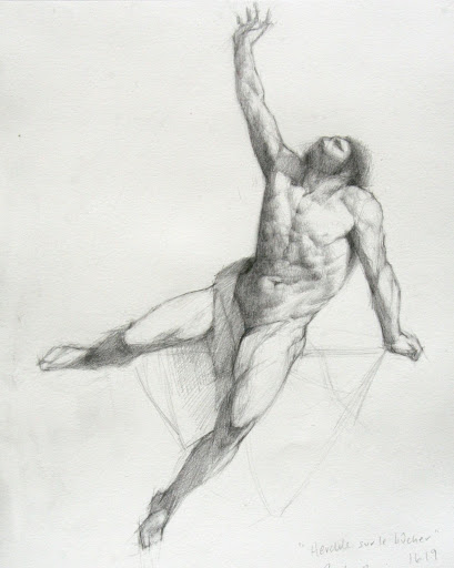
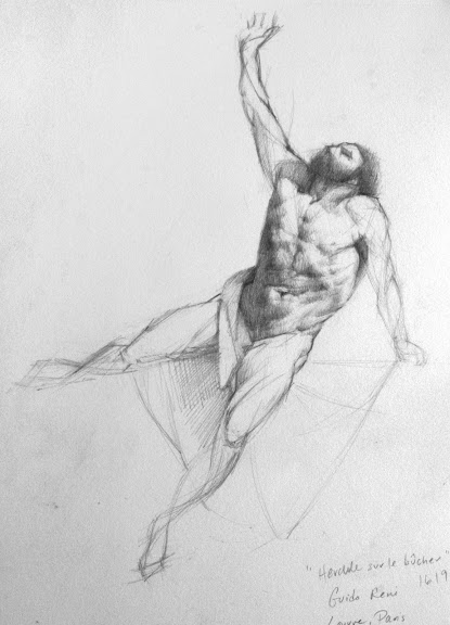
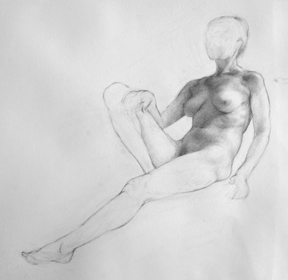
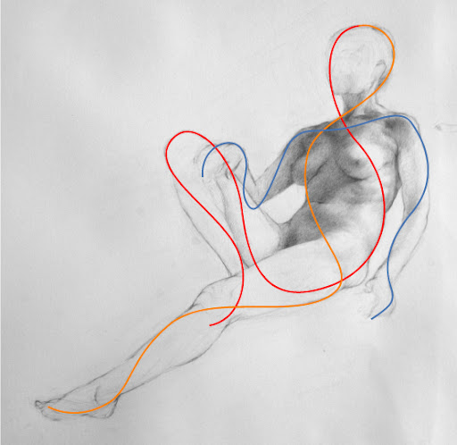
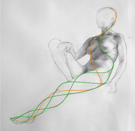
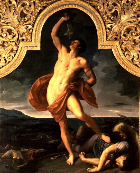
The centaur's extended leg in the lower left shows how using both approaches leads to greater accuracy. In the block-in stage the leg was elongated and stretched too far - easy to check by seeing where it falls directly under the tip of the extended elbow above. But when I corrected it I used curved method and found the correct shape according to the logic of the anatomy (which is just amazingly painted by Reni.)

I have been thinking a lot about figure drawing recently and all the approaches for teaching - not necessarily how the figure has been drawn, but how figure drawing has been taught.

The ateliers in the tradition of Gammell, Lack, and Angel all seem to use a sight-size approach and begin a student with cast drawing. I think most use the Bargue plates for beginning instruction as well. My understanding (without having studied this method) is that this trains the student to develop a highly sensitive ability to see angles, distances and values. It seems to me the goal here (again, without having direct experience) is to capture your subject exactly as it would appear if projected on the picture plane between you and the subject.

The tradition from the Golden Age of Illustration gave us constructive drawing in the vein of Bridgman and Vilppu and Reilly, (oh and Loomis), where the figure is conceived of as 3-dimensional wireframe construction of wedged rectangles and cylinders (if I may oversimplify and generalize these distinct methods). My understanding is that this is the approach used to teach animators and illustrators. The focus is on movement and the benefit is capturing gesture and pose quickly and efficiently, and teaching quickly and efficiently.
UPDATE 3/6: In the comments section of this post some excellent corrections and comments were made, be sure to read those.

Finally, as I would term it, "Expressive" figure drawing is from the tradition for teaching illustrators, but is highly influenced by expressionistic approach to fine art painting of the 20th century. The goal is to get a student to loosen up, use big arm movements, and to let go of inhibitions. I also believe this method is an ideological reaction to the art world's derision of figurative fine art in the last century, so the figure had to be approached with expressive marks to give it validity in an anti-figurative era (this is my own unsubstantiated theory). An example is here.

My teachers Ted Seth Jacobs and his students have modified their teaching from these traditions. Although Ted studied under Reilley and is connected to the 19th century academic lineage, he does not teach Bargue or sight-size. As I have documented in detail on my blog through my class notes (see "labels" in the right column), the focus is on developing an understanding of the 3 dimensional structure of organic form and the way light behaves on form. The student develops an understanding of life as organized and how each part is in harmony with the whole.

Each of these methods and their practitioners have critiques of the other methods: some lack form, some lack movement, some lack variety of markmaking, some lead to overmodeling.

I think each of these methods can benefit from the critique of the other traditions. Each approach has benefits and each has drawbacks, but ideally a student would spend at least some time studying each of the approaches.

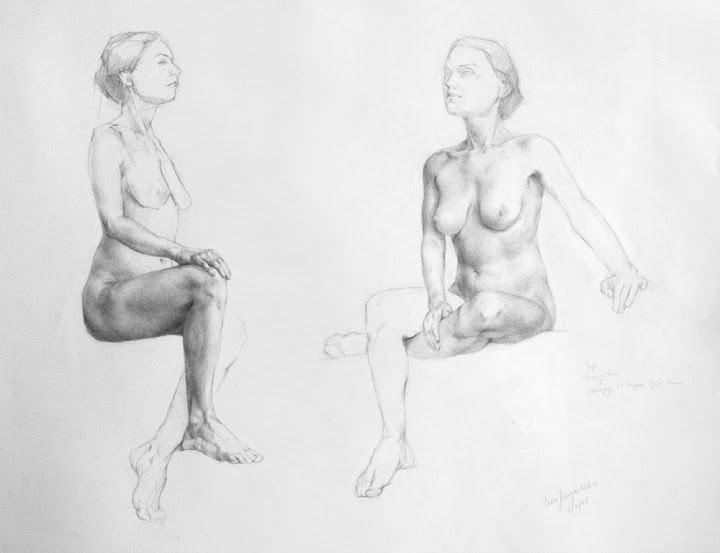
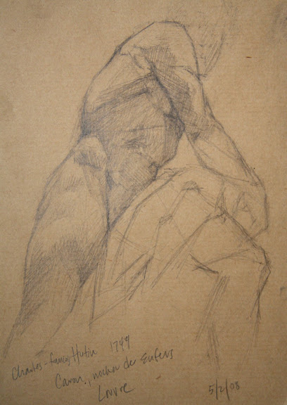
That said... you can't go wrong by copying the Masters ;)

Wednesday, February 18, 2009

Master Copy: Guido Reni's Samson

After Guido Reni's "Samson", 1618

After diagramming my wax paper drawing yesterday, I felt inspired today to try drawing an actual person. No models available, but luckily I have a few books with some good figures represented (including my treasured book about Reni, an out of print, hardcover color catalog given to me by my husband this past Christmas).

This sketch took about 2 hours, and I did it entirely with the "movement curve" approach, not even a straight line block-in to start.

I notice I run into the same arc of experience when I draw: I start off, and after a good while I feel like the drawing is going well, and I allow myself to move into more details. Almost immediately I find problems, realize I need to back up to the bigger shapes and gestures... and then I spend just as much time adjusting the major landmarks as I did putting them down on the blank page!

However, once I've wrestled that together I start to understand the pose, and suddenly something shifts and all the various elements start to harmonize. It's a nice feeling.

Patience has been the key to developing my drawing ability. I would like to be able to draw more quickly at some point, though.

~~~ UPDATE ~~~
Below I've diagrammed some of the steps of my methods for how I constructed this drawing.

I started by making a mark at the top and the bottom, and would not allow my drawing to go above or below these points.

Then I drew a general gesture for the overall tilt of the main pose and a secondary line for establishing the non-weight bearing leg.

I noticed where the main weight is pressing, the ankle of the forward leg, and sketched a vertical plumb line to see what falls along that path. This is how I noticed that the raised wrist is not directly above the weight-bearing ankle, which helped me capture the general gesture. Not that I got it right at the first pass, but it helped me begin to visualize the pose on the page.

I looked for the theme (red), counter-theme (orange) and ornament (blue) to capture the gesture precisely (see my Studio Escalier notes). I spent most my time between this and the first stage, back and forth, adjusting it until it felt like the pose.

This looks wiggly and swoopy, but the lines are quite precise and intersect movement with structure. They map the paths of energy and tension that are defined by the structure of how the body is holding itself up. The axis where the curves touch the outside contour help me see the exact shape of the contour and how every part interrelates to every other part of the figure as a whole.

Once I feel I have everything working to describe the pose, I use this system to move into smaller and smaller contours of the body. Inevitably I find errors from the earlier steps - when the network of curves do not "work" within the bigger errors I have made, like the hand landing in a wrong spot on the torso would show me I've estimated the curve of the shoulder incorrectly.

Nothing on the body has these simplified curves though - these are curves of movement, not of structure. The structure is a network of many compound curves, complexity within the harmony of the whole.

As Ted Jacobs taught me, the shapes of the body are fan-shaped and non-parallel. This translates to everything - no two high points are directly across from each other on a form. No three intersections or axis line up in a straight line.

The most difficult part was the non-weight bearing leg. That's because the limb is supporting some weight, but the upward pressure of the supported toe versus the downward pressure of gravity on the bent knee were making a curve in opposition to the general curve of gesture - two curves canceling each other out make it tempting to see a straight line, but the straight line makes the limb look rigid and dead - there must be tension and vitality, even in counter-acting curves. So I found myself struggling with it a lot, but my goal was to show the tensions without deadening the movement.

I find I also have a tendency to make everything regular and even: the first time I sketch say two curves defining the outer contours of the leg, my drawing looks awkward and clumsy and un-life like. I often wish I could see immediately what I am doing wrong, but a the stage I am at now, I can see it is wrong but not how to fix it, and I just have to fiddle around till it feels right.

I think I would be faster and more efficient if I could start to see my errors and tendencies as I make them (or even before!).

I find when drawing and painting I must suspend a certain type of evaluative, critical looking in order to work, but I need critical looking to tell if what I have drawn is satisfying, so I am always practicing and refining the skill of how to switch this critical evaluation on and off at will. So I was pleased and thrilled to find this quote by a mathematician that exactly describes this phenomenon:

"When I am working on a problem, I never think about beauty. I think only of how to solve the problem. But when I am finished, if the solution is not beautiful, I know it is wrong."
- Richard Buckminster Fuller (1895 - 1983) architect/mathematician/engineer

Tuesday, February 17, 2009

Antique Bottle: Session 2

8 x 10, oil on panel

This is a new little painting I started this week, a smaller size and a less complex composition than the previous four painting, just so I can get some satisfaction of completing a painting in less time.

I started with just the bottle and the shelf, I wanted to keep it really, really simple. But it just looked too boring, and after fiddling around with some twigs I finally gave in and crumpled up a small piece of wax paper and suddenly the composition was a whole lot more interesting... and also a lot harder. I was originally aiming for a 1-week painting, but this might take 2 weeks.

I thought I would share my drawing process. I diagrammed it below, on the under-painting (I did make a pencil drawing first, but I corrected the drawing with the under-painting, so I'll diagram my thinking on the better drawing.)

To start, I lay in some straight lines, trying to accurately capture the biggest, most general angles, tilts and distances. I spend quite a bit of time on this, until it "feels" like the gesture of he subject. I might break the lines into smaller segments than these, but I try not to.

Then I move into finding the curves, the major lines of movement or tension that are supporting the subject. This little piece of wax paper was behaving like an arch, so I knew I would find elements of the arch showing up here and there in the contours. The arch seems to me to have three points of contact with the board (at least from this view), so I tried to discover how it was supporting itself on these three points.

The corners peaking at the upper right are also part of the structure, so I searched for their relationship to where the arch legs are supported.

All the folds and crumple paths along the wax paper are arranged logically for how the paper is supporting itself, or being supported. I look for the main curves of movement, and as I develop the drawing along with the panting, I'll look for the smaller and smaller incidences of how the paper is logically crumpled.

When drawing the figure I follow the same method, except drawing the figure is harder.

See the first post about this painting here

Monday, February 16, 2009

Antique Bottle: Session 1

preliminary contour drawing
8 x 10 inches, pencil on panel

Monday, December 22, 2008

Sketchbook: Master Copies

Sketches after Ingres, "Bather", 1808
and Carravagio, "Lute Player", 1596


Sketches after Rubens, "Descent", 1612
and "Apotheosis", 1691


Sketches after Reni, "Deianeira", 1621


Sketch after Robert Campin,
"Portrait of a Woman", 1420

I bought the beautiful book Sister Wendy's Story of Painting because I wanted to refresh my art history knowledge with a general overview. Sister Wendy (of PBS Special fame) has written an inspiring survey of art, with hundreds of high-quality color reproductions.

The format is similar to Eyewitness Guidebooks, in that the information is presented visually with lots of sidebars and with a storytelling style of writing, great for a general survey. She has included an illustrated time line for each major period of art history, which is great for visual learners.

Sister Wendy tells the history of painting in terms of the constant sweep towards and away from Classicism, the swinging between Northern and Southern European influences, and between Catholic and Protestant perspectives. After reading the book I feel like I could plot all of art history along these major axis.

As I read the book I put a sticky note on every painting I found especially interesting, and now I'm going back through all the bookmarked pages to do sketches. I've found when sketching from a heavy book, it's good to set it up in a cookbook stand. And try to keep the cat away from the piles of graphite shavings.

Sunday, November 23, 2008

Silver Globe Pitcher: Contour Drawing

Contour drawing for Globe Pitcher
pencil on (wrinkled) trace paper

16 x 20 inches


After completing my small 8-inch value sketch, I began a full-size contour drawing of my subject at the actual size I will paint it. And I immediately ran into a problem. The proportions of my small drawing were not exactly the same as my 16 x 20 inch panel. And also, the composition I had sketched small, once blown up would require me to paint the pitcher huge, larger than it is in real life.

So even though the composition looked nice in the sketch, the larger scale made it look overwhelming, way too big. There's a lesson in here.

It's a change for me to paint this big. The previous paintings in this "Wax Paper" series are 11 x 14 inches and 12 x 12 inches. So 16 x 20 is a HUGE leap. It may not sound much bigger, but to me it's enormous. This is the problem with blogs... there's no sense of scale.

You'll also notice the left side of the crumpled wax paper has a new shape. I decided it looked better if it angled up at the left, instead of tapering down and to a point, running off the left into infinity.... So I crumpled up the wax paper on one side (gently) and altered the composition.

contour drawing phase 1

contour drawing phase 2

contour drawing phase 3


contour drawing phase 4


contour drawing final


I've drawn the final version on trace paper so I can transfer to the gessoed panel. I usually draw directly on the panel, but since I labored so hard to gesso them so perfectly, I was afraid of dinging or marring the perfect surface with a lot of erasing. So I nearly finalized the contour drawing on paper before transferring it.

As an final note, I'd love to draw your attention to this hi-LAR-ious blog entry by an abstract painter who says, in part:

"...what’s so hard about painting a realist painting nowadays, when even a no-talent can transfer images and paint textures straight from a computer to a canvas?"

To which I nearly choked, as you can imagine. Laurie Fendrich, I sure hope you find my link to your two posts on the superiority of abstract painting to realist painting, so you take a good look at my blog here and see that realist painting takes quite a bit of study and work, even "nowadays".

Post # 1 in which Ms. Fendrich describes her irritation at having been "duped" to admire the "abstract" work of a 3 year old

Post # 2 in which Ms. Fendrich has to respond to the tempest of comments she recieved on her first dip into the abstraction-versus-realism fire pit

Oh, and especially note the parts about how the Old Masters used optical devices, implication being that anyone with a lens and a grid could have produced the masterworks of art history.

Le sigh....

----

See the previous blog post about this painting here.

Silver Globe Pitcher: Value Sketch

value sketch for Globe Pitcher
graphite pencil on paper
about 6 x 8 inches

I am working on drawings to prepare my next painting. It will be much larger than my previous paintings, so I am trying to plan out the composition and values before I start. I started by spending some time on this small value sketch. It helped my visualize a feeling for the final painting.

I find my paintings work best if I spend time at the beginning imagining the finished piece as clearly as possible. I try to imagine the feeling it will have. I love the feeling of calm, cool overhead light resting on eye-level objects. I want the painting to feel like you are really seeing them and feeling the quiet.

The sketch only approximates this, but it helps me crystallize the feeling in my own mind.

sketch phase 1

sketch phase 2


sketch phase 3


sketch phase 4


sketch phase 5

sketch final

Saturday, October 18, 2008

Michael Grimaldi Drawing Workshop

Melissa
graphite pencil on paper
about 20 x 16 inches

This is the main drawing I did over the last two weeks in Michael Grimaldi's drawing workshop at BACAA. It was drawn over about 8, three-hour sessions. (It's interesting to compare this drawing to my first BACCA workshop drawing I did of Melissa in March 2006)

detail

We started the drawings with a 2-dimensional, stright-line block in that I have described many times on this blog, for example: here, here, and here.

After solving the basic proportions and refining the block-in, we moved into seeing the forms as three-dimensional blocks in perspective.

To construct the major masses of the head, torso and pelvis, we identified bony projections and median lines to describe the roll, pitch, and yaw position of each shape.

I've roughly diagrammed a few of these with the red lines in the picture above. The points where lines intersect are determined by bony projections and places where the flesh attaches to the underlying bony structures. We look for indications of these on the surface of the skin, and build a concept of the box construction of each form: showing the perspective to identify tilt, position and distance.

Here are some of my notes from what Michael said in class:

Gesture, Proportion, Perspective
All three are inseparable, any error in one creates a series of problems in your drawing.

All the answers are within the drawing.

We need to find the points on the body that yield the most information about perspective possible. These are the distant outside bony projections.

This pattern of points starts having a profound meaning about the subject's three-dimensionality.

Let the drawing inform what your next decision will be.

Make a three dimensional drawing without relying on value - the plotting of points and median line tells you what the perspective is doing.

Look for the constructive anatomy and the perspective as a foundation for the drawing.

Anticipate without inventing: Hone the ability to see your environment through knowledge.

Drawing is like diffusing a bomb, all the concepts are a form of deconstructing and reverse-engineering.

There are two extremes, monotony versus mayhem. Our goal is to find a balance between the two.

Composition is the "composite", the entire experience of the image, from design to texture to paper to size, everything that affects the view's experience of the image.

Cut of the light - the angle of the shadow is perpendicular to the light

The image above is a detail of the small value study I did in the upper right corner of my drawing, about 3 x 6 inches. Michael encouraged us to make small tonal studies before moving forward with making a full tonal drawing. This really helped solve a lot of the major tonal decisions - otherwise it's too easy to mix light and shadow and make inadvertent holes or protrusions.

The lower part of my drawing shows how I blocked the terminators - delineating where the light slips over the horizon of the form. These terminators seem much softer in life, but there is a distinct moment where the shadow ends/terminates and the light begins.

To find the terminators, which can be confusing when seeing light slide over a complicated form, Michael encourages us to find "the cut of the light" - the angle of the line perpendicular to the direction of the light source. I've diagrammed some of that here:


I also wrote down the artists and films Michael referred to in his lectures this week, here's the list and links to the best resource I could find about each (in no particular order):

Artists/Paintings/Art Movements
Brunelleschi - created/discovered our current understanding of perspective
Harold Speed
Munich School
Ashcan School
Antonio Lopez Garcia - Dream of Light
Vicent Disiderio
Neue Gallery, NY
Reubens - Rape of the Sabines
George Bellows - Use of the Golden Section
Gericault - Raft of the Medusa
Balthus
Chardin
Walter Murch
Damien Hirst
Wim Delvoye
Tim Hawkinson
Neo Rausch
Marlborough Gallery
Betty Parsons

Films
Michael references films constantly so I asked him to name some of his all-time favorite ones. This is his list, in no particular order and off the top of his head while we were talking:

The Conversation
Memento
The Lives of Others
Miller's Crossing
The French Connection
Blade Runner
Collateral
The Third Man
Kurosawa Eloru and Stray Dog

If you are interested in studying with Michael, who is a fabulous teacher, please visit Bay Area Classical Artist Atelier. He also has started his own school along with Kate Lehman and Dan Thompson: Janus Collaborative School of Art in New York.

NOTE: As Usual, My Caveat
Everything I post on my blog is my own highly subjective and filtered interpretation of my studies. My notes don't necessarily accurately reflect the teachings of my instructors, in fact my teachers may disagree or find some of my expression of their ideas to be inaccurate. The best way to understand their teaching is to buy their books and take their classes.

Monday, June 09, 2008

Sketchbook: California Trees

Buena Vista Park study

I've been home from Paris for 6 days now, and after the week of unpacking, doing laundry, and sorting through 6 weeks of mail, I'm sort of feeling ready to be productive again.

So today I walked up the hill to good ole' Buena Vista park and did this sketch.

I'm trying not to worry too much about my paints, which are in a box somewhere in the bowels of La Poste. I'm trying not to worry that the package tracking number on La Poste's web site gives me a message that says: "Colis en instance à La Poste, destinataire avisé disposant de 15 jours pour aller le retirer." That means, "The package is at the post office, receiver (that's me) has been advised to pick it up within 15 days".

I have no idea what that means. My package is sitting in the Paris post office waiting for me to pick it up? What?? So it's looking like I might need to replace several hundred dollar's worth of good paints and brushes, but I'm holding out hope.

Yes, I have been asked by friends and family and my husband "Why didn't you insure the box?" Good question. Answers are as follows:

a) Being a tourist and a poor speaker of French I'm afraid of French government employees, including post office workers (if you have spent time in France, you are afraid of them too).

b) I don't know how to conjugate the verb "to insure" and I'm not sure they would understand me if I did.

c) I heard a rumor from another American that if your box is worth more than 100 Euros you have to fill out special customs forms and the box has to go through lots of extra vague and scary processes. So I wrote the box was worth 85 Euros.

d) I've tried to ship paint in the USA and they sure don't like it. Now I ship "vegetable oil based artist materials", but I don't know how to say that in French.

So given all that, I took a risk and just shipped the damn box, and they probably x-rayed my package and found out it's not "livres et vestements" like I wrote on the form (books and clothes, misspelled) and on the x-ray machine they saw the squiggly metal tubes and the hinges of my tiny pochade box and thought it was something they would prefer not to ship. That's my guess. But they are French, who knows. Maybe they just thought my adorable pochade box was too lovely to leave their country.

Anyway, in the meantime I am drawing in my little Louvre gift-shop sketchbook with good old pencil (did I mention my good charcoal collection is in the box, too?).

As I drew these branches I started seeing all this crazy fluid spiraling, kind of like muscles twisting around bones, with interlaced forms creating non-parallel tapering wedges .... turns out this organic, energetic human form I've been studying applies to trees, too.

Are we surprised? Non.

Wednesday, May 28, 2008

Paris: Louvre Sketch: Reni Hercules II

Sketchbook:
After Guido Reni's
"Hercules sur le bucher", 1619
Louvre, Paris

I went back to the Louvre and worked on my drawing some more based on some helpful comments from my teacher Tim Stotz, you can see my earlier version here.

Friday, May 16, 2008

Paris: Louvre sketch: Reni Hercules

Sketchbook:
After Guido Reni's
"Hercules sur le bucher", 1619
Louvre, Paris

Luckily my husband loves museums too, so he was content to wander alone while I worked on this sketch.

I love this painting, how the ribcage feels like a heavy living mass of bone and connective tissues, sagging and stretching within a flexible network of skin and muscle barely holding everything together. The pelvis and ribcage are resenting their connection by the spine, each urging towards their own expression. The belly is only an afterthought, no intention of its own, merely subject to other forces. The limbs are all secondary, the gesture is complete in the torso.

Thursday, May 15, 2008

Paris: Louvre Sketch after Pajou

Sketchbook:
After Augustin Pajou's "Pluto Chaining Cerberus", 1760

I brought Nowell to the 18th century French sculpture wing of the Louvre today. It was fun to watch his jaw drop as we rounded the corner into the Puget Courtyard, full of the examples of the pinnacle of figurative sculpture. He was content to roam around filming for a while I worked on this sketch.

Wednesday, May 14, 2008

Paris: Musee Rodin

Sketchbook
After Rodin's "The Three Shades"


Nowell and I spent the afternoon at the Rodin Museum in Paris. It currently has an excellent exhibit on Camille Claudelle, Rodin's mistress who was an accomplished a sculptor as Rodin. This life-size figure group is outdoors in the gorgeous garden of the museum.

Nowell recreated a picture we took six months ago at Philadelphia's Rodin Museum:

Tuesday, May 13, 2008

Paris: Medici Fountain

Sketchbook:
Medici Fountain, Luxembourg Gardens, Paris

Every time I come to Paris I visit Marie de Medici's Fountain, tucked away in a corner of the Luxembourg Gardens. The first time I drew this fountain was exactly 20 years ago, when I was 16 and in Paris for the first time. Maybe I can track down that old sketchbook and post my first drawing of the sculpture.

Friday, May 09, 2008

Studio Escalier Workshop: Final Drawings

Sarah Twice
18 x 24, graphite pencil on paper
9 hours each drawing

For our final week at Studio Escalier's Drawing Workshop in Paris we worked on two long poses to practice all the contour and modeling lessons we have been learning from Tim and Michelle - one pose in the mornings and one pose in the afternoons. I decided to put both my final drawings on the same sheet of paper - just a bit of extra challenge for fun.

Here's a slideshow of the stages of the drawings

I had critiques with both Tim and Michelle. Their comments were really helpful and give me a lot to work on for my future drawings:

I need to think about "packing the form" - the human body is made of irregularly shaped packed forms arranged on curves. I need to remember to define the top edges of those forms, the edges facing the light, as much as the bottom edges, the edges facing away from the light.

Also, in both these drawings I've over-modeled in the light. All the darkest shadow is on the side of the model turned way from me, so almost everything I saw was in the light. In my zeal for modeling form I made everything too dark.

I also need to practice seeing the forms arranged in fans arcing off of changes of direction on the contour.

Finally, I need to emphasize structure and solidity, otherwise my approach with soft gradation tends to look too wispy. I agree. I am not interested in making pretty drawings, I want to make strong drawings.

Not only have I learned a lot about drawing from this workshop, but also my expectations for myself have been raised in the process. I have a vision for how well I will someday be able to draw, a vision for how I could draw with a lot of practice and investigation, and it's far more developed than I ever expected of myself before.

Friday, May 02, 2008

Louvre Sketch - Hutin Sculpture

Sketch after Charles-Francois HUTIN

This my sketch of a small, 30-inch sculpture done by Hutin in 1744 as his final exit project to graduate from the Royal French Academy.

Wednesday, April 30, 2008

Studio Escalier Workshop Day 8

tonal study, pencil on paper, 6 hours

(detail of above)

Day 8 of my workshop at Studio Escalier in Paris.

This is a drawing of a 6-hour pose. Yesterday for the first half I focused on the inner movement curves, the block-in, and finally the detailed contour. Tim and Michelle are teaching us to think of the contour three-dimensionally. So I am thinking of the contour wrapping around the body, moving towards and away from me.

I've taken my drawing into Adobe Illustrator and used the software to recreated my original inner movement curves to diagram the process I am learning:

As Tim teaches the technique, we draw three interrelated movements:

We start with the theme, which is the fundamental inner movement curve. The theme starts at the crown of the head, and flows down the center line of the face, down to the big toe of the standing leg, or the leg holding the most weight.

This is a precise curve, it describes specific points on the body and the relationships between these points. (In contrast to simply "expressing" the movement. This is a record of what we see and know about the body, it's not exaggeration or expressionism.)

The second line we draw (above) is the countertheme - the orange line. It's a secondary inner movement curve that travels from the top of the head, wrapping around the body the opposite direction and down the non-standing leg.


Third, we draw the ornament (above). This is the third interrelated movement. As with the theme and countertheme, the ornament wraps around the forms, moving side to side and back to front.

All of the curves wrap around the body three dimensionally. Above is the same countertheme curve, but I've created dotted segments to show where I am imagining it wrapping around the back side of the form. (I do not modify the figure to fit these curves, it's amazing the interrelations it's possible to see once you start looking this way.)

Above I've shown how adding more and more interrelated movement curves begins to describe the form. As I get more and more detailed with my contour line, I can see how every form on the body follows this wrapping helix pattern.

It's interesting to recreate the curves in Adobe Illustrator. The program creates Bezier curves that have a certain mathematical tensile force, and you have to learn to manipulate them to create flowing curves without awkward bends. The behavior of of Bezier curves is amazingly conducive to the Inner Movement Curves - it was shockingly easy to recreate the curves with the software. I have a feeling there is an implicit relationship between the cohesive, efficient, and functional forms of the body and mathematical curves.

Update added 5/03/08
Bezier was a 20th century French draftsman! Wikipedia has a great entry on Bezier curves, and near the bottom of the page you can see elegant animations for how Bezier curves are calculated.

After spending so much time on the contour, I moved on to the tonal value shading. I was surprised how quickly the value study progressed. I think learning the contour with this method gives me a deep understanding of the three dimensional figure, so flowing the light across the form is easier.

I'll end with a quote from Tim:

"I think the idea of theme, countertheme and ornament has the power to revolutionize the way you think about the figurative subject, to really marry your eye to your gut to your mind to your hand, and liberate your imagination."

I agree.