Friday, August 31, 2007

Notes From Juliette Aristides' Workshop II

Trio: Two Pears and a Fig
8 x 10 inches, oil on panel

The last day of Juliette's still life painting workshop was today. I am so excited to get back to my studio and practice all the new techniques I learned! More on this pear painting at the end of this post.

Here are many of the paintings and excercises I produced during the workshop:


Analysis of a master work
Juliette distributed color copies of master paintings and had us trace over them with dry-erase markers on clear acetate to analyze the structure of the composition. What looks like a chaotic image is actually very carefully composed: It all fits within a neat, perfectly centered diamond shape.

Black and white "poster study" of a master work
Juliette had us mix 9 values of titanium and ivory on our palettes: black, white, and 7 steps between. We then copied a master painting, simplifying the major light and dark areas into flat, "posterized" areas of tone.

Still life "poster study"
Using the same flat values, we painted a quick sketch of our still-life setup. We also did these same studies with cut paper - paper colored black, white, and two shades of gray. (I don't have a picture of this). The cut paper really forced us to simplify, and did not allow "cheating" - no mixing of vaules.

Value study underpainting - Raw umber "wipe-out"
(brown paint is applied and then "wiped out" to show white canvas beneath)


Warm/Cool study
This small study was done with only raw umber, ultramarine blue, and titanium white.

Egg Tiling, about 4 x 5 inches
This was my first attempt at the technique Juliette calls "tiling". After doing a raw umber underpainting, the color phase of the painting is applied stroke by stroke, starting from the darkest dark and stacking "tiles" up to the lightest light. Each tile color is mixed on the palette and applied with a single, short brushstroke. From a distance it blends together, but up close each color note is distinct. You can see sharp edges around my tiles - bad! With practice the goal is to paint tiles that are close in value and color, with no sharp transitions. It's a veery slooow process. But actually very satisfying.

Copper Pot and Baby Onions
12 x 16, oil on panel

I described how I started this painting in a previous post. This is my first attempt applying all of the techniques in a single painting. But after a couple days I decided I had composed a painting with too many complicated elements and too-strong contrasting colors and values. I wanted to try something more subtle to practice the techniques, so I called this one "done" and moved on.

Trio: Two Pears and a Fig
8 x 10 inches, oil on panel

I spent 2 and 1/2 days on this painting. The photograph does not show all the subtle "tiling" I sweated over, but you get the general idea. Juliette encouraged me to slow down (apparently my Daily Painting practice has made me a "speed painter") and look very carefully at the transitions. She had me pay close attention to midtones, the subtle gradations between the darkest darks and lightest lights across the surface of the pears. I feel like I learned so much within this one small painting, and I am so excited to get back to my studio and try more.

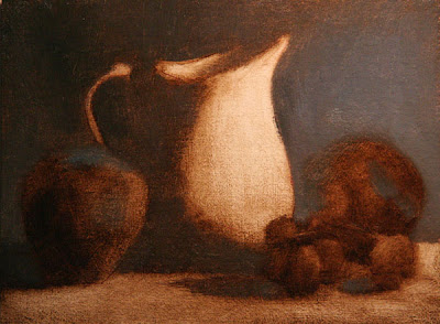
Pitcher and Fruit, 6 x 8 inches
Unfinished

I started this painting as a last quick project today, the last day, but did not have time to finish it. But I like the composition a lot, so maybe I'll set it up at home and finish it.

These are the steps Juliette taught for creating a painting:

1. Draw the composition with pencil on paper
2. Transfer drawing to the canvas
3. Ink the major lines with an indelible fine point sharpie pen
4. Paint the whole canvas with raw umber, and "wipe out" to create a tonal underpainting
5. Let the underpainting dry
6. With full color, paint the background, ground plane, shadow side of objects, light side of objects, in that order
7. Apply color with small "tiles"
8. Paint the "least interesting" areas of the painting first - save the best for last

More various notes and tips from Juliette:
  • Practice mixing a color wheel with lots of beautiful, clean neutrals
  • Lay a note down for a color and leave it - don't over-mix.
  • Your palette tends to reflect the painting - mix the colors you will need
  • To "pump up" the light in a painting, focus on super-extending the halftones - don't focus on the darkest darks and lightest lights.
  • Look at Chardin
  • Look at Fantin Latour
  • A strong image will read well from a distance
  • Economy - solve problems using less (ie, solve an edge using a shift in color, instead of a shift in value)
  • Become rock-solid in a few simple things
  • Lump shadow shapes and light shapes, not individual objects
  • Try one bright color note in a mainly monochromatic painting
  • Copy master works, analyze for lines, arcs, value, color distribution
A few links:
Fletcher Palette
Picture Perfect Viewfinder

Saturday, August 25, 2007

Notes from Juliette Aristides' Workshop

12 x 16 inches, oil on panel
Work in Progress

This is a painting I am working on in Juliette Aristides' still life workshop in Seattle right now.

As a class we started our paintings by doing a drawing and then transferring it to the canvas with transfer paper. Then we inked the drawing by tracing over the major lines with indelible sepia pen. Over the inked drawing, we did a raw umber underpainting called a "wipe out" (wiping away the brown paint with a cloth, down to the white canvas, to do a full tonal underpainting). Only then did we start with color, working from dark to light, concentrating on one area of the picture at a time.

Juliette teaches us to paint with small "tiles" of paint laid next to each other, each tile a short little brush stroke. She says I need to work on making tiles that are closer in tone and value, more sensitive and subtle. She demonstrated it for me in the white onions at the top, which is why those onions look so good!

We work on longer paintings like this one on the afternoons. In the mornings we do small exercises, like value scales and black and white poster studies and color wheel mixing. Now that I have my laptop I'll photograph some of those next week and post them.

Wednesday, August 15, 2007

Studio Incamminati

Studio Incamminati interior, artist of the foreground painting unknown

On BACAA founder Linda Dulaney's suggestion, I dropped by Studio Incamminati, a classical atelier art school in Philadelphia. I should have called ahead first, but they were very welcoming and accommodating, and a friendly student offered to give us a tour.

They have a lovely large space on the 4th floor of a downtown converted loft building. There they have set up 3 separate areas for a model to pose, with easels arranged in a circle for 10-15 students to work. We were told second-year students study with natural light near the large bank of windows, but first-year students start with artificial light in order to see sharp shadows and clear form.

The walls are covered with the very impressive drawings and paintings of students, along with beautiful demonstration drawings and paintings by instructors including those by Ted Seth Jacobs and Incamminati founder Nelson Shanks.

The student artwork was displayed in multiple stages, and it was fun to see them using the same methods I have been recently learning, starting with the block-in for both drawings and paintings. They even had the same kind of graphic, high-key color studies I did last week, and sure enough they were done in a workshop with Dan Thompson.

Rodin Museum

The Shade (foreground) and Adam (background)

Nowell and I got a chance to spend a couple hours at Phildelphia's Rodin Museum. Nowell had never been to the museum or seen so many Rodin works in one place so it was fun to see how much he loved the artwork.

Nowell pretending to "knock" on Rodin's Gates of Hell

Detail from Gates of Hell

Rodin's larger-than life sculpture Adam

My drawing of Adam

It was interesting to try out my newly learned "block-in" technique to sketch the sculpture. As I've been practicing recently, I used all straight lines, starting with long lines to create a large "envelope" polygon, and then cutting into it with shorter and short straight lines till the figure emerges.

It was fascinating to discover through the drawing process the zig-zag diagonals Rodin designed. Adam's weight bearing leg makes a nearly perfectly vertical line up to the back of his head, but everything else is a diagonal wrapping around that stable central axis. You can see his wrist, his right knee, and his left ankle are all on a straight diagonal line, nearly perpendicular to the diagonal line made by the left hip and right knee. And perfectly parallel to that hip/knee line is another diagonal going from the crease of his waist at the side to the inside crease of the wrist, and another parallel line from the elbow past the armpit to the sharp bend of the far shoulder blade on the back.

The thing I wonder about this approach though, is although the gesture is captured and the proportions are accurate, the drawing itself does not look very dynamic. Previous to my recent introduction to classical drawing, I would have scribbled and erased and made a much less accurate but also more energetic drawing.

I guess when I get faster with this process I'll be able to make energetic marks that are also accurate. That's my hope at least. And despite the tentativeness of the drawing, I really loved having the chance to draw from such an amazing work of art.

Monday, August 13, 2007

Barnstone Studios, Coplay PA

While in Pennsylvania this past week I made sure to take a side trip to visit Barnstone Studios, where both Juliette Aristides and Dan Thompson studied for several years. I called first and spoke to founder Myron Barnstone who welcomed me to come that evening to observe a class.

I walked up the stairs on a late afternoon summer day and entered what I consider to be art school heaven.

The entire 3rd floor of the building is one big room with white walls, white ceiling, and wooden floor and windows all the way around. All the windows were open and several fans were on to combat the sweltering day, so the air was cool and the room was bright with ambient natural light. Drawing benches were set up around a central drawing stand and a few students milled around talking quietly while waiting for class to start.

Student artwork covered movable white walls arranged around the room, all excellent but the most striking being a series of larger-than-life figure drawings on huge paper done by an 18 year old student who had already been studying at Barnstone for 6 years. My envy was palpable I am sure.

In the middle of it all was Myron Barnstone who surprised me by rising to greet me enthusiastically and then spending 20 minutes to give me a personal tour of the space, gesturing at student artwork while he talked with a laser light pen. He then invited me to stay and observe the drawing class which was about to begin.

The students began to draw from the posed figure. First they lightly sketched the three-dimensional cubes of the head, torso and pelvis and a center line. Next they seemed to focus on the features of the face, which surprised me. Then main lines of the full figure were sketched in lightly with a series of straight lines, and at intersections the students drew dark points with their charcoal.

I could not see how this method would be successful, but within the short, 10-minute poses I saw several students create convincing figures, with drawings that resembled to me a three-dimensional transparent wireframe with hard points at the intersections. (I did not take the class so I am sure I am getting this wrong, but it's how it appeared to me.)

Mr. Barnstone circled the room quickly, barking out sharp corrections to individual students. He is a white-bearded, intimidating figure who does not hesitate to take over the charcoal to demonstrate a better angle, but who also punctuates his comments with winks or the occasional joking threat to "cut off a toe" of any student who does not follow his instruction. His students are quietly deferential and he clearly runs a tight ship, but the overall attitude is that everyone is enthusiastic to learn from him.

After a few 10-minute poses we are all called to the lecture room, a corner blocked off in the back with rows of folding chairs and an ingenious glass wall which is a rear-projection slide projector. Myron Barnstone flips through maybe 30 slides in 20 minutes, diagramming a wide range of master drawings with Phi diagrams overlays, derived from the Golden Section. He shows how the strict conformity of the drawings to the Phi system, from ancient Egyptian murals up through Sargent portraits, is so exact that any suggestion that the system is intuitive or accidental is laughable.

I was somewhat familiar with the basic concept of the Golden Section from Juliette's introduction at her workshop, and what she describes in her drawing book Classical Drawing Atelier.

Mr. Barnstone kept referring to a "Root 2" and "Root 5" Golden Section, terms I was not familiar with, but my questions were answered when he invited me to watch a video of another one his lectures. I took lots of notes but couldn't capture everything. Here are some of my notes:


After the lecture I asked him if there are any books that teach the Golden Section as applied to art. He recommended about 10 books to me, but said what he teaches is not offered in any one of them.

He said again and again: Creating art is not the slavish copying of what we see, but intentional design. He feels that great art is a modified version of what we see - as he has written on a plaque: Select, Emphasize, Exaggerate, Entend, Elaborate, Refine

I asked him if he feels there is a current revival in the study of classical art. He surprised me by saying emphatically No. He says there is a revival in the interest in making pictures using classical techniques, but not everyone is making art with those techniques. He says he is most interested in artists who use what they have learned to make new, relevant contemporary artwork.

He says there is no use in repeating, going back to what was done before, but that we must use these concepts to make art that resonates today. As illustration of this he mentioned several artists, including Ann Gale, an artist whom I just discovered on my own a couple weeks ago.

He also had a lot to say about color - that most classical paintings are of the "brown school" of color, like Ingres or Rembrandt which are mostly shades of brown, black and yellow. And that now we know so much more about color that we should not bother using color the way the Old Masters did. This was also a familiar concept after working with Dan for the last couple weeks.

I left scheming about when and for how long I could steal away to study at Barnstone Studios. I am hoping I can study there next year for a couple months.

I should caveat all this by saying that I am not a journalist, and these notes are simply my perception of what Mr. Barnstone said. Nothing is an exact quote.

Friday, August 10, 2007

More Notes From Dan Thompson

20 x 24 inches, oil on canvas

I thought I would show the progression of painting which Dan Thompson taught at our workshop, using various drawings and paintings I did during the two-week course at BACAA. (The earlier set of notes from the workshop is here.)

We started out drawing short poses, starting at one minute each and gradually increasing to one hour. The three following drawings were each one-hour poses. The basic steps were to block-in a line drawing of the major contours and shadow shapes. Then fill all the simplified shadow areas in with a single tone to create a two-tone drawing.


Next we started grisaille paintings, using flake white and raw umber on a neutral gray toned canvas.
20 x 24 inches, 1-day pose


The beginning of the second week Dan set up the model with a bright, artificial light shining directly up at her from a position on the floor, with brightly colored fabrics all around and behind. He covered the light with colored theater gels, so we could practice painting "just the light" without any local color. He cast first a cool light and then a warm light on each of the two setups. We were to block in the most basic, simplified shapes of color, and we only used a palette knife - no brushes. These are the 4 small paintings I created:

9 x 12 inches for each panel, 2 days of painting

This is where I started having a philosophical crises and found the exercise very difficult. Technically it was challenging, working in dim light for hours, trying to see very strange colors, wielding the awkward palette knife, only to create a very disharmonious paintings. But more than that, it was hard to keep the paintings truly perceptual, and not merely expressionistic.

Finally, Dan set up the model in a natural-light pose for the final three days. I did two paintings of the same pose, the progressions can be seen below:


20 x 24 inches, two days

I got a bit frustrated working on the above painting, so the last day I very quickly started over with the painting below, same pose but more closely cropped. The drawing suffers, but I think I began to get a glimpse of the color concepts Dan was trying to teach.

20 x 24 inches, 4 hours

Since Dan's class I have been very inspired to improve my figure drawing skills. Dan's knowledge of constructive anatomy is truly daunting, and I felt my clumsy attempts really got in the way of my painting. I bought several drawing books Dan recommended, and started studying from Bridgeman's Constructive Anatomy. This is one of the pages I sketched while on vacation the week after the workshop:

9 x 11 inches, or 3F size
pencil on paper
(Japanese Multi-Drawing Book is my current favorite sketchbook,
I draw on the backs of the pages as they have a smoother tooth)


It is certainly easier to draw from books than from life, but the understanding I am gaining will inform my life drawing.

Wednesday, August 01, 2007

Notes From Dan Thompson's Workshop

Dan's Painting Demo on AmericanArtist.com

I've had three days in Dan's 2-week class, and we've been learning his method for capturing the proportions and values of a figure. We've mostly done drawing exercises, no finished drawings and no paintings yet, so I don't really have anything visual to post.

A few notes, links, and ideas from Dan's class:

"The Human Figure" by Vanderpoel (Google Book link)
Dan recommends the 1920's version for better reproductions of the drawings.
UPDATE: Ebay got too expensive, but I found a reasonably-priced copy of a 1920's edition on Biblio.

Myron Barnstone
Both Dan Thompson and Juliette Aristides studied drawing and the Golden Section at the Barnstone Studio in Pennsylvania.

Reiley Lines
Six codified lines for defining a figure in any position. As his student says at the above link: "The six line figure is not the way to draw, it's the way to think"

Goldstein: The Art of Responsive Drawing


Steps for drawing the Figure:
1. Gesture
2. Proportion
3. Envelope
4. Light/dark block-in
5. Orientation: x, y, z

Balance the conceptual (what you know) with perceptual (what you see).

Tonal Relationships, 1-5 tonal scale
1. Block in only two tones, light and dark, for the entire figure
2. Tone all the light areas with a 2-value tone
3. Sketch in the darkest tonal accents ith a #5 value
4. Only apply #3 values at the end. Keep major tonal relationships constant.

Andrew Loomis

Howard Pyle

---------------------------------------------------------
Oh and a neat forum I found digging around online:
Society of Figurative Arts

Monday, July 30, 2007

Silver Pitcher with Apricots

11 x 14 inches, oil on panel

I decided to try a longer painting, so I have been working on this one for about a week now. Working over dry or semi-dry paint has different challenges than working wet-on-wet in a single session. It was nice to have the time to refine things a bit more, but I found a whole new set of things I need to learn.

Luckily I am about to begin a marathon of painting workshops. Tomorrow I start a 2-week figure painting workshop with Dan Thompson at BACAA. Later in August I'll be taking a two-week still-life painting workshop with Juliette Aristides, up at Gage Academy in Seattle. I'm really excited about everything I will be learning this month from these two amazing artists.

Here are the process shots taken over the last week:


(Yes, that's me reflected in the middle, with my white painting apron on.)

Friday, July 27, 2007

Cast Drawing, Sessions VIII and IX

Vine charcoal on Canson paper, 18 x 24 inches

It's done! It took nine sessions for a total of 36 hours. You can see the last session, and every previous stage, by clicking back through the previous posts.

Thursday, July 19, 2007

Onion on a Paper Bag SOLD

11 x 14 inches, oil on panel
Process shots:


I spent a lot of time on the underpainting to get the proportions right. The bag leans so far to the right, and we often want to "straighten" things out. Drawing is basically just making your brain stop editing what you see.


I quickly put in the basic colors of the onion first, with saturated, clean colors. I knew I'd spend a lot of time on the complicated bag, and I wanted the onion to be fully incorporated even if I neglected it while the bag developed.


I blocked in the basic structure of the bag with flat brushes. I just bought some new long-bristled Princeton brushes I like, in both flats and filberts. I use a large sable filbert for the background after I have blocked in the color with a bristle brush.

I used smaller filbert bristle brushes, and in some cases a small flat bristle, to refine the various planes of the crumpled bag. At this point I am very happy I spent so much time on the underpainting - the basic shapes are right so I can focus on color rather than drawing.

After a lot more refining, this is the final. It took about 8 hours to complete.

I experimented with Prussian blue instead of my usual Ultramarine, it was a nice change for me. The whole palette was:

Cad Red Medium
Cad Yellow Deep (an orange I love)
Cad Yellow Medium
Sap Green
Prussian Blue
Raw Umber (just for the underpainting)
Mars Black (yes, I just started using black last week for the first time ever)
Titanium White

I used to get really frustrated where a light area meets a dark area - because so much white mixed with so much dark (blue, umber, black, or all three) makes a really chalky, ugly midtone. So I have started pouring a ton of color into my midtones and it has really helped.

Monday, July 16, 2007

Two Onions

8 x 10 inches, oil on cradled panel

This would have been a whole lot easier if I had just painted the onions, and left the silver platter out of the composition.

Wednesday, July 11, 2007

Silver Pitcher & Plum - SOLD

1o x 10 inches, oil on panel


Wow, today was a blast. I went out this morning and bought a bunch of fruit for still lifes at our little neighborhood grocery store, and then checked out a little antique shop around the corner. I ended up buying about 5 different vessels, including this amazing globe pitcher and the little pewter pitcher.

With all the new props to play with my still life just fell together, and over the next 5 hours or so this painting just fell out of my brush.

I'm trying with these recent paintings to let objects melt into the background and into each other, finding as many instances of "passage" as I can, while still retaining the structure of the form. This is the most successful I've ever been at that, and I'm really happy with the painting.

Here are the process shots. I included a shot of the block-in this time, which I usually do in the first 10 minutes and never photograph.