Wednesday, March 04, 2009

Oil Studies: Onion, Plum, and Cup

White Sprouted Onion SOLD
oil on panel
5 x 7 inches

I decided to try something I haven't done in a while: a small, fast painting! I enjoyed it so much I did a couple more.

Silver Cup
oil on panel
6 x 6 inches

Plum SOLD
oil on panel
5 x 7 inches

All three of these are for sale for $150 each plus shipping. The first person to email me with the one they want gets it.

Tuesday, March 03, 2009

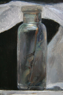
Antique Bottle: FINAL

Antique Bottle with Wax Paper SOLD
8 x 10 inches
oil on panel

Contour drawing, pencil on panel

Underpainting
Transparent raw umber and ivory black, using the white of the panel for light areas


Overpainting Stage I


Friday, February 27, 2009

Antique Bottle: Sessions 5 & 6


Had fun spending most the day on the front edge of the shelf, all the chipped paint and knots and scratches were so satisfying to paint, and so much faster than the wax paper. Now everything is done except for a couple more sessions on the wax paper.

See the previous post about this painting here

Workshop: Classical Long Pose Figure Drawing

Learn to draw the human figure with accurate proportion, dynamic movement and convincing form. We will work from one long 12-hour pose by one model to create beautiful, classical figure drawings using graphite pencil. Careful analysis of a long pose will strengthen your drawing ability whether you are an absolute beginner or an experienced artist.

The two-day workshop is two Sundays, April 19 and April 26.

Final registration deadline is April 5, 2009

Register with 2 checks to:
$140 payable to FOSAS (workshop fee)
$25 payable to S Valeri (model fee)

Include workshop name, your contact information and a self-addressed stamped envelope for class confirmation and send to:

FOSAS
1032 Irving Street #520
SF, CA 94122
(This is the mailing address, not the location of the class.)

Click here for directions and more nformation

NOTE: I will also be offering private and small group drawing and painting classes during the week between the two Sundays. Email me for details: sadiej[at]gmail.com

Wednesday, February 25, 2009

Antique Bottle: Sessions 4 & 5

oil on panel, detail, full size: 8 x 10 inches

(earlier stage)

I've spent two more sessions on my small still life painting. This detail shows the second opaque layer on one wing of the wax paper. I'll do at least one more layer to refine it - that's 4 passes including the underpainting.

My goal is to capture that "vibration" feeling, that makes the viewer feel like they are really seeing my subject (meaning *I* have truly seen and recorded my subject). Not quite there yet.

I'm finding working smaller is not at all faster than working large - people lean in closer to a small painting, so I think the "vibration" feeling will require an even higher level of finish.

As usual, I'm not painting up to the lightest lights yet, I've found it works best to nearly finish the whole thing and go in at the very end with pure white highlights.

As I think most painters will relate, there is always the temptation to pop in the highlights early on. But I find it skews my perception of the value range, and I end up shifting everything too light if I don't intentionally stay a few steps darker than the highlights for most the painting process.

Have you ever had that feeling that you wish there was a brighter tube of paint than white? When you are sure there is only pure, uncontaminated white paint on your brush, but it doesn't look like a highlight when you put it on the canvas? You wash your brush thoroughly and try again, and it's still doesn't "pop"? I hate that, it's the sign of a painting that has lost its value range. May as well wipe down and start over!

Anyway, I'm hoping to finish this one soon, there's a nice row of still lifes lined up on my shelf ready to be painted...

Previous post about this painting is here

UPDATE: I got a question about what my painting medium is, here are the recipes I use:

Underpainting:
2 parts refined linseed oil
1 part rectified turpentine

Overpainting:
1 part refined linseed oil
1 part stand oil

Fast-Pose Gesture Drawing

pencil on paper
detail about 12 x 14 inches
3 hour pose

A couple weeks ago I went to a life drawing session and was kind of horrified at how bad my short-pose gesture drawings were. I'm honestly categorically against teaching people to draw the human figure solely with fast gesture drawings, but at the same time I was mortified at how bad mine were - skritchy messes of lines that did not show at all what the model was doing.

We "warmed up" (how I loathe that word) with 1-10 minute poses, but most the session was a 3-hour pose. The drawing above is the 3-hour pose, and again I was amazed at how frantically I worked to capture the pose within the 3 hours, and felt the final drawing was not very successful.

Below was the best of the short poses from that day, a 10-minute pose. I'm not even going to post the 1-minute gestures.

10 minute gesture, pencil on paper

So after that experience I decided I needed to do some homework before the next class and so I looked at Bridgman (the god of comic book artists). I did some sketches from my Bridgman books and then moved into gesture sketches of master figure paintings.

Sketches after Bridgman
9 x 12 sketchbook page, pencil

I did this several days in a row, a couple hours a day. It was so fun I really didn't want to paint any more!

Sketches after Bridgman, Careggio, Reni
9 x 12 sketchbook page, pencil

For all of these I used a combination of Bridgman construction ideas, plus the straight-line block-in, plus the inner movement curve. Frankly the curve works best for these sketches.

Ok, I am not very fast yet - each of these individual figures on this page took 30 to 60 minutes to begin to capture the pose. But my goal is make highly accurate gesture drawings: simple, undecorated sketches that clearly show the feeling and intention of the movement.

When I went back to open life drawing session yesterday, I felt just these few hours of "homework" helped a lot! My gesture drawing improved greatly:

1 minute poses, pencil on paper

10 minute pose


3 hour pose, approx 12 x 14 inches, pencil on paper

I still struggled with capturing the poses quickly and efficiently, but I think all these drawings are better than the first day's drawings. And since I left a lot of the construction lines in you can see how I am using the "movement curve."

My original posts about Studio Escalier's inner movement curve concept are here and here.

Studio Tour

Sneak peek: You can see potential future still life flotsam clustered at the far right end of my still life shelf.

My current painting is clipped to the easel, along with my palette. I use the handy rubber-tipped clips you can buy in hardware stores. They are perfect to hold a panel but I really wish they were not bright orange.

I use white tape on the floor to mark where my stool sits for the current painting. I sometimes sit and sometimes stand while I paint, but my stool is high enough (and I am short enough) that my head is the same height either way.

This is my prized "dobie" rolling chest of drawers. I have two, and they are perfect for painting in a small studio. (I bought them from IKEA a few years ago and my husband can attest to the fact that they were a PITA to assemble.)

I put my paints on the top drawer, jars of various medium mixtures in the second drawer. My brushes stand in jars that fit perfectly on the shelf on the left side, and the handle acts as a stand for my mahlstick - you can see it leaning there on the right. There must be some better trick for not dropping one's mahlstick, I still manage to drop it a few times a week and wow it makes a loud noise on the wood floor.

Finally, here is a shot of the view above my head: Some fine San Francisco architecture, a bank of afternoon fog rolling in, and a network of wires I confess I've never noticed before I took this photo.


About 6 months ago I climbed up on top the studio roof and washed and hosed down the skylights. They might be getting to that point again.

Saturday, February 21, 2009

Antique Bottle: Sessions 3 & 4

I've worked a couple more days on this painting, but I'll save all the full-view in-progress shots until I post the finished painting. This detail is the first overpainting layer of the little glass medicine bottle, I'll refine it further with a second overpainting layer later, but it was really fun painting all the stains and discoloration in one alla prima pass.

See the previous post about this painting here

Master Copy: Guido Reni's Nessus & Deianeira

Sketch after Guido Reni's Nessus & Deianeira
9 x 12 inches, pencil on paper

block-in stage

This one I did primarily with block-in just to break it down and simplify it, and because it was hard to see the gesture of the kidnapped Deianerira as so much of her body is obscured by drapery. But I also cross-checked my block-in by visualizing the major curves and modifying the block-in where I had made errors that disrupted the overall lines of movement.

The centaur's extended leg in the lower left shows how using both approaches leads to greater accuracy. In the block-in stage the leg was elongated and stretched too far - easy to check by seeing where it falls directly under the tip of the extended elbow above. But when I corrected it I used curved method and found the correct shape according to the logic of the anatomy (which is just amazingly painted by Reni.)

I have been thinking a lot about figure drawing recently and all the approaches for teaching - not necessarily how the figure has been drawn, but how figure drawing has been taught.

The ateliers in the tradition of Gammell, Lack, and Angel all seem to use a sight-size approach and begin a student with cast drawing. I think most use the Bargue plates for beginning instruction as well. My understanding (without having studied this method) is that this trains the student to develop a highly sensitive ability to see angles, distances and values. It seems to me the goal here (again, without having direct experience) is to capture your subject exactly as it would appear if projected on the picture plane between you and the subject.

The tradition from the Golden Age of Illustration gave us constructive drawing in the vein of Bridgman and Vilppu and Reilly, (oh and Loomis), where the figure is conceived of as 3-dimensional wireframe construction of wedged rectangles and cylinders (if I may oversimplify and generalize these distinct methods). My understanding is that this is the approach used to teach animators and illustrators. The focus is on movement and the benefit is capturing gesture and pose quickly and efficiently, and teaching quickly and efficiently.
UPDATE 3/6: In the comments section of this post some excellent corrections and comments were made, be sure to read those.

Finally, as I would term it, "Expressive" figure drawing is from the tradition for teaching illustrators, but is highly influenced by expressionistic approach to fine art painting of the 20th century. The goal is to get a student to loosen up, use big arm movements, and to let go of inhibitions. I also believe this method is an ideological reaction to the art world's derision of figurative fine art in the last century, so the figure had to be approached with expressive marks to give it validity in an anti-figurative era (this is my own unsubstantiated theory). An example is here.

My teachers Ted Seth Jacobs and his students have modified their teaching from these traditions. Although Ted studied under Reilley and is connected to the 19th century academic lineage, he does not teach Bargue or sight-size. As I have documented in detail on my blog through my class notes (see "labels" in the right column), the focus is on developing an understanding of the 3 dimensional structure of organic form and the way light behaves on form. The student develops an understanding of life as organized and how each part is in harmony with the whole.

Each of these methods and their practitioners have critiques of the other methods: some lack form, some lack movement, some lack variety of markmaking, some lead to overmodeling.

I think each of these methods can benefit from the critique of the other traditions. Each approach has benefits and each has drawbacks, but ideally a student would spend at least some time studying each of the approaches.

That said... you can't go wrong by copying the Masters ;)

Friday, February 20, 2009

Blog Award

I've received an "I love your blog" award from artist and teacher Pat Aube Gray, I'm honored! As a recipient I must list 7 things I love. My husband, my family and my 3 orange tabbies are of course at the top of my list, but I'll expand a bit for interest:

1. I love how seriously museum guards take their job. All over the world I have put my nose close to see the brushstrokes of paintings, and all over the world I have never gotten away with it for more than 3 seconds. Museum guards have a pride in their work and a diligence we should all hope to emulate in every aspect of our lives.

2. I love when the sky is dark with low clouds but the sun peeks through from a late angle and makes the world turn gold. The dark purple sky and shining gold earth gives me a feeling of terrible joy, only ever lasting a few moments.

3. I love my art studio. It is set up with everything I need to be productive and un-distracted. It is quiet except for the sounds I play in it, it is easy to heat with my space heater, it has a skylight the opens for fresh air and an installed fan to blow out fumes for the rare times I use turpentine. It has a stool the perfect height so I can either stand or sit to keep my head in the perfect spot to see my subject. And it has the most wonderful, cool lovely light, constant all day except for when the fog rolls in.

4. I love the sound of lawn mowers and what we used to call "heat bugs" (cicadas). They signal summer to me, at least the summer in the North East of the US.

5. I love San Francisco. Every time of day here has beautiful light shining on beautiful architecture and any quick walk or drive always shows me a scene so beautiful I want to paint it.

6. I love koi fish. Ever since I was a kid they have fascinated me and my dream is to have a koi pond someday. I once built an indoor fish pond in one of my apartments, it had a pump and a small waterfall and was made of bricks and sat on the floor. It had goldfish in it, and I learned that goldfish were bred to be admired from above, not from the side as they are seen in a glass fishtank.

7. I love staying up late to talk around a table with old friends, especially with wine. It's probably my favorite thing to do.

Now I need to list 7 art blogs I love to pass along the award. These are blogs I enjoy every time something new pops up. They might not post every day, but every post is a gem.

Daily Routines
Not really an art blog, but related - this site chronicles the daily schedules and habits of famous artists, writers and philosophers of all stripes. I find it inspiring some days, daunting other times, but always interesting.

A Year in Art
Jason Brockert shares both the practical nitty-gritty of being a working artist and also his philosophies and musings in a year of weekly essays, inspiring and entertaining always.

Nathan Fowkes
I am always stunned by how Nathan can show everything from the planes of the head to the play of light on a landscape with just a few strokes. And he teaches!

Life Spatula
"Spatula" is an art school refugee like me, and her quests to continue artmaking and continue her art education are inspiring, and as an added bonus her witty writing just cracks me up. She's about to join an atelier this year (I think where Nathan teaches even?), so it will be such fun to watch her progress (she better keep posting!).

Scott Conary and Shawn Kenny
I almost didn't list these two because I am friends with both from our art school days at RISD. But they are both amazing, juicy painters and I'd love to share both their work if you don't know of them already.

That's only 6! But I follow a lot of blogs and I admire them all, you can see them all in the right column here.

Wednesday, February 18, 2009

Master Copy: Guido Reni's Samson

After Guido Reni's "Samson", 1618

After diagramming my wax paper drawing yesterday, I felt inspired today to try drawing an actual person. No models available, but luckily I have a few books with some good figures represented (including my treasured book about Reni, an out of print, hardcover color catalog given to me by my husband this past Christmas).

This sketch took about 2 hours, and I did it entirely with the "movement curve" approach, not even a straight line block-in to start.

I notice I run into the same arc of experience when I draw: I start off, and after a good while I feel like the drawing is going well, and I allow myself to move into more details. Almost immediately I find problems, realize I need to back up to the bigger shapes and gestures... and then I spend just as much time adjusting the major landmarks as I did putting them down on the blank page!

However, once I've wrestled that together I start to understand the pose, and suddenly something shifts and all the various elements start to harmonize. It's a nice feeling.

Patience has been the key to developing my drawing ability. I would like to be able to draw more quickly at some point, though.

~~~ UPDATE ~~~
Below I've diagrammed some of the steps of my methods for how I constructed this drawing.

I started by making a mark at the top and the bottom, and would not allow my drawing to go above or below these points.

Then I drew a general gesture for the overall tilt of the main pose and a secondary line for establishing the non-weight bearing leg.

I noticed where the main weight is pressing, the ankle of the forward leg, and sketched a vertical plumb line to see what falls along that path. This is how I noticed that the raised wrist is not directly above the weight-bearing ankle, which helped me capture the general gesture. Not that I got it right at the first pass, but it helped me begin to visualize the pose on the page.

I looked for the theme (red), counter-theme (orange) and ornament (blue) to capture the gesture precisely (see my Studio Escalier notes). I spent most my time between this and the first stage, back and forth, adjusting it until it felt like the pose.

This looks wiggly and swoopy, but the lines are quite precise and intersect movement with structure. They map the paths of energy and tension that are defined by the structure of how the body is holding itself up. The axis where the curves touch the outside contour help me see the exact shape of the contour and how every part interrelates to every other part of the figure as a whole.

Once I feel I have everything working to describe the pose, I use this system to move into smaller and smaller contours of the body. Inevitably I find errors from the earlier steps - when the network of curves do not "work" within the bigger errors I have made, like the hand landing in a wrong spot on the torso would show me I've estimated the curve of the shoulder incorrectly.

Nothing on the body has these simplified curves though - these are curves of movement, not of structure. The structure is a network of many compound curves, complexity within the harmony of the whole.

As Ted Jacobs taught me, the shapes of the body are fan-shaped and non-parallel. This translates to everything - no two high points are directly across from each other on a form. No three intersections or axis line up in a straight line.

The most difficult part was the non-weight bearing leg. That's because the limb is supporting some weight, but the upward pressure of the supported toe versus the downward pressure of gravity on the bent knee were making a curve in opposition to the general curve of gesture - two curves canceling each other out make it tempting to see a straight line, but the straight line makes the limb look rigid and dead - there must be tension and vitality, even in counter-acting curves. So I found myself struggling with it a lot, but my goal was to show the tensions without deadening the movement.

I find I also have a tendency to make everything regular and even: the first time I sketch say two curves defining the outer contours of the leg, my drawing looks awkward and clumsy and un-life like. I often wish I could see immediately what I am doing wrong, but a the stage I am at now, I can see it is wrong but not how to fix it, and I just have to fiddle around till it feels right.

I think I would be faster and more efficient if I could start to see my errors and tendencies as I make them (or even before!).

I find when drawing and painting I must suspend a certain type of evaluative, critical looking in order to work, but I need critical looking to tell if what I have drawn is satisfying, so I am always practicing and refining the skill of how to switch this critical evaluation on and off at will. So I was pleased and thrilled to find this quote by a mathematician that exactly describes this phenomenon:

"When I am working on a problem, I never think about beauty. I think only of how to solve the problem. But when I am finished, if the solution is not beautiful, I know it is wrong."
- Richard Buckminster Fuller (1895 - 1983) architect/mathematician/engineer

Tuesday, February 17, 2009

Antique Bottle: Session 2

8 x 10, oil on panel

This is a new little painting I started this week, a smaller size and a less complex composition than the previous four painting, just so I can get some satisfaction of completing a painting in less time.

I started with just the bottle and the shelf, I wanted to keep it really, really simple. But it just looked too boring, and after fiddling around with some twigs I finally gave in and crumpled up a small piece of wax paper and suddenly the composition was a whole lot more interesting... and also a lot harder. I was originally aiming for a 1-week painting, but this might take 2 weeks.

I thought I would share my drawing process. I diagrammed it below, on the under-painting (I did make a pencil drawing first, but I corrected the drawing with the under-painting, so I'll diagram my thinking on the better drawing.)

To start, I lay in some straight lines, trying to accurately capture the biggest, most general angles, tilts and distances. I spend quite a bit of time on this, until it "feels" like the gesture of he subject. I might break the lines into smaller segments than these, but I try not to.

Then I move into finding the curves, the major lines of movement or tension that are supporting the subject. This little piece of wax paper was behaving like an arch, so I knew I would find elements of the arch showing up here and there in the contours. The arch seems to me to have three points of contact with the board (at least from this view), so I tried to discover how it was supporting itself on these three points.

The corners peaking at the upper right are also part of the structure, so I searched for their relationship to where the arch legs are supported.

All the folds and crumple paths along the wax paper are arranged logically for how the paper is supporting itself, or being supported. I look for the main curves of movement, and as I develop the drawing along with the panting, I'll look for the smaller and smaller incidences of how the paper is logically crumpled.

When drawing the figure I follow the same method, except drawing the figure is harder.

See the first post about this painting here

Monday, February 16, 2009

Antique Bottle: Session 1

preliminary contour drawing
8 x 10 inches, pencil on panel

Tuesday, February 10, 2009

Gallery Show: STUDIO Gallery


My painting Wax Paper and Ribbon will be showing at STUDIO Gallery on Polk Street in San Francisco March 11 to April 12. This is the first showing of a painting in my "wax paper" series and I am thrilled STUDIO is including my work in the show.

The opening is Sunday March 15, I will be there and I hope to see you.

Teaching: Drawing Workshop at Sharon Art Studio

I will be teaching "Classical Long Pose Figure Drawing", a two day workshop at Sharon Art Studio here in San Francisco.

I am thrilled to be teaching at this wonderful community center, they are a great organization and have a beautiful north-light drawing studio in an historic stone building.

The class is two Sundays, April 19 and 26th.

Click here for more info

Wednesday, February 04, 2009

Silver Globe Pitcher: FINAL

oil on panel
16 x 20 inches
Award: Oil Painters of America 2009 Western Regional Juried Show


I made a video slide show showing all the stages of the painting and some detail closeups. You can see the movie for this painting here.

More about this painting:
In 2008 I began a series of still life paintings using crumpled wax paper as my subject. I was drawn to the material because I can twist, and crush the wax paper into draped and spiraling shapes to create dynamic environments for the simple, antique bottles and pitchers I collect.

I am always on the lookout for interesting vessels to paint, and when I found a spherical silver water pitcher at a flea market, I instantly fell in love.

Certain objects call to me and must be painted. I have learned that collecting something not-quite-right, just because I "might use it someday" is rarely successful. Those objects languish on my shelf for years, always passed over. The objects I paint resonate with me deeply and demand to be painted immediately. I had a vision of the silver globe pitcher draped in a "shawl" of crumpled wax paper, with the shawl arranged as if a small breeze were filling and lifting it.

When I set up a new still life I spend several studio days crumpling paper and discarding it, moving objects around, trying to find the best shape and composition through my viewfinder. The wax paper takes gentle coaxing and twisting to arrange it in with the feeling I am envisioning.

The final arrangement must look fresh and transparent, like it just landed there, no matter how many discarded pieces it took to reach my vision.

I begin all my paintings with a detailed contour drawing in graphite pencil on wooden panel I have prepared myself with homemade gesso. I spend several days on the drawing, first on trace paper and then directly on the board. I find that if I spend the time needed on the drawing, the structure and believability of the final painting is more successful. I never rush the drawing process, even when I am anxious to begin painting.

Once the drawing is finished, I paint in many layers over the course of a month or more, first in grays, called a "grisaille", to establish values, and later in color. I use tiny brushes from start to finish, and work on a small area each day. I move slowly around the painting, bringing each section up to the highest degree of finish possible before moving to the next area. Silver Globe Pitcher took me over 120 hours to complete over the course of 2 months.

It is only the latest stages of my process where I get to enjoy the beautiful and most subtle effects of light and texture on the surface of the objects, like the turquoise tarnished area at the base of the pitcher, the transparent paper melting into the background, the pedestal of the pitcher peeking through the folds of paper. But it requires all the earlier stages of building a solid drawing and value structure in order to successfully render the beauty I see in the surface details.

Silver Globe Pitcher is a rare instance where I include a self-portrait in my painting. I wanted the self-portrait to be a discovery, so the viewer sees and appreciates the whole composition first, before noticing my tiny image reflected in the vase. That way, each viewer has a sense of having discovered something on their own, a small secret in the painting.

My self-portrait embedded in the painting allows each person to discover my own image peering back. The viewer can see the entire little studio where I worked on this painting, and have a sense of being able to get a glimpse into the experience of the painter.


See the previous blog post about this painting here.

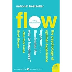
Book Report: "Flow"


"Flow" is the state we get into when we are challenged to sharpen our skills to accomplish a task. The athlete, the scientist, the gardener, the mechanic, the artist, the chess player all feel flow when they are working at their best. Flow is the optimal state of human experience, meaning it's the state most fulfilling to us.

Reading the book has really inspired me - of course as an artist I relate to the state of flow while I paint, but also for everyday, non-art experiences: I am finding so often when I want to disengage and tune out and watch tv or hang out on the internet or otherwise waste time, that it's equally restful and relaxing to actually engage. There is fulfillment in the everyday contemplation of what is in front of us.

I am reminded of a quote by Thomas Moore:
"Simple gestures taking place on the surface of life can be of central importance to the soul."

Painting and drawing could be called "simple gestures" - really, it's just pushing colored mud around with a hairy stick - but anyone who has tried it understands that it can take you pretty deep - through a quagmire of wrestling with our deepest fears, and occasionally through that to a place of peace. To where time and self-consciousness stop and we can just Be, without evaluating or worrying.

Maybe all we have to do to access the soul is to set up a space with a few objects on a table and some lighting, and look.

Simple gestures.

Tuesday, January 27, 2009

Silver Globe Pitcher: Overpainting Stage 5


All of today's painting session was spent refining this area of the wax paper. I'm really enjoying all the transparent folds.

See the previous blog post about this painting here.

Monday, January 26, 2009

Silver Globe Pitcher: Overpainting Stage 4

16 x 20, oil on panel (detail)

I had a lot of fun with this left section of the the wax paper. The big chunky flap of paper in front was a huge lesson in remembering not to have "tunnel vision", remembering to compare the local value range to the entire painting. This area has a huge amount of information all within a few very short steps of value, so I had to be careful not to be tempted to exaggerate. Then the highlights are in another value stratosphere, making it all even more complicated!

I am thrilled to report that my recent video painting demo got a wonderful (embarrassingly wonderful) writeup on the blog Art Studio Secrets. In addition to the very nice things written, I am also flattered because the other artists profiled on this new blog are artists whom I have long admired: Alex Kanevsky, Carol Marine, David Kassan, and Paul Seaton.

See the previous blog post about this painting here.

Tuesday, January 20, 2009

Silver Globe Pitcher: Overpainting Stage 3

(detail)

Here's a sneak peek at my little self-portrait in the silver globe pitcher.

I thought I wouldn't get much done today with so much juicy politics to watch, but Obama's Inauguration speech this morning (9am my time) was so energizing that when it was over I was too jumpy to watch more on TV, and I was out in the studio painting all day. I did listen to live NPR dissection of the day's events all day.

I've been reading the book "Flow", which is all about how optimum human experience occurs when we focus on challenging work, so I particularly liked this part of the President's speech:

"...there is nothing so satisfying to the spirit, so defining of our character, than giving our all to a difficult task."

Who can disagree with that?

See the previous blog post about this painting here.

Friday, January 16, 2009

Silver Globe Pitcher: Overpainting Stage 2

Detail of work in progress

Detail of work in progress, previous stage

The handle and spout of the silver pitcher has been giving me some frustration, there's a lot of very close, dark colors, punctuated by very bright highlights. Everything depends on very accurate drawing at these stages, the slightest wavering of paint strokes makes for a wobbly pitcher handle. After much wrestling, I'm feeling like I'm closing in on it, though.

I've also been struggling with the swatch of wax paper that runs behind the pitcher. The crinkles up in the right corner catch the light and jumps out quite a bit, but if I paint them with too much contrast they look a) too eye-catching and b) dumb. It's been a lot of push and pull to get it to this stage.

For some reason the bottom pedestal of the pitcher I worked on last week was a breeze in comparison to these areas, even with all that semi-transparent wax paper overlapping the pedestal.

All these photographs are reducing the color saturation compared to the actual painting. My paintings are of course very monochromatic, but I use a full range of hues to mix my neutral colors, and in person you can see a lot more range of hues within the values. For the final photo I'll work harder to get a very accurate photo.

Mediums:
I still like working with the tubed Maroger quite a lot, but it has a tendency to dry fairly matte in the dark areas. So I'm going back to the linseed-based medium for the darks, especially the background. I'm sticking with the Maroger for the light areas.

See the previous blog post about this painting here.

Color Mixing

I thought I'd give a little introduction to the palette I use and how I mix my colors.

COLOR THEORY

There are many different color theories - models and philosophies for understanding how color behaves. I use a methodology of color mixing that I learned from my great and most influential teacher at RISD, Anthony Janello. Tony however might cry to see what I have done to his beautiful color system, as I use it to mix up mainly grays, while he is a high-chroma colorist. I can't find any of Tony's paintings online, but I did find a recent student of his who posted the kind of color studies I also did in his class.

As my approach has evolved it's become my own and I don't think any of my teachers would appreciate me crediting them with my color handling, as I basically create monochromatic paintings. But you could use the same fundamental color theory to make highly chromatic paintings, it's all in the proportions.

PALETTE

My palette is limited, essentially primaries: a red, a yellow, and a blue, plus a couple others that I've discovered save me time, plus white. I arrange my colors is roughly rainbow order, and I always put them in the same order. The specific colors I use evolves all the time, but right now I'm using these (as seen left to right on my palette above).

titanium white (two puddles in case the first gets contaminated)
magenta
cadmium red
cadmium orange (I use it as a yellow)
yellow ochre
sap green
cobalt blue
ultramarine blue
mars red (actually a rich brown)

A note on black: I don't use it because it makes more problems for me than it solves.

A note about "red" - the red we were taught in kindergarten to mix with blue to make purple does not work. Magenta is a "true" primary color, meaning you can use it to mix a secondary color. Magenta is my "red". Cadmium red is really an orange, and mixing it with blue makes mud.


MIXING

For purposes of vocabulary:
Hue is color
Value is light and dark
Chroma is intensity/brightness

Any swatch of color can be defined by it's hue, value, and chroma. When you mix any two colors together, the chroma/intensity is always reduced - a bright yellow and a bright red will make a slightly less intense orange. Different hues also have different values. So the complicated thing about color mixing is how to get the color/hue you want while also controlling the chroma and value.


Before I start painting I mix up a few puddles of dark paint and light paint for the areas I'll be working on and make some 5-step chains of puddles between the darks and lights. Mine are neutral (low chroma), but you could use highly chromatic/colorful chains, too.

To start mixing, first I choose the value puddle I want, and then if the paint mixture is too red, I mix in the complementary or opposite, green; if it's too purple I add yellow, if it is too blue I add orange.

Any two colors mixed together will lower the chroma/intensity. So any two colors opposite each other on the color wheel will essentially cancel each other out. I use this "canceling out" to mix subtle shifts between hue, value and chroma. Memorizing the color wheel is the most helpful thing you can do as a painter.


With this method I can mix subtle shifts of hue, value, and chroma. I essentially visualize the color space in 3 axis of dark to light, intense to less intense, and one side of the hue to the other - blue and orange for example. I picture my puddle of paint where it exists in my color model, and "push" it around the three axis: darker or lighter, bluer or more orange, more chromatic or less chromatic.

Different colors also have different values right out of the tube. So if I am mixing a dark neutral, and it is too blue, I don't mix in a high-value orange like a cadmium, because the value will lighten while the chroma decreases.

Which is why I like Mars red - I use it like a low-value orange. I use sap green for the same reason - it's a higher chroma green than what I can usually mix, an I use it to "cancel" with magenta, cadmium red, or mars red.

I use two blues for the same reason - both are high chroma, but one is much lower value, so I use ultramarine for low-value mixtures, and cobalt for high-value mixes.

After a while the system becomes intuitive and you don't think about it much while you paint. But I still sometimes get stuck and have to ask myself "what color is this paint?" to notice it is purple, and I better add in some yellow or I'll end up with a purple painting.

A note about paint quality:
It's always worthwhile to buy high-quality paint. The cheap tubes simply have more oil and less actual pigment, so you use more paint anyway.

A note about lighting:
Light is very very important. If you paint under a normal lightbulb, the yellow tint will distort your perception of all the colors. The more I paint, the more I find the only true light is indirect daylight (north light). At the very least, paint with a full spectrum, daylight, color corrected lamp designed specifically for artists for shining on your easel. However, you can shine any color light you want on your subject, as demonstrated with magnificence by Dan Thompson.

For more color theory:

Munsell is a great introduction for understanding hue, value, chroma, although I don't follow the methodology. I posted their chart above.

Handprint is an amazing site for understanding the science and practical mixing of color. It's focused on watercolor but much of the information applies to paint of any kind.

Book Report: Art and Fear


I read this book years ago, and I didn't realize how much it had influenced my thinking until I recently opened it to look up a quote to bolster my argument in a discussion, and found that I've lifted my own philosophy about talent and artistic training directly from the authors.

So, I re-read the book in full, and decided to write up a little book report and give them credit for their theory which I have been trumpeting as my own.

I don't agree with everything is the book, but it has some fabulous ideas that were very liberating to me at a time when I was terrified to make art.

"The prevailing view of artmaking today [is that] art rests fundamentally upon talent, and that talent is a gift randomly built into some people and not into others. In common parlance, either you have it, or you don't.... This view is fatalistic - and offers no useful encouragement to those who would make art.

"Artmaking involves skills that can be learned. The conventional wisdom here is that while "craft" can be taught, "art" remains a magical gift bestowed only by the gods. Not so. In large measure becoming an artist consists of learning to accept yourself, which makes your work personal, and in following your voice, which makes your work distinctive. Clearly these qualities can be nurtured by others. Even talent is rarely distinguishable over the long run, from perseverance and hard work."

"... our flaws and weaknesses, while often obstacles to our getting our work done, are a source of strength as well."

"Making art provides uncomfortably accurate feedback about the gap that inevitably exists between what you intended to do, and what you did."

"Your job is to learn to work on your work."

"Those who continue to make art are those who have learned how to continue -- or more precisely, have learned how not to quit."

I have learned the hard way (and I am sure the authors have learned this too) that this philosophy can raise ire. But I do think their words might resonate deeply with many people who want to make art but for one reason or another feel they are not "real artists".

All we can do is come up with a philosophy that helps us keep making art. So if this philosophy resonates with you, read this book, and then go forth and make art.

Also, I'll be teaching a drawing workshop for art-makers of all stripes soon, so if you think the philosophy would be helpful to you in the classroom, come to San Francisco in late April - details coming soon!