Sunday, December 09, 2007

TSJ Workshop: Reclining Nude II

pencil on paper, 18 x 24 inches

I have now worked on this drawing for 2 weeks, or 10 sessions. See the earlier version here.

I have one more week left, so I have to decide what to do. Do I continue to modify and refine this drawing, or do I start a new one?

I've gotten some great comments from my artists group (we are a group of artists of all kinds, writers, animators, singers, and filmmakers, and we meet monthly to share our latest endeavors over wine and snacks.) Of course they said complimentary things, too, but they very astutely pointed out the places I am struggling.

I need to resolve some issues with her right shoulder, her back, and refine the face & hair a bit more. They loved the elbow, which is one of the last things I worked on, so maybe I will try to apply what I learned there to the back, which I worked on very early in the drawing.

I am really enjoying my workshop with Ted Seth Jacobs, he is teaching me new ways to understand what I am looking at. The elbow in the the above drawing is I think most evident of what I am learning.

Paris, 15 years later

I am very excited to learn that I have been accepted to a figure drawing program in Paris for three weeks in April 08. The course is taught by former students of Ted's who live and teach in France, their school is Studio Escalier. I studied at Parsons Paris for 6 months in college, back in 1993, so I am looking forward to visiting Paris as an art student once again, 15 years after the first time.

Notes from TSJ

I have transcribed some more of my notes from TSJ's teachings. These are some of his overall themes, the ideas he repeats no matter what specifics he is showing us:

"I am not your teacher: nature is your teacher. But you have to have knowledge of the principles of form to understand what nature is showing you. These principles are helpful only as far as they help us see nature. If nature disagrees with a principle, nature is right, the principle is wrong. Nature is our teacher always."

-- Ted Seth Jacobs

Contour
  • Contour is not flat, it is moving in 3 dimensions, back and forward
  • Every contour on the body is held in a balance of tension between opposing forces.
  • Every change in the contour is a result of 3-dimensional form

Light and shadow

  • Everything is divided into light and shadow. Always know whether you are working in the shadow or in the light. There is no such thing as “halftone”. There is only:
    Light light
    Dark light
    Light shadow
    Dark shadow
    Accent (the darkest dark)

See the model as a flat ribbon of light
  • Squint your eyes to simplify the lights and darks
  • Don’t worry about highlights, pay attention to the largest masses

    Ask yourself:
  • Which end is closer to the light source?
  • What is the tilt of the ribbon to the light?
  • What is the lightest part of the pose?

Model the smaller forms in harmony with the larger value relationships.

Think about the three dimensional forms, not just a two dimensional pattern of lights and darks.

The edge of the shadow (also called the terminator, or core shadow) is not an impenetrable wall, there are forms criss-crossing through it

Shape the light to describe the form;
See what end is wider, which end is narrower; it’s often a “fan” shape, edges are never parallel

Form principles
  • Even a concave shape is made up of tiny convex forms
  • Each shape is a wedge that interlocks with other wedge shapes
  • Find the specialness of each shape
  • Make a portrait of each shape
We are not copying: copying is trying to capture what you see without understanding what you are looking at.
We are not representing reality; we are suggesting reality.

Saturday, December 08, 2007

Abstractionism, Realism, and Honesty

A very good friend of mine is an abstract painter. We’ve been friends for 12 years now, and I’ve had the privilege of visiting her studio many times.

I know very little about abstract painting, but my friend seems to value my opinion, so she tells me a lot about her thought process, her technique, what she is attempting, whether she feels she fails or succeeds. I am always impressed by both the work itself, and what she puts herself through to make it.

She is as rigorous and self-disciplined as any traditional atelier-trained painter. She continually challenges herself, continuously refines her technique, and never allows herself to rely on cheap flourishes. Nothing is accidental, everything is deeply intentional, and not a mark is made without questioning her own intentions, conscious and unconscious. She has the deepest integrity an artist can have – she is brutally honest with herself. Her paintings are gorgeous and moving on every level.

However, as we talk about art, we sometimes come up against a wall, the divide between realists and abstractionists. Our visual goals as artists are quite different.

There is a huge division between the world of abstract painters, who are concerned with surface, and the world of realist painters, who are concerned with illusion. Interestingly, both sides would probably use the word “decorative”, with a sneer, to describe the other.

When I hear realist artists deride abstract artists, or vice versa, I wonder why each threatens the other so much. Both sides tend to cite the worst or most extreme examples of the other to characterize these two large and varied movements.

Many artists on both sides are doing the hard work of excavating truth. On the other hand, in both realist and abstract art, there are dishonest artists. Dishonest artists make paintings with the main goal of shoring up their ego, instead of the goal of revealing truth, connecting with the universal.

When evaluating art, whether realist or abstract, I ask myself "is the artist being honest with herself?" Everything comes into focus when this question is asked.

Derision tells us nothing about the art and everything about the critic.

Whether abstract or realist, only honesty counts.

Thursday, November 29, 2007

TSJ Workshop - Reclining Nude I

18 x 24 inches, pencil on paper

We are now in the 4th week of Ted Seth Jacobs' drawing workshop at BACAA.

This week we started drawing a 3-week pose. Today is the 4th day, and I spent the first 3 1/2 days struggling with the block-in. I don't know what it is, something about the leaning tilt, but it is an incredibly difficult gesture to capture. I erased and started again a half-dozen times. But practicing a block-in is a good exercise, so the time was well spent although I don't have much to show for it.

This is an interesting stage of the drawing, because you can see the earliest marks of my block-in, especially at the feet, as well as the more polished part by the shoulders.

While I draw I repeat in my head over and over "rounding and ending", which I described here. The practice of thinking about the three-dimensionality of each protrusion is a a new technique for me. Also, being conscious about which sides of a shadow are soft, and which sides are crisp is really helpful. Repeating "rounding and ending, rounding and ending" helps me remember.

I have also been thinking a lot about how to paint and draw nudes, especially female nudes, without relying on a traditional idea of beauty as a hook. I think about how to depict an individual without reducing her to an idea of a woman. There is so much history to contend with, it's hard to resist. The temptation is to emphasize her beauty. Especially because this model is tall and slim and attractive, and especially because she has been arranged in a classical pose.

My goal is to try to depict her as a real, breathing human being. Let's see how I do.

Perception and Distortion

What we think we see is very different from the raw data that hits our retina. Our brains warp and remodel everything we see to fit into what we think we know about the world.

By the time an image has been projected onto our retina, has stimulated the appropriate light-receiving cells, has transferred visual data to our brain, has been interpreted at base-level cortex and higher-thinking cognitive levels of our minds, has been categorized, compared to what we already know, and emotionally processed, by the time all this has happened, what we think we “see” has been interpreted and distorted and edited so to have nothing to do with the original beams of light that entered our corneas. The original data has been distorted; not distorted “beyond recognition” but distorted TO recognition.

The artist must learn to recognize these distortions and exorcise them, or use them. When we look at our own work and are not happy with what we see, we are becoming aware of our unconscious distortions. It’s an uncomfortable feeling, but it helps us learn. We must learn to recognize and edit out unconscious distortions, and learn how to present truly “raw” data to the viewer, just as real life presents raw data.

This is not to promote what is commonly called “slavish copying.” Artists can and should choose to distort the image, choose what to emphasize, choose what to leave out, choose to guide the viewer. But any distortion has to be intentional, deliberate.

Even abstract artists I know talk of trying to become aware of the unconscious associations, influences, references and baggage visible in their art. They attempt to only present visual information with intention.

Lack of intention, or ignorance on the part of the artist is always painfully obvious to the viewer, consciously or subconsciously, and detracts from their experience of a work of art.

The pursuit of art is learning to throw away unconscious distortions and replace them with conscious choices.

Kind of like life.

Wednesday, November 28, 2007

Talent is a Myth

People have told me I have “talent” all my life. Maybe I do have some. But all “talent” ever did for me was make me able to draw a marginally better bunny rabbit than my classmates in second grade. The difference between a “talented” seven-year old’s drawing of a bunny and another kid’s drawing of a bunny is minimal. They are both seven.

Everything after that is sheer work. Sheer number of hours spent putting pencil to paper or brush to canvas. Sheer practice. It’s an enjoyable kind of "work", but it is still work. I draw marginally well because I drew every day between age 3 and age 21. If you did anything every day for 18 years, you would have some degree of ability.

It’s not talent.

Talent is a myth.

The myth of talent cripples.

We like to think of artists being born, being magical, special, different. Once we think of ourselves as “artists”, it makes everything we do have a special weight: The weight of having to prove that you are a “real artist’ with everything you do. There is little room for error. Creating a “bad” work of art throws artists into despair. They feel they are not “really” an artist.

No one is “really” an artist. The people who work hard at their craft every day for years and years get better at it than those who don’t.

I can be stymied by the imagined imperative that everything I create, every mark I make, must indicate my unique, intelligent and inherent talent, and any failure reveals a lack of uniqueness. If I spend my time evaluating myself, there is a defensiveness that obscures the art. Defensiveness makes art that is fearful. Defensiveness makes art that “protests too much.”

To truly learn, and to truly create, we must shed all ego. The idea that “I am an artist” must go out the window. The wondering “am I good” must be driven out of our heads. Just keep going, don’t stop, don’t look back, don’t evaluate, just produce.

Don’t wonder if you have talent, or insist you have talent, or hope you have talent, or beg your teachers or peers or critics to tell you that you have talent. Don’t despair when you realize you have no talent. Talent is a myth.

Work hard at your art. Then you will be a true artist.

Tuesday, November 20, 2007

TSJ Workshop: Head Study Day II

Looking at anyone from this angle makes their face look wide and their nose upturned... but Melissa does not have a wide face nor an upturned nose. I think in this version she looks more like herself than in the previous session, where she looked like some sort of plump Swiss Miss character.

Ted has been teaching us about "rounding and ending" a shadow. This is where a shadow is shaped by the light falling over the rounded edge of a form, which makes a soft gradated edge. Then the shadow ends in a crease, a hard edge, before the next rounded form begins.

This hard edge is eventually slightly softened through "knitting" the two forms together, but the basic idea is seeing where the shadows have soft edges (over a curved surface) and where they have firm edges (at the crease between two forms).

You can see this most explicitly at the hollow in Melissa's upturned cheek. (It's even more exaggerated in this photo of the drawing, and I will say, it's very frustrating to work for two days to calculate every value, just to have it all destroyed in the photo!).

Anyway, you can see how the shadow rounds down off the hight point of her cheekbone, and falls into the crevice above her jawbone - "rounding and ending". I tried to practice this all over the drawing.

At this stage (about 7 hours into it) the forms are all still generalized, but if I had more time with this pose I would go further and see how many sub-forms I can find.

Had fun with the hand and it went very quickly - I did most of it in just two 20-minute sessions. You can see the "rounding and ending" concept over the tip of the index finger quite clearly, too.

Monday, November 19, 2007

TSJ Workshop: Head Study

pencil on paper, 3 hour pose

I decided to try a new drawing of just the model's face and hand these last two days of the pose.

Something is not quite right... the angle is difficult, but I was hoping to catch more of a likeness, and this doesn't look much like Melissa. I'll try to discover what is wrong tomorrow.

Saturday, November 17, 2007

TSJ Workshop: Melissa Day 5

pencil on paper, 12 x 18 inches, detail
Day 5


Next week is short because of the holiday, so I'll only have two more days on this pose. I think I am done with this drawing, so I may start a new one just of her head and maybe her right hand near her face. It would be fun to try the face larger and with more detail. Not often I get an angle like this to work from.

Ted's comments are that I am making things "too straight" (like the shadow on the thigh, or the top edge of the calf). Which makes sense, because I have been practicing a straight-line block-in all year!

But I can see that Ted is right - the body feels more real, specific, organic and yes, organized, when all the compound curves are articulated: muscles wrap around bone, the bone itself is thick and thin and twisted, irregular wedges notch into asymmetrical arches; nothing is constant or machined.

On the other hand, it's very hard to get accurate proportion without focusing a good amount of time and attention on a straight-line block-in at the beginning. I would say it's impossible. After this year's training, I can always tell if someone is NOT using a block-in.

My idea is melding the two approaches. Blocking-in with straight lines to get all the tilts and distances to be accurate. Then using Ted's way of seeing to express the myriad organic structures that make up the whole form.

Wednesday, November 14, 2007

TSJ Workshop: Melissa Day 3

pencil on paper, 12 x 18 inches, detail
Day 3

This is the drawing I am working on right now during Ted Seth Jacobs' 6-week figure drawing workshop. This is day 3 of a 10-day pose. You can see earlier stages of the drawing here.

I have blocked in the general proportions, refined the contour, and lightly sketched the main shadows. Now I am trying to create the smaller forms according to the philosophy Ted has been teaching us.

In the mornings, Ted draws from the model for us and demonstrates all the forms and sub-forms he sees on the model. He shows us how everything fits together, interlocks, and how the individual forms describe pathways along the body to create a network of structure.

I am trying to do the same in my drawing. Ted is teaching me how to see how gravity and pressure affect the masses of the body, and it is giving the figure more weight and substance. I think you can see the difference in my earlier drawing of Melissa I did last March.

Obviously the earlier drawing is of a very different pose, but you can see the forms are more simplified and generalized; less specific, and more "floaty".

In contrast, I feel like the models' legs in this drawing are pressing on the surface and on each other.

Seven more days drawing this pose, stay tuned :)

Tuesday, November 13, 2007

Studio Video Tour


Take a tour of my little art studio!

Sorry no music or real sound - yes my husband is a filmmaker, but he's is working 12-hour days this week (on special effects for the new SpeedRacer movie), so he hasn't had time to teach me any video editing skillz.

TSJ Workshop: Melissa, Day 1 and Day 2

pencil on paper, 12 x 18 inches, detail
Day 2

Block-in stage
Day 1

This is the drawing I am working on in Ted Seth Jacobs' workshop. This will be a 2-week pose, so I am trying to take my time. After I refined the block-in, I focused mainly on the feet. I'll move to other areas each day.

(You can see Ted's sketches of the structure of the foot and head in the top image, which he drew for me when he came around to critique my drawing.)

I have lots of notes from the last few days, will write them up soon!

Saturday, November 10, 2007

American Artist Drawing Magazine


The Fall 2007 issue of American Artist: Drawing magazine has a twelve page article all about BACAA, and my artwork is featured in the article! There are photos of me working on my cast drawing, and my drawing of Caroline is published as well. I am also quoted throughout the article.

The print magazine is available at art supply stores and large bookstores, and you can read the full article online here!

Thursday, November 08, 2007

TSJ on "Structure"

graphite on paper (detail)

18 x 24 inches, graphite on paper

Ted lectures in the mornings, and in the afternoons we draw from the model.

Below I've summarized some of his concepts and diagrammed my drawing to show how I am attempting to apply his techniques:

Contours, (the visible "lines"), are affected by the bulges and masses which make up the structure of the body. There are NO concave lines, because the human body is full and has volume. Even very slender people have substantial mass and volume. A concave contour is actually made up of a series of small convex forms.

I've traced the contour lines I drew as they enter the body and correspond to interior structural masses.

These contour lines are arranged, visibly or invisibly, along the body. The structural masses are arranged along these pathways, making a basketweave pattern throughout the form (under and over, in a network).

Structures of the body are arranged in "families" of forms. Each structure has a rounded shape, growing darker as it turns away from the light.


The darkest edge of a form usually ends just before the lightest edge of the next structure, creating a layering of forms and sub-forms.


Ted on Organization of the Body:

The hallmark of the classical approach to drawing is that nature is organized.

Everything is designed with an economy of space, form, and function.

Features of the body are never like snowballs thrown on randomly.

See every point in relationship to the whole; nothing is in the right place until everything is.


Ted on "Structural Pathways"

All the forms of the body are arranged on curving pathways, never straight or angular.

These pathways create a network, like a hairnet.

Pathways exist in 3 dimensions like a basketweave - sometimes on the surface, sometimes burrowing underneath.

Pathways exist in two sets of arches, some arching up and some arching down.


Ted on Structural Forms:


Structure is a vocabulary of forms.

Shapes grow on the body outwards: ample, convex, superimposed, smaller in top of each other.

Universal structural shapes are modified by gesture: squashed, stretched, twisted.

Sometimes forms are so modified they are unrecognizable.

See how these structures are perceived through the actions of light.

Forms are layered - every form can be reduced to its underlying mass.

The body is not a smooth surface, it is made up of specific shapes, it is "particulate".

Train your eye to see the "specialness" of each individual shape.

Continuity - everything in the body connects in a fluid, continuous manner.

Contour reflects the 3-dimensional structure of the form.


Ted on Perception:

Monocular vision (like a camera, or closing one eye) has less perception of form - two eyes "wrap" around the form.

Don't use tools like plumb lines and measuring rods - make yourself the measuring instrument.

Only one point of your subject is NOT foreshortened, the point directly in line from your eye. All other points on the subject are forshortened to a greater or lesser degree.

Drawing is all about recording what you see without being distracted by the symbolic, verbal, abstract symbols of what you are seeing (like the almond/dot egyptian symbol for "eye", which has nothing to do with what a real eye looks like).


My current favorite quote from Ted:
"Drawing is an exercise in human fallibility - it shows how wrong we can be."

Tuesday, November 06, 2007

Ted Seth Jacobs - Figure Workshop

This week I've begun Ted Seth Jacobs' 6-week figure drawing workshop, offered through the Bay Area Classical Artist Atelier.

So far I have come up with this summary of my impression of Ted's method for figure drawing. (Note: This is my impression, and not a direct quote, he may describe it differently):

The human body is an organized, "designed" system of interlocking structures.

This interlocking system as a whole is affected by the downward pull of gravity, and also by the upward pressures of supports.

The whole or the parts can be seen as being pulled and pushed, resulting in draping (like a suspension bridge) and bulging.

Pressure from supports (like a chair, etc) makes the masses of the body take on the characteristics of the underlying support.

Ted draws figures with all curved lines. He feels that sharp corners are antithetical to life, and would result in "starvation, disease, and death!" (he says with a deep ominous tone, and then a chuckle).

As you can imagine, I am having a hard time reconciling this, considering I have spent most of 2007 studying a more formal, straight-edged block-in method.

But I believe there is a correlation between the two approaches - both are investigations into the underlying system. One uses perfect arcs and straight lines, the other uses undulating curves. But both are looking for the structure, the system, the truth, the architecture, the energy of the human form.

Ted looks for lines of action, grouped in "families" of similar directions. He teaches us that every contour (visible line) is in direct relationship to these invisible lines of movement.

Today he drew a demo for us of Bouguereau's Pieta at the Legion of Honor museum here in San Francisco. This is my approximation of some of the relationships he diagrammed for us:


Below, the more formal/rigid analysis I've been practicing these last few months. I try to find main angles that repeat in parallel all over the form. The angel of the jaw as it correlates to the angle of the ankle, and everything between.


And this last one is for fun - it's more about the composition and architecture of the entire painting, versus the structure of a single figure. It's fascinating to find these diagrams in a painting, so clear and yet hidden at first glance. We feel it before we see it:


As a final note: My favorite concept so far from Ted:
"The simplest definition of a 'gesture' is an action showing intention, or desire."

Thursday, November 01, 2007

Pewter on Plastic

9 x 12 inches, graphite pencil on paper

The scan does not capture the subtlety of the graphite, but you get the general idea.

My goal with this still life drawing was to make a more dramatic composition and attain a sense of depth. Compared to my previous attempts (scroll down to see my other recent still life drawings) I think I did a better job of making an engaging image. But still not quite there yet.

I also experimented with making fine white marks with the eraser into the graphite, and alternating those marks with layers of crosshatching, to create a more interesting and complex surface. You can see it especially on the main body of the pewter pitcher, which I built up with layers of knitted marks.

Thursday, October 25, 2007

After Michaelangelo's Sibyl

Sketch after Michaelangelo's Study for the Libyan Sibyl
12 x 16 inches, graphite pencil on paper


Last month on my trip to New York I was able to see the original of this drawing in the study room of the Met. The mere 40 minutes I was able to look at the original drawing (and the fact that I was a bit overwhelmed being in the presence of it) made it impossible to do a satisfactory study of it.

So I bought a reproduction at the Met gift shop, and this week I did this study of it. I spent about 8 hours on this.

I am so amazed by the organized matrix of systems that make up a human being. I say "matrix" because every part is interrelated to every other part, like a grid. To put any landmark in the wrong position skews every other landmark in the drawing.

And of course Michaelangelo designs his drawing to illustrate these relationships. Copying his drawing is like watching a chess player think.

For fun I've diagrammed some of the relationships I found:

If I draw lines following the axis of each hand, as if she is balancing rods across the heels of each palm, you can see that these two lines can be repeated all over the body, connecting everything in a system:

Another thing I look for is verticals. When we draw, we tend to put things where we think they are. The twisted position in this drawing makes it even more complicated to capture the gesture, because we tend to want to exaggerate the twist, or "untwist" the form while we draw:

To fight against this habit of untwisting or over-twisting, I drop vertical imaginary plumb lines and keep them in mind for lining up landmarks. Glancing at this image quickly, I never would have guessed that the ear is directly over the top left corner of the pelvis, or that the back contour of the back is almost a perfect vertical.

This is the sketch I did at the Met in front of the original drawing. Although it looks clunky and angular, I used the same method for both drawings. I don't draw any curves, I just keep segmenting the straight lines.

I wanted to see how I did on the fast drawing in the Met, so I colored it red and superimposed it over my longer study. I did pretty well in the fast sketch after all. In fact, I made the same mistake twice, but corrected it in the longer sketch!

You can see how the fast sketch (in red) has the left arm too far over to the left. I did the same thing on the longer sketch, but later realized my mistake and adjusted it back over to the right, fairly far into the drawing.

I think I did that twice because I see the head as positioned between the two hands, so I unconsciously tried to center it between the two hands. In reality, it is much closer to the left hand.

Thursday, October 18, 2007

Self Portrait Sketch

9 x 12 inches, graphite pencil on paper

I haven't done a self portrait in about 15 years. That's almost half my lifetime ago. But it was a nice challenging exercise, and the model is very obliging (and cheap), so I'll probably do another one, maybe even within 15 years.

Wednesday, October 17, 2007

Pewter Pitcher and Grapes Drawing

8 x 10, graphite pencil on paper

earlier block-in stage of the same drawing

My conflict recently is whether to spend my time on exercises and studies, or to try to create finished paintings to the best of my current ability.

The conflict is that working on exercises makes me feel like time is rushing by me while I piddle around and have little to show or sell. But then, painting "finished" pieces always makes me realize how much better I would be if I had spent more time studying drawing, or value, or color, or form as a discrete problems instead of tackling everything at once in a painting.

I have a feeling this is something I will struggle with my whole life.


Thought I would share my latest version of my still-life setup, which has evolved to be somewhat elaborate recently:

I want a more direct, artificial light to fall on my still life so I can see stronger shadows. So I tacked a big piece of white foamcore to hang down from my skylight. The white, general light still falls on my easel, while the the still life is shaded from the skylight, and lit by a little incandescent light on a flexible arm.

I also was struggling to hold up a cardboard viewfinder while I am blocking in the composition. So I set up an extra easel and clamped my viewfinder to it. If I position everything perfectly, I can see my still life setup framed perfectly in the viewfinder, and without turning my head significantly I can also see my easel, and even reach it with my pencil if I am lucky.

It takes a lot of shifting around to get the right position of the viewer, the easel, and my own head, but once it's set up it makes everything so much easier.

Tuesday, October 16, 2007

Peeled Lemon II

8 x 10 inches, graphite pencil on paper

earlier stage of the same drawing

After seeing all those Dutch paintings this summer I feel strangely tempted to tackle dewy fruit and reflective goblets and glass flutes and heavy satin cloth....

I have cut up and peeled nearly a dozen lemons to get the perfect twisted peel and correct lemon shape for these two drawings. The fruit flies are loving my studio these days.

Wednesday, October 10, 2007

Peeled Lemon 1

8 x 10 inches, graphite pencil on paper


earlier stage of the same drawing

Inspired by the lemons often present in Dutch still lifes, I decided to try my own. Problem is, the lemon peel dries out after just a day or two, so I haven't gotten as far painting them yet.

Tuesday, October 02, 2007

Last Day in New York

Today I spent ALL DAY at the Met, it was fantastic!!

First off I had to track down Madam X, and discovered that they have devoted an entire gallery room to Sargent pantings. I was... agog. And the best part is it was nearly empty the whole time I was in there. (Maybe because they are renovating the American Wing so this layout is temporary, and also it is up and down stairs and rather hard to find and The Sargent Room is at the very end of rooms and rooms of American art. Anyway, I just felt I'd gone to heaven.)

What you can't see here are some exquisite landscapes on a wall to the right, including this incredible little painting of an Alpine Pool. And high up on another wall is The Wyndham Sisters. And truly, when you look at that painting, you can just about hear their silk gowns rustling on the white brocade couch.

Sketch after Velazquez' Juan de Pareja
approx. 6 x 6 inches, pencil on paper

This one is for my friend Shawn Kenney, who told me Velazquez' Juan de Pareja is one of his favorite paintings. So thanks to him mentioning that I sought it out and decided to do a little sketch.

Next up on my Met to-do list was to spend some time in the new Greek and Roman sculpture gallery. It has huge glass ceilings and a fountain making bubbling-water noises and as soon as you enter you start to breathe more deeply and slow down and really look. And there's lots to look at.

Sketch from an Aphrodite in Marble
Roman copy of a Greek orginal
Pencil on paper, approx 9 x 5 inches

Finally, I took another look at the Age of Rembrandt exhibit (see highlights from the exhibit here). This was actually my third visit to the Met this week, so I had already seen most the exhibit.

The exhibit was bigger than the Portland exhibit I went to last month, so it was nice to see a LOT of paintings. But, being the Met, it was really crowded. I would have loved to spend some time drawing Aristotle's Sleeves, but the place was just too mobbed.

So today was our last day in New York. I've added more pictures to my NY Picasa Album. Some are arty "photographs", some are just snapshots taken with the crappy camera phone. (The arty-est one is the blue billowing tarp over a dumpster, you have to agree.)

Next it's home and back to the studio. Stay tuned!!

Thursday, September 27, 2007

Drawing at the Met

Sketch after Michaelangelo

Sketch after Leonardo

At the Metropolitan Museum of Art you can make an appointment at the Drawing Study Room, which is like a library, and they will pull any drawing you want to see from their collection and put it on a stand on the table in front of you. Wow... so I went and did this today, and of course had to choose their two most famous drawings, Michaelangelo's Study for the Libyan Sibyl and Leonardo's Head of the Virgin. I only had a short time with each, and I was pretty overwhelmed with being in the presence of a 499 year old drawing, but I enjoyed the chance to get a good look at them. I'm also inspired to do more master copies from reproductions at home.

Today I also visited Grand Central Academy of Art today. Dan Thompson teaches there and he was kind enough to give me a tour. The school is set up in four huge old classrooms on the 6th floor of a midtown building. Each room is dedicated to a single pursuit: figure study, cast drawings, sculpture for painters, etc, and they have arranged the lighting and painted the walls to be perfect for each pursuit. The school is gathering an amazing collection of casts, and everywhere you see statues set up with lights, stacked in corners, tacked to walls, with students busily working away on detailed pencil drawings.

I've now visited Studio Incamminati, Gage Academy, and Barnstone Studios - between all these, I have certainly had a great little tour of the "American atelier movement" these last few weeks.

Wednesday, September 26, 2007

Frick Frack etc...

Sketches from the Frick

I spent a couple hours at the Frick Collection today. It wasn't very busy so I could stand and draw without being jostled by throngs. I sketched a Rembrandt self-portrait from 1658, and the lady from Vermeer's "Mistress & Maid" - the mistress is receiving an apparently unexpected letter from her maid, thus the gesture of surprise.

Front steps of the Frick Collection

I also visited 4 galleries today, but I was only really excited by two of them:

Forum Gallery
A works on paper exhibit with some good Modern and contemporary specimens. Got to see my first Stephen Assael up close and in person. He seems to scrape away a lot with a knife of some sort, so he layers lots of dark marks with graphite and charcoal, and then white marks with the scraping. The show as a whole seemed a bit jumbled though, with only the fact that the work was on paper holding it all together.

Hirschle & Adler
A great show of still lifes by Paul Rahilly. His color technique is very impressive - he uses tons of color but manages to keep a compelling value range as well. The gallery was also showing selections from the permanent collection, including these "Allegorical Figures in Blue/Pink" which were just luscious to see up close.

New York is of course all about walking.... and walking.... and taking the subway. I quickly gave up on trying to wear even semi-attractive shoes and have been comfortably clomping around in my San Francisco standard-issue chartreuse green Keens. (I just try to stay out of the way of the many model-types who seem to glide effortlessly down the street in their white headbands, huge sunglasses, and smart little pumps.)

The heat hasn't been record-breaking, just high 80's, but being from San Francisco even 80's is shockingly warm, and the subway platforms are just about unbearable. It's supposed to rain Friday so maybe the heat will break soon. Ah, September in NY!

Monday, September 24, 2007

New York Monday 9/24

Ten days in New York! I am so excited to have time to explore!

My first pilgrimage was to visit Arcadia Gallery, which I first discovered online over a year ago. The current show is "small works" which I was thrilled about, because about 20 artists are represented with several small paintings each. You can see the whole Small Works Show here, but the tiny images on the website do not do the work justice. Camie Davis, Paul Raymond Seaton and Daniel Adel's paintings were particularly stunning in person.

The gallery prints up a large multi-page color brochure/catalog for each of their shows and sells copies of them for just $3. So I now own a handful of beautiful little catalogs for Adel, Seaton, Grimaldi, Hicks, Mackesy and Lipking.

Had a nice conversation with the gallery owner, who guessed I must be a painter, because apparently only painters buy up handfuls of their brochures. He says he does not show "classical realists" per se... rather painters who paint very well. He says he looks for something contemporary and relevant, not simply work that attempts to mimic the past. I told him Myron Barnstone said nearly the same thing to me.

FYI, Arcadia is going to have major works showing at the San Francisco Fine Art Fair at Fort Mason this Sept 28/29. If you are in SF this weekend don't miss it!

After the gallery visit we had a wonderful afternoon walking through SoHo and the Village (see pictures). New York is only 75 degrees Fahrenheit and sunny about 8 days a year, and we caught one such day!

Thursday, September 20, 2007

Jacob Collins Interview 2006

Some great quotes from an interview with Jacob Collins (the interview took place a year ago, but I just discovered it):

"One of the things I noticed when I was an art student was that a lot of artists or young art students were made to feel very culturally insecure—even in a socially or socio-economically way. In light of this, they tried to pursue a kind of art, like modernism, that seemed to push forward. Traditional art was, essentially, the art of provincials or hicks, not intellectual or significant."

"When I was a kid, I felt like I was isolated in my pursuit of traditional art forms... There’s a certain amount of regret that I experienced when I was launching into a career where I was pretty isolated: I was doing Traditional art in the 1980s... and gradually, one by one, I found other people who were interested in the same thing—in the beginning I was quite amazed and excited to find another person who also wanted to draw a figure with a coherent structure, or to learn how to put together a painting with paint and glaze.... I started finding people in very mysterious ways: people popped up and showed up at the door. I was very inspired. I found that I was meeting a whole lot of people who had the same strong desire for Traditionalism as me."

"For quite a while when I was starting out, most of the market in New York was for Modern art.... But now it’s changing, it’s changing fast. The galleries are really recognizing the passions of the artists and the interests of the collectors."

Read the whole interview here.

Sunday, September 16, 2007

Drawing Marathon

Pencil on paper, 18 x 24 inches

Charcoal on paper, 18 x 24 inches

On Sunday I attended Bay Area Model's Guild Drawing Marathon, which is an all-day drawing event held quarterly. They have a room full of models working all day, with different lengths of poses. I worked at the long-pose model stand, so each of these two drawings was 3-hour session.

Thursday, September 13, 2007

Rembrandt in Portland, OR

I visited Portland Museum of Art to see the Rembrandt and the Golden Age of Dutch Art exhibit. The work is on tour from Amsterdam's Rijksmuseum while that museum is being renovated. It was wonderful to see the Rembrandts in person, I love to stare at his brush strokes and try to fathom how he builds up from transparent darkness to his signature clotted, swirly lights.

As for the other Dutch Masters, I was especially entranced by this Still Life by Jan van de Velde, which surprised me. The reproduction does not do it justice at all, but the painting was just captivating in person. Even standing within inches from the canvas, the illusion of the glass objects emerging from the dark background is never broken. More than just stunning hyper-realism, this painting has a magical, captivating feeling.

(An interesting footnote - smoking was considered a sin, but the wealthy, pious Dutch liked to hang images of the vices they rejected, as a way to display their own righteousness. Which is why so many Dutch still lifes feature pipes and smoking paraphernalia. I wonder, would that be the equivalent of our own most wealthy and pious members of society displaying images of illegal drug paraphernalia?)

At the museum store I bought a fascinating book: Art in the Making: Rembrandt which has gorgeous close-ups of Rembrandt's brush strokes, as well as magnified cross-sections of the paint layers, and analysis of what pigments he used and how he used them. Very fun to find such a technical book.

While in Portland I visited my college friend, painter Scott Conary, whom I had not seen in person in 14 years. He and his wife were kind enough to put me up for the night, and we drank wine and talked art for hours. We had some good discussions, because he does not understand my fascination with classical realism, but at least he liked what I showed him of Michael Grimaldi so we found some common ground :)

Monday, September 10, 2007

Drapery and Pitcher

8.5 x 11 inches, graphite pencil on paper

I decided to work on a drapery study while I have been waiting for my paints to be shipped back from Seattle.

Saturday, September 01, 2007

Time Lapse

Juliette Aristides' Still Life Painting Workshop
Gage Academy, Seattle WA, August 2007

This is so cool - Nowell set up his high-definition digital video camera on his tripod and recorded a couple time-lapse films of our art class this week.

You can see the films on YouTube:
Gage Academy on YouTube Day 1
Gage Academy on YouTube Day 2

You can also see higher-quality versions of the the clips on
Nowell's website.

Note - you'll need Quicktime, and the file sizes are large, it may take a while to load


Friday, August 31, 2007

Notes From Juliette Aristides' Workshop II

Trio: Two Pears and a Fig
8 x 10 inches, oil on panel

The last day of Juliette's still life painting workshop was today. I am so excited to get back to my studio and practice all the new techniques I learned! More on this pear painting at the end of this post.

Here are many of the paintings and excercises I produced during the workshop:


Analysis of a master work
Juliette distributed color copies of master paintings and had us trace over them with dry-erase markers on clear acetate to analyze the structure of the composition. What looks like a chaotic image is actually very carefully composed: It all fits within a neat, perfectly centered diamond shape.

Black and white "poster study" of a master work
Juliette had us mix 9 values of titanium and ivory on our palettes: black, white, and 7 steps between. We then copied a master painting, simplifying the major light and dark areas into flat, "posterized" areas of tone.

Still life "poster study"
Using the same flat values, we painted a quick sketch of our still-life setup. We also did these same studies with cut paper - paper colored black, white, and two shades of gray. (I don't have a picture of this). The cut paper really forced us to simplify, and did not allow "cheating" - no mixing of vaules.

Value study underpainting - Raw umber "wipe-out"
(brown paint is applied and then "wiped out" to show white canvas beneath)


Warm/Cool study
This small study was done with only raw umber, ultramarine blue, and titanium white.

Egg Tiling, about 4 x 5 inches
This was my first attempt at the technique Juliette calls "tiling". After doing a raw umber underpainting, the color phase of the painting is applied stroke by stroke, starting from the darkest dark and stacking "tiles" up to the lightest light. Each tile color is mixed on the palette and applied with a single, short brushstroke. From a distance it blends together, but up close each color note is distinct. You can see sharp edges around my tiles - bad! With practice the goal is to paint tiles that are close in value and color, with no sharp transitions. It's a veery slooow process. But actually very satisfying.

Copper Pot and Baby Onions
12 x 16, oil on panel

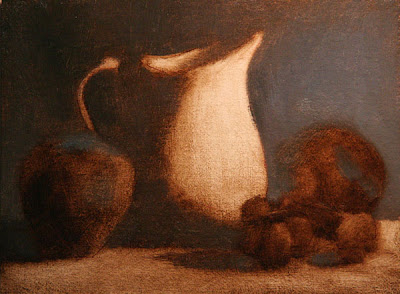
I described how I started this painting in a previous post. This is my first attempt applying all of the techniques in a single painting. But after a couple days I decided I had composed a painting with too many complicated elements and too-strong contrasting colors and values. I wanted to try something more subtle to practice the techniques, so I called this one "done" and moved on.

Trio: Two Pears and a Fig
8 x 10 inches, oil on panel

I spent 2 and 1/2 days on this painting. The photograph does not show all the subtle "tiling" I sweated over, but you get the general idea. Juliette encouraged me to slow down (apparently my Daily Painting practice has made me a "speed painter") and look very carefully at the transitions. She had me pay close attention to midtones, the subtle gradations between the darkest darks and lightest lights across the surface of the pears. I feel like I learned so much within this one small painting, and I am so excited to get back to my studio and try more.

Pitcher and Fruit, 6 x 8 inches
Unfinished

I started this painting as a last quick project today, the last day, but did not have time to finish it. But I like the composition a lot, so maybe I'll set it up at home and finish it.

These are the steps Juliette taught for creating a painting:

1. Draw the composition with pencil on paper
2. Transfer drawing to the canvas
3. Ink the major lines with an indelible fine point sharpie pen
4. Paint the whole canvas with raw umber, and "wipe out" to create a tonal underpainting
5. Let the underpainting dry
6. With full color, paint the background, ground plane, shadow side of objects, light side of objects, in that order
7. Apply color with small "tiles"
8. Paint the "least interesting" areas of the painting first - save the best for last

More various notes and tips from Juliette:
  • Practice mixing a color wheel with lots of beautiful, clean neutrals
  • Lay a note down for a color and leave it - don't over-mix.
  • Your palette tends to reflect the painting - mix the colors you will need
  • To "pump up" the light in a painting, focus on super-extending the halftones - don't focus on the darkest darks and lightest lights.
  • Look at Chardin
  • Look at Fantin Latour
  • A strong image will read well from a distance
  • Economy - solve problems using less (ie, solve an edge using a shift in color, instead of a shift in value)
  • Become rock-solid in a few simple things
  • Lump shadow shapes and light shapes, not individual objects
  • Try one bright color note in a mainly monochromatic painting
  • Copy master works, analyze for lines, arcs, value, color distribution
A few links:
Fletcher Palette
Picture Perfect Viewfinder