Saturday, December 30, 2006

Vase in Tissue SOLD

6 x 8 inches, oil on panel

Thanks everyone for your comments and emails, I am glad people are enjoying my process shots and notations about my materials.

Brushes:
I created this painting using round brushes, I started sketching with size #8 and spent the second half of the day with size #2. I also used a #14 filbert to smooth out the background.

I always paint with two brushes at a time of the same size and shape - well, I paint with one brush and hold the other in my left hand, with the palette. I switch back and forth between the brushes constantly, occasionally giving them both a good cleaning in my Silicoil jar of turps. One brush is reserved for lights, and one for darks, which helps me keep my brushes and colors clean.

Colors:
I tend to settle on 3 so-called "primaries" plus Titanium white, even if I start out with more colors laid out on my palette. Today I used: Cadmium Yellow Deep, Permanent Violet Medium, and Ultramarine Blue (all Rembrandt brand). I also used Sennelier brand Phthalo Green Cool, which helped capture the bright green light shining through the vase - better than Ultramarine & Cad yellow mixed together would have.

Process shots:

Phase 1

Phase 2

Phase 3

Phase 4

Phase 5 - Final Painting

Wednesday, December 27, 2006

Tissue Wrapping

8 x 8, oil on panel
I do realize the subject of this painting is somewhat obscured; as my husband pointed out, "I like it, but no one is going to know what it is." So, just so you know: This is a piece of tissue paper wrapped around a clementine fruit.

I was attracted to the subject for the dramatic feel of the twisted paper, like a frozen wave or cloud. A full value range of lights and darks and a full hue range of warm and cool colors are represented, presenting an interesting challenge to paint.

I'd like to do a series of large compositions over the next year, so maybe this will be a study for a larger and more refined painting.

Process shots:

Phase 1

Phase 2

Phase 3


Phase 4


Phase 5

Phase 6 - Final Painting

Wednesday, December 20, 2006

Maple Leaf in a Bottle SOLD

6 x 6, oil on panel
New Brushes
I had a great time playing with my new round brushes, I got a much more expressive stroke even with fine detail, and I was able to keep layering without carving away earlier colors. I think you can see the looser brushstrokes if you click for the larger picture. Why didn't I try rounds before?

I used only size 1 and 2 rounds for this painting and didn't fall back on my comfortable filberts, even though it takes longer to spread paint around the larger areas with the rounds. I'm glad I did, I like the effect.

New Colors
I'm really loving the cad red med (PR108) for it's saturation and transparency, no chalkiness when mixed with dark colors, and has a lovely stain when mixed with lighter colors (aka yellows). But I went back to my normal cad yellow medium (PY35), the new cad yellow light (PY154) I find frustratingly weak, although maybe it will be good for very subtle tinting like warm highlights. I like the new quinacridone rose too, but am finding I prefer my old permanent violet medium if I had to choose just one cool red/magenta.

Oh no.... strangely, both my cool reds have the exact same pigment code (PV19) marked on the back of the tube, and both tubes are Rembrandt brand, and yet Perm. Violet Medium is a dark cool purple and Quin. Rose is a brighter cool red. I really don't understand that. Something in the paint besides pigment is defining the color? This color thing is complicated.

New Lamp
I painted in daylight today, but photographed the work with the new lamp as the only lightsource and wow, I am really impressed with the color. I used a daylight white balance setting on the camera and then didn't have to do any color correcting at all once I got the digital image into Photoshop, the colors were right on. Also the sheer top-down angle really reduced the glare factor. So I can shoot right on my painting easel and dismantle my "photo-studio area". So that's made this lamp worth it's $88 price tag right there.

Tuesday, December 19, 2006

Victorian in San Francisco SOLD

5 x 7 inches, oil on panel

Yesterday I met my friend Lisa for a sketching date in a cafe. She works as a professional animator and often draws in cafes, so we both brought our sketchbooks to the Grove on Fillmore.

It's her favorite cafe but I'd never been, and I have to say, it's pretty much the ideal spot: Good food, cosy atmosphere, and waitstaff who serve and bus without making you feel like you should go; we occupied a choice window table for close to 4 hours.

So the sun shining through the windows of the building across the street caught my eye and I did a drawing of it. I just love how the late afternoon light shines in one set of windows and out the other.

I had a lot of fun with the sketch and thought the building would be fun to paint, so today I went back alone with my little oil kit paintbox and did an onsite color study (which I won't post here, it was terrible). I also took some photos and thanks to my new "daylight" lamp (see yesterday's post), I was able to continue working after dark.

Process shots will be uploaded soon, having technical difficulties with Blogger tonight!

Pencil sketch done yesterday, Dec 18

Painting Phase 1


Painting Phase 2

Painting Phase 3

Final Painting

Monday, December 18, 2006

Full Spectrum Lamp

This is my new lamp, it clamps to the top of my easel and has a flexible arm so I can move it around. I haven't actually painted with it and I'm not convinced it's true "natural daylight" as it claims, but the white light looks pretty good. I'll report back after I paint under it.

Edited to add: I found a whole chapter devoted to green on the handprint.com site - guess I'm not the only one who has problems with green!

NEW UPDATE -- April 6 2007
I am not very happy with this lamp after all. The light color is great, but the problem is the arm is too stiff. It attaches very securely to the easel, but it will not move where I want it to go. Very annoying. A few people have asked which lamp it is:
This is the lamp I have
This is the lamp I am thinking of buying

Leaf with Ring Box SOLD

5 x 7, oil on panel

It's done! I only needed two more hours on it, I could have finished it the day I started it if the sun didn't set so early. (See below for the process shots done a few days ago).

I decided some of the background brushstrokes were too busy & distracting so I smoothed it out a bit, and made the background cooler to contrast with the warm leaf. I also increased the value contrast by making darks darker and lights lighter, and I refined the top side of the leaf.

Click this picture to see an animation of the process:


I bought some new paint colors today from the recommended palette on handprint.com. I could immediately tell a satisfying difference in the reds: quinacridone rose (PV19) and cad. red medium (pr108) instead of my old alizarin and cad red deep seemed like more intense color out of the tube and remained saturated when mixed with other colors. There was a real "wow" feeling when I started playing with them.

The yellow (P154, called perm. yellow light in the Rembrandt line of paints) I didn't like so much- felt really "weak", like I had to use a LOT to make an effect and it seemed chalky when mixed with other colors - "reduced chroma" the handprint site would say. But I'll keep playing with it, and maybe try some other yellows he recommends. I also bought a new green (PG7) but I am scared of green... after having a primary palette theory drilled into my head in art school, I feel like I should mix my own green, but I'll try it. I need a whole lesson on using greens I think.

I also bought a full-spectrum light that clamps to the easel and shines on the canvas, if it works (although I'm doubtful) maybe I can continue painting after the sun goes down. And I bought several new round brushes - Kolinski brushes are my favorites. Looking forward to experimenting with my new toys this week.

Saturday, December 16, 2006

Leaf with Ring Box - Work in Progress

5 x 7, oil on panel, work in progress

Yesterday Nowell and I had lunch with our good friends Jaimee and Sean. Jaimee is about to have her first baby any minute now, and both our husbands are off work at the moment, so we took the opportunity to have a nice lunch all together on a weekday. We all enjoyed the good food and company, and the excitement and nervousness of a new baby coming; the feeling that everything is about to change.

It's been overcast all week, but yesterday was warm and sunny, so after lunch we walked their dog to a nearby park where I collected a handful of leaves to paint. This is one of the leaves.

I would like to work on this for another session so I'm not uploading it to eBay yet. My process shots are below:


I want to continue tomorrow or Monday because I want to try for more detail. Also, I have to work on colors more: The top of the leaf is supposed to be bright red while reflecting the cool white light, and I'm having a hard time making it look pale, cool red (pink?) while also contrasting sufficiently with the the warm underside.

I'm struggling with brush strokes these days. I've noticed that when the paint gets thick, each brushstroke from a Filbert shaped brush is shaped like a trough, with thick new paint on the outside edges of each stroke, but the center carving into the paint below. As light as I can touch the brush to the surface, I can't seem to stop this from happening. So I am going to try using Rounds soon.

I'm starting to wish I had a teacher to answer all my questions. Suggestions and tips from fellow painters would be welcome. What brush shapes do you use?

Handprint Color Theory

I just have to post about Handprint, a fascinating site about color theory.

This site, written over several years by Bruce MacEvoy, is a detailed description of his personal exploration of color along with his analysis (and debunking!) of the main traditional color theories. Each theory is described in detail and tested methodically. It's meant for watercolor but many of the philosophies seem applicable to oil paint.

Thursday, December 14, 2006

Tin Ring Box SOLD

6 x 6 inches, oil on panel
This is a tiny engraved box smaller than one inch across. Since the subject is small and monochromatic, and the painting itself is small, I expected to spend an hour or two on it. I ended up spending four hours!

My goal was to experiment with loose, interesting brushstrokes that also describe an accurate and precise form. I find ellipses to be one of the most challenging shapes to draw with accuracy. You can see from my process shots below how the shape wobbles and falls apart and comes back together at the end:

Phase 1
I started with a Raw Umber oil sketch on an acrylic toned panel.

Phase 2
I started fleshing out the basic forms with a gray-green I mixed from cadmium yellow, ultramarine blue, some magenta, and some white. It looks murky because I am trying to keep everything soft and indistinct while I work out the proportions and placement - not very pretty, but easier to change things if I need to.

Phase 3
This is the fun part - I start swirling in some details with a light green gray to finalize the drawing phase and establish the full range of values. The paint is not very thick and the the red panel beneath is still showing through, but the basic elements are all in place.


Phase 4
I find that almost every painting I do has a "crisis period", and here it is. I lose control and I get a little panicky trying to move it back towards the painting I see in my head. Here the painting has dissolved into wobbly ellipses and pasty shadows - the result of a dirty brush and losing the structure of the drawing while I focus on the details. How much prettier my process would be if I could just jump from Phase 3 to the final painting. But as much as I hate it, the "crisis phase" is always a learning experience.

Phase 5, final painting
Ok, I managed to pull the painting together to a place where I am happy with it and it stands as a finished piece. The ellipses are precise and convincing while the overall style is loose and dynamic. I lost some of the most expressive brushstrokes of Phase 3, so I still have to work on that, but it's been a good exercise for me. I compare this to my previous monochromatic still life, Vase and Creamer done just 7 weeks ago, and feel I have already learned a lot through my Daily Painting practice.

Wednesday, December 13, 2006

Mandarins in a Blue Bowl

Today I'm posting the finished product of a 3-day painting. Read up from the bottom of December 11 to see the painting evolve. You can also watch an animation of the painting.

9 x 12 inches, oil on 1" deep wood panel
For the final few hours of the painting I tinkered with the fruit. I ended up peeling another mandarin for the curl of peel; the one I was using before completely withered over the last couple days. The fruit in the bowl now have solid round forms, and all the colors are deep and saturated.

I also made some final refinements to the peeled fruit in the foreground. I added some contrasting light and darks, and I emphasize the orange glow of light shining through the single slice in front.

Phase 7
In this phase I concentrated on the background and the butcher block surface. I glazed the whole backdrop darker; the pattern detail I'd thought about including seemed distracting. I also decided the cutting board was too warm, so I completely repainted it in cooler colors and added more detail of the wood grain and knots. I think the cool color better captures the feeling of the winter light, and makes the orange fruit really pop. I also refined the bowl in this phase, adjusting the reflections and subtleties, and deepening the shadow, giving it a blue cast on the edges. I decided to remove the piece of rind to the right of the bowl as it was cluttering the composition.

Tuesday, December 12, 2006

Mandarins in a Blue Bowl - SESSION 2

Today is a continuation of the painting I began yesterday. It's not yet for sale, I'll probably finish tomorrow and post it on eBay tomorrow evening. Read up from the bottom of yesterday's post to see the painting evolve:

Phase 6
Here you can see I've been brightening up the colors of the fruit in the bowl. The challenging part of this is making the light side of the fruit distinct from the dark side, without making a sharp corner nor a muddy mess where they meet.

I worked on the blue bowl so it looks more like transparent glass and not like an opaque ceramic bowl. I also made it more symmetrical and fixed the ellipse of the edge so it is more accurate and convincing.

A few problems to work on tomorrow: The fruit in the foreground is more detailed now and looks very different from the style of the rest of the painting. Also, the actual orange peel is starting to dry out and the shape is changing. I soaked in it water for a while today to plump it back up, I hope I can get away with doing that another day. I also need to deepen the shadow cast on the ground by the bowl, it's actually quite dark in real life.


Phase 5
I worked for a while adjusting the size and shape of the fruit in the foreground, adding detail to the background, and suggesting the wood grain of the cutting board surface. At this point I realized that the colors were getting muddy - every new brushstroke mixes with the paint underneath so you don't get clean fresh colors if you push the paint around too much. You can see it's especially a problem on the dark side of the fruit in the bowl.

Monday, December 11, 2006

Mandarins in a Blue Bowl - SESSION 1

Today I am starting a slightly longer painting, I plan to work on it for a few days and describe my process and thinking along the way. At 9 x 12 inches it's a little larger than my recent daily paintings, and the finished piece will be a bit more detailed than the dailies. When the painting is complete I'll post it for sale on eBay, in the meantime I'll just be posting the in-progress photos here.

The painting is a picture of several mandarins in a blue glass bowl, with peeled and sectioned fruit scattered in the foreground. To see the painting process in order read from the bottom up:

Phase 4
In this phase I start to correct my mistakes - you can see I've adjusted the size of fruit in the bowl, and made the bowl itself wider and more shallow, for example.

When the major design problems are solved I start adding more colors and refining the details. I use smaller brushes, and start to make some edges defined and more precise. I make sure the darkest darks and the lightest lights are represented, as well as clean, accurate swatches of the major colors. If I'm not careful the painting will get "muddy" as it progresses, so early on I try to establish the full range of values and accurate colors.

As I paint I'm always thinking about what I will do next, there are always problems I am not sure how I will solve. For example, the hanging cloth background has an embroidered pattern and I don't know yet how much detail and contrast to include. I'm also wondering how to show that the peel to the right of the bowl is partly obscured by the shadow. Also, I noticed that the blue bowl is not truly symmetrical and the ellipse of the rim is inaccurate. So I have my work cut out for me. Check back tomorrow and see how I do!

Phase 3
This looks a lot more developed than the first step, but really I am just filling in some of the lighter tones and basic colors. Since I made most my drawing and composition decisions in the Raw Umber phase of the painting, this step is usually fast and satisfying. At this point I stop painting and spend time just looking back and forth between the painting and the still-life set up in front of me. I usually find I have made some errors I need to fix.


Phase 2
For the first step of the oil painting I use just one color, Raw Umber, to sketch out the composition with loose, rough brushstrokes. As the painting progresses I usually realize I made some mistakes at this stage, so I try to keep the edges soft and blurry so it's easy to adjust any errors of proportion.

Phase 1
I start by preparing my wood panel with white artists' primer paint called "gesso". When the gesso is dry I paint a layer of acrylic paint in Burnt Umber to tone the panel. When the acrylic layer is dry I am ready to start oil painting. I usually prepare 5-10 panels this way at a time so when I am ready to start a painting I have several sizes on hand to chose from.

The reason I start with a colored background is because the initial colors and values I put down are more accurate than they would be on a stark white background.

I prefer wood artists' panels to canvas because the support is firm (there is no "give"), and the paint slides around easily on the smooth surface compared to the textured surface of a canvas.

Friday, December 08, 2006

The Daily Painters

I am excited to report that starting tomorrow my new paintings will be included every day on dailypainters.com, a blog that displays new work by "Painting a Day" artists. I am so honored to be an official member of this group!

Mandarin Orange SOLD

5 x 7 inches, oil on panel

I was inspired to paint this because of how the light glows through the translucent orange slice.

I am all zenned-out after spending most the day working on this little painting. By contrast, when working outdoors I feel anxious and distracted: I have to work quickly to catch the ever-changing light; there's noise and activity all around; I'm usually uncomfortable and cold; and often I have passers-by peeking over my shoulder (which is actually kind of flattering and they are always nice, but I get performance anxiety!). I've also usually spent at least an hour lugging my paint box around looking for the perfect scene with a suitable spot to perch and paint it, stressing as the light fades moment by moment. It hardly seems worth it!

So I'm not sure I'm cut our for plein air (onsite/outdoor) painting, but I would like to practice more landscapes and cityscapes. It was drilled into me in art school to avoid working from photographs, but there is a very successful and highly talented Daily Painter who almost always works from photos. Her name is Karen Jurick and somehow she manages to make beautiful paintings from her own photos.

Wednesday, December 06, 2006

Pond Reflection

6 x 8 inches, oil on panel

Back at the Japanese Tea Garden: Yellow Ginkgo leaves float across the upside-down reflection of the surrounding trees. I love the diagonal sweep of light across the surface, the vertical points of reflected pine tree tops, and the sprinkle of floating leaves.

Tuesday, December 05, 2006

Autumn Trees

6 x 8 inches, oil on panel

I went back to the Japanese Tea Garden again today. I'm trying to take advantage this last spell of sunny, warm-ish days by painting outside as much as possible. I got very cold after sitting on a rock and painting all afternoon, but I took advantage of being in a tea garden and warmed up with a pot of jasmine.

Monday, December 04, 2006

Floating Leaves

5 x 7 inches, oil on panel

Today I spent the afternoon in Golden Gate Park's Japanese Tea Garden. I took 153 photos and was dazzled by how the design of the garden makes a beautiful composition appear from just about any angle.

I was too visually overwhelmed to choose a single view to paint, and after a while I just sat down in one spot and started noticing the small details of the fallen ginkgo leaves and Japanese maple leaves drifting by on the surface of a pond. I loved how the leaves looked as they floated on the surface and almost - but not quite - merged with the reflection of the trees and sky.

I spent a long time trying to figure out how we see that the floating debris is on a different plane than the reflection. I noticed that each leaf makes a dimple in the surface tension of the water, which creates a wobbly outline and makes the leaf "pop" visually. I tried to imitate this in my little Monet-inspired sketch.

Friday, December 01, 2006

Seashell and Bottle SOLD

5 x 7 inches, oil on panel

This is the same seashell I did in a more impressionistic style earlier this week. I decided to tackle it more directly this time and really attempt to capture the pearly reflective surface of the shell. Light and shadow define form, but when every surface on an object reflects light, I discovered that the form is very hard to describe. I enjoyed the challenge, though.

Thursday, November 30, 2006

San Francisco Ferry Building

6 x 8 inches, oil on panel

Today Nowell and I went to the Embarcadero waterfront area downtown here in San Francisco. Nowell experimented with his new HD video camera while I did this painting of the Ferry Building. It was very cold and as the sun sank lower the wind picked up, so by the time we packed up our equipment we were shrieking with the cold and forcing our numb fingers to work faster.

We dropped everything off in the car (where I balanced the wet painting on the dashboard) and managed to recover from the cold at the bar of the nearby Slanted Door restaurant with a snack of sherry and oysters.

Overall, a pretty satisfying day.

Wednesday, November 29, 2006

Cafe Centro SOLD

6 x 8 inches, oil on panel

Tuesday, November 28, 2006

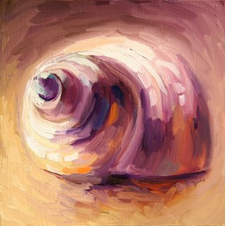
Seashell

6 x 6 inches, oil on panel

Monday, November 27, 2006

Alley in Tuscany SOLD

6 x 8 inches, oil on panel

It's nice to be painting again after a few days off! From now on I'll be doing a painting a day on weekdays.

This is one of the dozens of picturesque alleyways we admired while travelling in Italy earlier this year.