Friday, May 29, 2009

Bottle Collection: Overpainting III

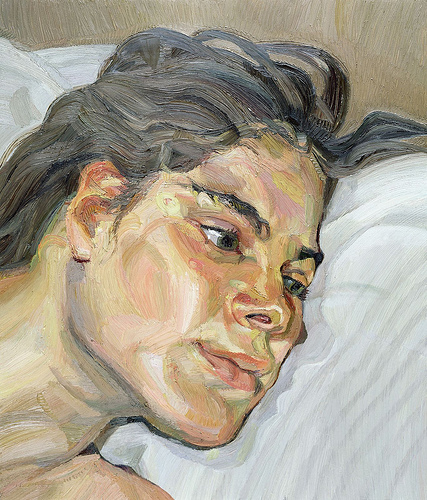
Cropped detail of larger painting
full size: 18 x 24 inches
oil on panel


Here are earlier stages of this section:

This first stage is the underpainting and you can still see the graphite line drawing showing through the thin wash underpainting:

Next I did a rough "closed" underpainting -using white instead of the white of the panel. It got more refined than this but still I consider it an underpainting, thinking only in value and using a very limited palette:

Below is the first stage of the overpainting, where I am using a full spectrum of colors, and no black at all, to get a richer, more colorful range of greys. Here I am making what I think of as a "bed layer" - much more refined than the underpainting, but nowhere near the final level of detail. I'm not trying to paint to a finish, I'm just putting down whatever I think will help me in the final stages.

On to the final layers. At this point I am trying to achieve the highest level of finish possible in a very small area of the painting for every session. At a certain point I can see what I need to do to push the realism further, but I have to wait for the layer to dry before I can do more layers:

Below I am working completely in glazes, using honey-consistency glazing medium with just dark, transparent paints, and occasionally bringing a light area just a bit higher. This looks pretty similar to the previous stage, but it represents many more hours of work. This is the final push for the most impact I am capable of achieving with the paint.
Lessons learned: I did my underpainting using a mixture of mars red and ultramarine, instead of my usual raw umber and ivory black, and I regret it. My intention was to make a more colorful, warm red underpainting to sort of "glow through" the very cool overpainting colors and create a subtle vibration. But what I am finding is that the underpainting is actually very, very violet, and I am having to mix enormous amounts of yellow into all the subsequent layers of paint. (Yellow being the compliment of violet or purple, therefore they cancel each other to a neutral). 

I am also continuing to learn how discerning the human eye is, that a tiny whisper of different value or hue between two adjoining shapes makes a clearly discernible edge. I am constantly experimenting with how subtle a difference I can make that will still read as a difference, and describe form. In the shadowy areas of the wax paper we can see a lot of sculpted form and transparency within a very low value range - dark to black, with just little glimmers for highlights.

It's fun to try to emulate that effect, nudging hues and values around in tiny steps to describe the forms.

Dust as always is the bane of my existence. I've taken to turning the painting backwards to tilt downards a bit and tenting it with plastic overnight. I also tent my entire brush and palette area with plastic overnight. I never wear sweaters or wool in the studio, and I never tear paper towels or cut cloth rags inside the studio. All of that has helped, but I still spend a period of every painting session cleaning my surface.

PS: I've made a post about all my mediums, paints and brushes, you can always find it in the materials link in the right column under Labels.

Saturday, May 16, 2009

Hudson River Fellowship

I've been accepted to this year's Hudson River Fellowship, 4 weeks studying landscape painting with Jacob Collins! So I'll be spending this July in upstate New York, trekking my pochade box around the Catskills. 

Tuesday, May 12, 2009

Bottle Collection: Overpainting II

detail in progress

It's always satisfying to bring at least a small area of the painting up to the highest degree of finish I can manage. Here are previous stages of this area of the larger painting:


I'm pretty happy with it at this stage, although for several painting sessions I was really struggling over the brightest areas of wax paper in front. It's always hardest for me to figure out how to paint an area with lots of bright highlights.

I've been thinking about highlights and why they are so difficult. They are not, as we are sometimes taught, simply the lightest areas. In fact, in order to paint convincing highlights, I find I have to paint the entire form without the highlights first. Highlights behave in a completely different way than the rest of the light. 

I think understand why: unlike other light effects, the highlights are reflections the way a mirror is a reflection. So light is not merely bouncing off the surface, but there is a depth to the highlight. It's actually hitting a different plane of vision, so we actually re-focus our eyes to see a highlight. 

Which is why it is so hard to paint highlights: we are trying to capture a stereoscopic effect. Our eyes can perceive depth in real life, but a painting is merely the illusion of depth. 

SHOW: Winged Victory at STUDIO Gallery

My drawing Winged Victory will be at Studio Gallery's "Body Work" show, May 13 to June 7.

I will be attending the last hour of the opening this Sunday, May 17, 2-6pm, hope to see you there!

Friday, April 24, 2009

Winged Victory

Winged Victory
(after a cast of the Hellenistic Greek Statue Victoire De Samothrace)
18 x 24 inches, cropped detail
white chalk and vine charcoal on blue laid Ingres paper

In 2003 I was amazed to find for sale a high quality 1/2 scale cast of the Winged Victory. She is my prized possession but somehow I rarely find time to sit and draw her. I finally got a chance and spent several days over the last couple weeks experimenting with chalk on toned paper.

I started with a pencil line drawing on white paper and transferred the major lines once I felt confident with the drawing. It was difficult to control details and values on the textured laid paper and I found it worked best to sharpen white chalk pencil and hard/medium vine charcoal to a very fine point with sandpaper.

I'll be teaching this Sunday and then Monday I'll be out of town for 10 days, so the blog will be quiet a while till I get home and get my studio work going again. I've been chipping away at the big still life, hoping to post another finished detail soon!

Wednesday, April 22, 2009

Teaching News

I currently have space for 1 more student in my upcoming weekly drawing class, held Sundays 1-5 at my San Francisco studio in the Cole Valley neighborhood. The course is 5 weeks and begins May 10, 2009. Email me for details at sadiej@gmail.com.

For more information about my classes, teaching philosophy, and about my experience and background, please visit my Teaching Page.

Thursday, April 16, 2009

SHOW: STUDIO Gallery, San Francisco

My painting Wax Paper II will be showing at Studio Gallery at 1815 Polk Street, San Francisco, from April 15th to May 10th.

I'm thrilled to be showing there again, last month's show was very successful and Wax Paper and Ribbon was sold!

It's a gorgeous solo show of landscapes by Bill Cone (my painting is included with a small collection in the back with other artists.)

Cone's paintings are incredible in their use of color, they remind me of my teacher Juliette Aristides' advice on color: "See if you can show an edge with a shift in color temperature instead of just a shift in value". He does it skillfully! Be sure and check out the show if you are in the Bay Area.

Opening Reception this Sunday, April 19, 2-6 pm.

Sunday, April 12, 2009

Bottle Collection: Overpainting


Finally getting to a high level of finish in one corner of the painting. Here are the previous stages of this area (it's about a 5 x 6 inch corner of a larger 18 x 24 inch painting):

detail, underpainting stage 2

detail, underpainting stage 1

I was taught to paint first the background, second the ground plane, third the shadow side of objects, and finally the light side, in that order. But I find that tackling a painting is sort of a psychological game, and I get bored and frustrated working on the background and ground plane for days before I get to the "good parts".

So I've developed my own method. I have found that I need to bring an exciting/challenging area up to the highest finish I can. That sort of sets the standard for the rest of the painting, and I have to bring everything else up to the same standard. It keeps me excited to work every day and makes it all seem like a fun challenge, and less like an impossible acreage to cover with my tiny brush.

I think every painter must have to develop their own way to approach a painting to stay engaged and motivated, and to avoid over thinking, or avoid just giving up out of frustration or intimidation. It's a psychological dilemma to solve every day in the studio.

I'd love to hear how you solve this. Or, if you are not a painter, how you keep yourself energized and excited for any challenging project? Do you do the fun parts first and crank out the boring bits at the end? Or do you save the best for last? Do you tackle the hardest things right away, or warm up with more manageable steps?

Thursday, April 09, 2009

Recent Figure Drawings

Shawnrey: 3 hour study
graphite pencil on buff canson paper
18 x 24 inches, detail

Claire: 3 hour study
graphite pencil on buff canson paper
18 x 24 inches, detail

I've been continuing my figure drawing studies and having a lot of fun with it. I've been drawing these last few weeks at Michael Markowitz's studio in Noe Valley. He has an amazing drawing studio in a classic San Francisco corner storefront, all set up with ropes and carpeted platforms for the model. All around the room are tiers of easels and tables for artists, with tons of lighting overhead. He auditions all his models before hiring them for a class, so far the ones I have worked with there are experienced, strong and professional. He runs several open drawing sessions a week, I believe he currently has space in Tuesday mornings and Thursday evening sessions. He posts his classes often on Craigslist>San Francisco>Artists
You can also email him for details: 23rdstreetstudio@gmail.com

Projekt30 Juried Show


I'm pleased to announce that my recent paintings have been accepted into the Projekt30 online juried show for the month of April. Projekt30 hosts a thirty-artist juried exhibition each month, as well as special theme exhibitions several times a year.

Wednesday, April 01, 2009

Art Renewal Center Salon FINALIST

I am thrilled to announce that my painting, Wax Paper II, is a Finalist in the International 2008/2009 Art Renewal Center Salon competition!

This competition attracts the finest realist painters in the world and I am so honored to have my work placed with the stunning group of 30 other Finalist paintings in the Still Life category.

> See my painting on the ARC page among the other finalists

> See the ARC Salon winners in all categories

> Read earlier blog posts about how I made this painting

Monday, March 30, 2009

Bottle Collection: Underpainting II

detail in progress

detail, previous stage

18 x 24, underpainting, work in progress

I've developed the underpainting for this painting more than any of my previous paintings. It's not much fun, because the results are not very satisfying. In fact, it's really ugly even after days and days of work on it! But I realized that if I spend more time on this stage, getting the basic values of each area very settled, the later stages go much faster.

My materials - paint, mediums, gesso, brushes


I've been getting some questions about what materials I use, so I thought I'd write a post about it so all my answers are in one place.

Brushes
I love love love Robert Simmons brushes. They are amazingly good quality and amazingly cheap. They are so cheap that when a brush loses it's springiness or it frays, I just toss it and grab a new brush. I use the 785 series white sable round, mostly sizes 4, 1, and 8/0. I also make my own smaller brush with an x-acto knife, by trimming off half the hairs of an 8/0 size brush.

Paints
Use good quality brands. Cheap oil paints are just less pigment and more oil, so you use more anyway. A tube of cheap paint actually feels lighter in the hand than the same color tube of a higher quality paint! I like Sennelier brand. I've never used Old Holland but I've heard those are the best and plan to try them out as I need to replace my tubes. I was taught by Kirstine Reiner to grind my own paints, which is really the best way to paint, and not as difficult as it might seem. I'm starting to be annoyed by the "graniness" of prepackaged paints, so maybe I'll get around to mixing my own again someday.

Palette
I use a small brown wooden handheld palette. I've tried white palettes, glass palettes, and huge oversized wooden handheld palettes, but I always go back to the little brown one. And I often clamp it to the easel just below my painting so I don't have to hold it.

Mediums
I mix my mediums in a clear, straight-edged jar, and I make a few evenly spaced marks up the side with a small sharpie for measuring by "parts".

Underpainting medium (for thin, transparent layers)
2 parts linseed oil
1 part turp

Painting medium (for heavier oil, later layers)
1 part linseed oil
1 part stand oil

Panels
Art Board

Gesso
I mix my own, but it's a big project, so for smaller/faster paintings I use a Art Board brand gesso.

Brush cleaner
Turpenoid Natural in the green can is great for cleaning brushes, I swish my brushes in it to clean them in a "Silicoil" jar. I like that it leaves the bristles pliable and conditioned and never dries them. I don't use Turpenoid Natural in my paints or mediums though, it seems to dry sticky and I'd be afraid of what that would do to a finished painting over time.

Thursday, March 26, 2009

Wrapped Pitcher: FINAL - SOLD

6 x 8 inches, oil on panel (SOLD)

It was really nice to focus on a small painting! Had a lot of fun with this, did it in about 8 half-day sessions in under 2 weeks. I didn't include a shot of every day of work... the last few days the changes are important, but are barely visible in a photograph.

Here are the stages:

Underpainting
Transparent paint, no white, pencil drawing still visible.


Opaque painting stage 1
Blocked in the major values with opaque paint -still thin, using underpainting medium.


Overpainting stage 2
The whole panel has at least one layer of overpainting, and I'm starting to refine the details in the upper right edge of wax paper. Using real medium now.


Overpainting stage 3
I decided all my shadows within the wax paper were too dark, so I lightened all the wax paper.

Final

Went back into the wax paper and refined all the details. I wanted to get an accurately wide spread of values within the wax paper but also show that the overall range of values in the wax paper is very light. Finding the steps between the brightest highlights and the next step down is always the hardest. Making the darks distinct from the lights, but not too dark, is always hard, too.

This painting and all others listed under "available work" are for sale. Please email me for a price list.

If you haven't yet, come on over and check out my new blog, Women Painting Women, it's a great collection of 59 amazing artists and counting!

Thursday, March 19, 2009

Bottle Collection: Underpainting I

18 x 24 inches, oil on panel
see the previous post about this painting

Before I began the underpainting I applied a thin layer of varnish to preserve the drawing but mostly to seal the thirsty, absorbent gesso ground. Wow, what a difference! Its is such a nicer surface to paint on, grabby but not too thirsty, silky but not too powdery. It made painting this layer much faster than usual.

A reader asked me recently what I use for the underpainting. My process always evolves, but today I used Mars Red, Ultramarine Blue, and a little touch of Titanium white. I used the palette knife first to mix up a nice batch of this combination, mixing in my underpainting medium (2p linseed, 1p turp) so I had a nice big puddle of paint on my palette with the correct consistency.

I tend to be against pre-mixing and I usually just dip my brush in whatever I need as I paint, and but it felt like a luxury to paint with a generous puddle and saved a lot of time, so I'll probably keep doing it.

A note about materials and process: I am not a precise, materials, craft-obsessed painter. I tend to hate recipes and I get impatient with complicated preparation. However, I am finding a strange thing happening. As I get more refined in my painting I am more sensitive to materials and I am getting more and more interested in craft. I'm not generally drawn to craft for craft's sake but good materials made of simple, high quality ingredients, prepared carefully, make a huge difference for painting.

I think it's possible to get distracted by materials and craft though, so the needs of the painting should drive the investigation of materials. Craftsmanship and materials should save time and make painting more enjoyable, not the reverse.

Wrapped Pitcher: Underpainting 2

6 x 8 inches, oil on panel

This is the "second under painting" layer, called a closed grisaille. I'm still working monochromatically, as with the previous layer of transparent underpainting, but I'm using opaque paint, meaning the light areas are white paint, not just rubbed through to the light panel ground.

I'm trying to set up a base layer that will help me when I am working on smaller details in the final stages. I want each large area to already have a defined value range, so I don't make the darks too dark and or the lights too light within a given area.

I'm also avoiding painting the lightest lights or darkest darks at this point because I want to reserve the option to punch a dark back,or pop a light out from this range of midtones.

Once this layer is dry I think I'm ready to move on to the fun part, the actual painting.

Blog updates

I've added a couple features to this blog: You can now Follow this blog by clicking the widget in the right column. It's a really helpful way for keeping up with all your blogs (and remembering to go back to the ones you like!).

You can also add me to your Facebook friend list with the badge in the right column.

I've also posted some painting to my new blog, Women Painting Women. I'd like for that blog to be collaborative, so if you have a suggestion for a painting to include please comment there or email me sadiej[at]gmail.com.

Thanks!

Wednesday, March 18, 2009

Bottle Collection: Preliminary Drawing

18 x 24, pencil on panel

I worked a lot more on the contour drawing, as you can see I'm having a lot of fun with all these waves and flourishes of wax paper.

I thought it might be interesting to show how I am cross-referencing movement curves, or pathways. The red lines are the obvious ones, the finger-like folds fanning out from the spiral-crushed center. What is exciting is to find the secondary lines of movement, the green lines. Together they make a meshed network, and you can find them running nearly any direction.

Wherever these curves intersect there is an "event", a significant landmark.

This approach really helps me plot and organize what at first seems like an overwhelming jumble. The network of pathways continues to subdivide in deeper and deeper complexity, so the deeper into the drawing, the easier everything starts to have a logical place. It always amazes me to see that even something "random" like crumpled paper has an internal logic.

One of the most important things I have learned about drawing is to not be afraid to change what I've put down before. I think it's common to draw a nice area and then realize it's in the wrong spot, and kind of "fudge" the drawing all around to keep the "good part".

What I have come to understand (and continue to try to understand) is that the overall logic is the most important thing, there is no "good part" of a drawing if the whole is not harmonious.

Thus I am ruthless with my eraser. Inevitably as I am drawing (and I think anyone who draws will relate!) I come to a point that doesn't "fit". I thought everything was right, but I get to a more detailed area and realize it's totally the wrong size and shape to fit all the detail that belongs there.

I've given up trying to preserve anything at all. If it's wrong, it's wrong, and I think in order to learn to be a truly accomplished draughtsperson we have to be willing to scrap all the previous work in order to improve the whole drawing. I did it many times for this drawing.

There must be a determination to really understand what is happening instead of preserving the pretty bits... anything less is merely the artist's ego dragging the drawing along to congratulate itself.

A drawing should only be a record of the artist's investigation of truth, and ego only obscures truth.

There you go, another life lesson from drawing.

Tuesday, March 17, 2009

Wrapped Pitcher: Underpainting

6 x 8 inches oil on panel

It's probably hard to see what the subject is at this early stage of under painting messiness, but it's my favorite little pewter pitcher wrapped up in wax paper.

I'm trying an experiment, so see if I can work on a series of small paintings while I also work on a large painting. My plan is to work most the day on the Big Painting, but reserve an hour or two to work on the smaller project, hopefully one that I can finish in a week.

I'm usually completely focused on one painting at a time, which I like because I go to bed thinking about it and wake up knowing what I'm going to start in the studio instead of dithering about What To Do. But at my current rate of output it will take me forever to get to my goal of 30 portfolio-standard pieces. So I'm hoping I can speed up and start cranking out more than one painting every month or two.

On another note, I've started a new blog devoted to contemporary Women Painting Women. If you have any suggestions for work to include there please email me! sadiej[at]gmail.com

Drawing Vessels

I'm working out a composition for a new painting on trace paper, and the new setup has several bottles and vases. I thought I'd share how I draw manufactured, symmetrical objects, since they can be tricky.

The least successful approach (as I have found out the hard way) is to try to draw a curvy contour and then try to match it exactly on the other side.

Instead, I start with vertical lines marking the center line, and the edges of the widest point and the edges of the width of the neck. Then I sketch a series of diamonds to mark the outermost contours. I also draw a lot of X's to see the relationships between the neck, body and shoulders of the vessel. Finally, I draw the ovals, circles, and rectangles that make up the compound shape.

Only after that, I refine the contour. I try to be as precise as possible. Often there is a "lost edge" where the contour of the form recedes into shadow or is obscured by another shape. But I draw the entire vessel symmetrically even if part will eventually be hidden.

Finally I check it by looking at the drawing over my shoulder with a mirror. Errors of symmetry will jump out immediately when seen in reverse.

If the vessel in the final paintings is even slightly wobbly, crooked, leaning, or asymmetrical it will weaken the believability of the whole painting.

My new painting has two vases and three jars in the composition, and huge frothy waves of wax paper. It's my most ambitions still life yet, and the largest at 18 x 24 inches. I've spent several days sketching and re-sketching the composition on trace paper, and today I transferred the final drawing to the panel. I'll post some photos soon when I am a bit further along, but here's a sneak preview:

Friday, March 13, 2009

Sotheby's "Women" Show

Apparently Sotheby's is putting together a show of art that depicts women as subjects. I thought I'd collect the highlighted images they've listed so far in the press release blurb:

Edvard Munch's Madonna (1895–97),
Picasso's Le Repos (1932),
Warhol's Turquoise Marilyn (1964),
Lucian Freud's Portrait of Rose (1978–79), (can't find this one, but here's Esther)
Richard Prince's Spiritual America (1983), featuring a rephotographed nude, prepubescent Brooke Shields.

Woman as virgin, muse, child. Seems like the theme here (so far) is the tension between available/unavailable -- desire and the inability to fulfill that desire. But could we say that applies to all depictions of women in art?

The show is called "Women". I'm curious to find out if there are any woman artists, or if women are only the subjects.

What do you think about a show that uses "women" as a subject? Is it a great way to collect some star artworks under a common theme, or is it celebration of the traditional objectification of women in art? If it is both, does the second detract form the first?

Tangentially, what about shows of women artists - which is what I thought the show would be before I read the press release. Should women be grouped together (and separated from men) as artists?

Tuesday, March 10, 2009

Book Report: "Guido Reni" by Pepper

Guido Reni
A Complete Catalogue of his Works
with an Introductory Text
by D Stephen Pepper

My husband found a mint copy of this out of print book and gave it to me for Christmas. I am so thrilled to own it! 228 reproductions including 16 color plates. The introductory essay, a biography of Reni's life and discussion of his intentions as a painter, illuminates the role of painting in the early 17th century.

I had always been taught to admire Caravaggio above all others of this era for his earthiness and "realism", and that it was due to the limitations of the times that his paintings were considered scandalous for his depictions of dirty feet, dead corpses and shadowed figures. But this essay by Pepper helped me understand the reaction to his paintings in the light of the times.

In the early 17th century there was an inherent tension between the concepts of heaven and earth, as neither was thought to be any less real than the other. The duty of painting was to be a visual philosophy, depicting ideas above all else. And so the way drapery and figures were treated in painting were at the time a visual discourse on ideas about the nature and order of the universe. Painting itself was seen as powerful enough to actually transform the soul of the person viewing it, so the job of the painter was nothing less than to elevate the souls of his viewers.

Caravaggio's work was scandalous not for the technique, but for the ideas. Instead of making paintings that elevate and educate, Caravaggio did not show the tension between planes of experience. To him a dead figure should be painted to appear truly dead in every way (appealing in our own era, but not the goal of the times). To do this was seen as denying the possibility of resurrection, denying redemption itself. So his paintings were not simply "too gritty" for the times, but were seen as lacking the ability to inspire.

As for Reni, seen in this light, I've developed an even greater appreciation for his paintings. His depiction of the human body is profoundly insightful, and his ability to show strength, vigor, weight and action while also showing effortless divinity gives his paintings a singing tension. He was described in his time as having a "mortal hand painting celestial vision".

For example, his treatment of drapery, structural but also flowing, was recognized and admired by his contemporaries, and apparently Bernini himself admired Reni's drapery before he sculpted probably the most striking garment in art history, the robes of St Theresa.

Reni studied in his youth with the Carraci, the artist brothers who founded a painting school in Bologna that emphasized studying from life and seeking beauty through naturalism. They rejected the non-naturalistic Mannerism and saw Raphael as their master, as he used knowledge of nature as a means for expressing ideas. Although Reni left the school, he was consistent with these ideas throughout his life.

After reading Pepper's introduction I am even more inspired by Reni's paintings. His deep and thorough knowledge of form allows him to elegantly describe complex tension and balance. He shows how earthly form can be an expression of the divine.

The act of observation can sometimes allow us to touch a plane of experience beyond what is perceivable by our five physical senses. In that sense, it is conceivable that a painting can "touch the soul". Certainly Reni's do.

Wednesday, March 04, 2009

Oil Studies: Onion, Plum, and Cup

White Sprouted Onion SOLD
oil on panel
5 x 7 inches

I decided to try something I haven't done in a while: a small, fast painting! I enjoyed it so much I did a couple more.

Silver Cup
oil on panel
6 x 6 inches

Plum SOLD
oil on panel
5 x 7 inches

All three of these are for sale for $150 each plus shipping. The first person to email me with the one they want gets it.

Tuesday, March 03, 2009

Antique Bottle: FINAL

Antique Bottle with Wax Paper SOLD
8 x 10 inches
oil on panel

Contour drawing, pencil on panel

Underpainting
Transparent raw umber and ivory black, using the white of the panel for light areas


Overpainting Stage I