Wednesday, April 30, 2008

Studio Escalier Workshop Day 8

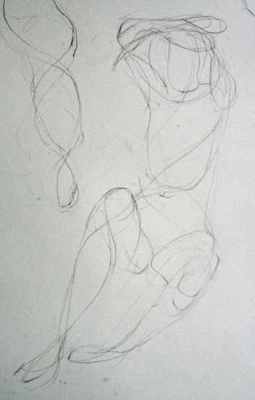
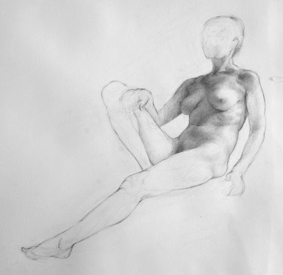
tonal study, pencil on paper, 6 hours

(detail of above)

Day 8 of my workshop at Studio Escalier in Paris.

This is a drawing of a 6-hour pose. Yesterday for the first half I focused on the inner movement curves, the block-in, and finally the detailed contour. Tim and Michelle are teaching us to think of the contour three-dimensionally. So I am thinking of the contour wrapping around the body, moving towards and away from me.

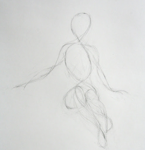
I've taken my drawing into Adobe Illustrator and used the software to recreated my original inner movement curves to diagram the process I am learning:
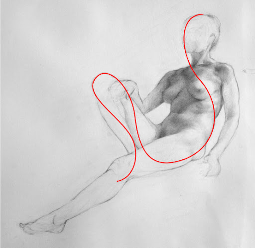
As Tim teaches the technique, we draw three interrelated movements:

We start with the theme, which is the fundamental inner movement curve. The theme starts at the crown of the head, and flows down the center line of the face, down to the big toe of the standing leg, or the leg holding the most weight.

This is a precise curve, it describes specific points on the body and the relationships between these points. (In contrast to simply "expressing" the movement. This is a record of what we see and know about the body, it's not exaggeration or expressionism.)
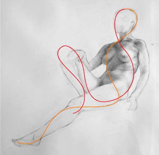
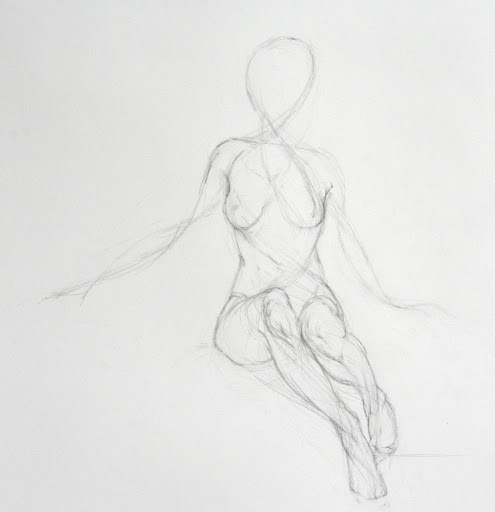
The second line we draw (above) is the countertheme - the orange line. It's a secondary inner movement curve that travels from the top of the head, wrapping around the body the opposite direction and down the non-standing leg.
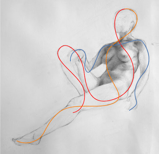

Third, we draw the ornament (above). This is the third interrelated movement. As with the theme and countertheme, the ornament wraps around the forms, moving side to side and back to front.

All of the curves wrap around the body three dimensionally. Above is the same countertheme curve, but I've created dotted segments to show where I am imagining it wrapping around the back side of the form. (I do not modify the figure to fit these curves, it's amazing the interrelations it's possible to see once you start looking this way.)
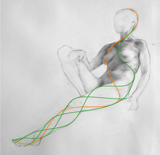
Above I've shown how adding more and more interrelated movement curves begins to describe the form. As I get more and more detailed with my contour line, I can see how every form on the body follows this wrapping helix pattern.

It's interesting to recreate the curves in Adobe Illustrator. The program creates Bezier curves that have a certain mathematical tensile force, and you have to learn to manipulate them to create flowing curves without awkward bends. The behavior of of Bezier curves is amazingly conducive to the Inner Movement Curves - it was shockingly easy to recreate the curves with the software. I have a feeling there is an implicit relationship between the cohesive, efficient, and functional forms of the body and mathematical curves.

Update added 5/03/08
Bezier was a 20th century French draftsman! Wikipedia has a great entry on Bezier curves, and near the bottom of the page you can see elegant animations for how Bezier curves are calculated.

After spending so much time on the contour, I moved on to the tonal value shading. I was surprised how quickly the value study progressed. I think learning the contour with this method gives me a deep understanding of the three dimensional figure, so flowing the light across the form is easier.

I'll end with a quote from Tim:

"I think the idea of theme, countertheme and ornament has the power to revolutionize the way you think about the figurative subject, to really marry your eye to your gut to your mind to your hand, and liberate your imagination."

I agree.
Wednesday, April 23, 2008

Studio Escalier - Drawing Movement

Afternoon Pose, pencil on paper

I'm practicing drawings based on the "inner movement curve" method in my class at Studio Escalier, and today I really felt something click.

This drawing feels more solid, more believable than my previous drawings. I feel like I am suddenly seeing the relationships between all the parts as a whole, and feeling the three dimensionality of the pose. It has everything to do with what I studied with Ted Seth Jacobs, but Tim Stotz's emphasis on movement is making Ted's teachings come together for me. (Tim was a student of Ted's, so no wonder).

The drawing above started with this drawing of the interior lines of movement:

Afternoon Pose, Phase I

The first gesture lines aren't much to look at. In fact they look somewhat random and loosey-goosey. But it's actually quite precise. They correspond to very specific points I see on the body - and more importantly, the relationship between those points.

Next I started fleshing out the drawing, starting with the legs and drawing more and more inner movement curves to create the full line drawing. The outside curve of the knee has everything to do with the interior angle of the ankle. Everything wraps around and appears again in a logical place.

Afternoon Pose, Phase II

Once I started seeing all the relationships it became like a treasure hunt to find more. They are everywhere, all the way out to the fingertips and I am sure down to the tiniest tissue structures.

Afternoon Pose, Phase III, final

In contrast, this is the drawing I did in the morning, when I was really struggling with the concept. I think you can see it does not have the same energy as the afternoon drawing.

Morning Pose

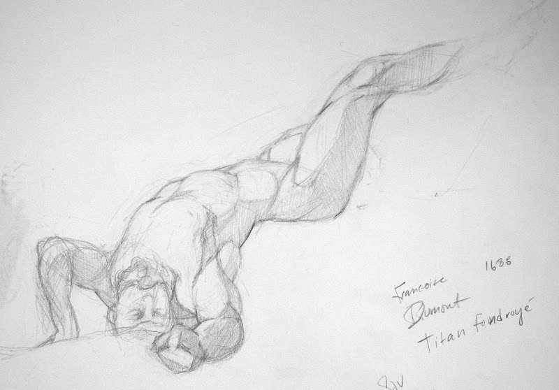
Studio Escalier has arranged several evenings for us to draw at the Louvre from the sculpture gallery. Tonight was the first night, and it was incredibly exciting to see all the sculptures so powerfully describing the same concepts we have been studying.

This is my drawing of a 30-inch marble sculpture by Dumont, done in 1712. It was in a room full of similar small-scale sculptures, which Tim explained were the final thesis projects which students of the 18th century French sculpture academy had to submit in order to graduate and go on to be professional sculptors. These small works represent the pinnacle of the art of figurative sculpture.

The figure has a clenched fist thrust directly at me... I don't know why I choose such a difficult view. But it made me interested to do more hand studies.

By the way, the Louvre website is amazing. I just found out you can browse the entire collection, room by room. I found the room we were drawing in today here.

Photos of the Louvre Pyramid

Tuesday, April 22, 2008

Studio Escalier Drawing Workshop

Pencil on paper, 2 hours

Pencil on paper, 5 minutes

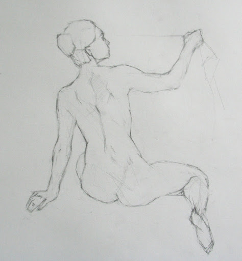
These are a couple of my first drawings done at Studio Escalier in Paris this week.

Tim Stotz has us focusing on "inner movement curves" to establish the proportions, instead of using the straight-line block in. Also, we are doing 5-minute to 2-hour drawings. Both are very foreign to me after a year if doing 20-40-hour block-in drawings. But it's a good approach for me to practice and I'm enjoying a more responsive and less analytical way to draw.

Paris Photos


Friday, April 18, 2008

Paris! A tale of ethernet cables and "veau"....

I arrived yesterday and until a few hours ago it was mostly tedious and boring, dealing with getting a functioning local cellphone and accessing the internet in my apartment which both required trips to several locations in the city to buy wires (NEVER travel without an ethernet cable!!!) and special parts to make the phone work. I learned that the French word for ethernet cord is......... "ethernet cord". On the plus side, it gave me many opportunities to parle en francaise with the natives, and everyone replies to me in French, so even though I never learned any grammar and have forgotten what miserable shreds of tense conjugation I once had, I think I am successfully speaking French.

There were a few brief moments last night and today when I felt like I was in Paris - crossing the Seine over an uplit bridge as I walked home after dark last night, catching my first glimpse of that special tower which holds rank as the world's favorite keychain fob. But mainly it's been a maze of hunting down the closest Monoprix grocery store and returning to my apartment to repeatedly enter a 30-digit passcode into what I have come to believe is an imaginary "wireless" connection. Thus the cord.

But eventually I got myself trussed safely back into the various virtual networks I need to feel sane (and connected to my painfully far away husband) and finally I was able to relax and start feeling the Paris vibe.

And now I'd like to sing the praises of Monoprix.... a store that is the prettiest, most compact and city-fied Walmart you'll every see. I bought a travel sewing kit, asparagus, kelloggs brand cereal, a grid-ruled notebook, proscuitto, and a polka dot scarf, among other things. If I were so inclined I also could have bought baby girl dresses, plastic picnic ware, a sack of croissants, and the entire Neutrogena line of skin care products. I restrained myself, at least for now.

When the groceries were put away in my microscopic fridge I went to a cafe around the corner for dinner and and despite the goofy dancing tomato logo on the awning the food was divine: I had "veau" which I need to look up because I don't even know what kind of meat I was eating, but it was sooo good, tender meat on a t-bone with a creamy sauce. Had that along with a carafe du vin bordeaux and finished it all off with mousse au chocolat which unexpectedly had little chips all over the top which at first I thought were chopped nuts but turned out to TOFFEE and wow... if there is ever a proper topping for chocolate mousse it is little bits of toffee.

So, now I feel like I am here :)

Oh, and the apartment I rented is just lovely - artsy and quirky as only the french can manage, the owner has decorated with tiny antique chests and huge gold-framed mirrors paired with modern reflective tile in the bathroom and kitchen, with pickled white hardwood floors throughout. Very cute, very eclectic. Buddahs and framed oil paintings and weird little lamps on doilies abound. And a tiny 6-inch window above the bed, just big enough to crack open and let in a tiny whiff of damp Paris nighttime air, the best air on the planet in my humble opinion.

Sunday, April 13, 2008

Belgrave Ave Plein Air SOLD

oil on panel 5 x 7 inches

Today my friend Janell and I set up for side-by-side plein air painting. We painted in the neighborhood up the hill from my house, called Ashbury Heights. This yellow house sits on a sharp corner, where one fork of the street goes downhill and one goes uphill. My favorite part of the composition is the shadow the streetlamp cast on the pavement.

The weather here was amazing today, almost 80 degrees and clear skies, which is very unusual for us this time of year. Unfortunately, the 10-day weather.com report for Paris predicts clouds, showers and high-50's there for the foreseeable future. So my plein air painting opportunities may be limited!

Friday, April 11, 2008

Michael Grimaldi: Final Notes

I've already summarized the workshop with Michael Grimaldi, but I also wanted to record some of my notes from the class:

Artists Referenced

The New Objectivists
Menzel, Kollowitz - responses to the breaking down of Victorian society because of WWI and the sinking of the Titanic. In these extreme situations, codes of chivalry and honor were broken and violated the previous conception of human dignity.

Ernest Meissonier
Successful artist of the late 19th century. Fell out of favor because his paintings came to represent something people no longer believed in.

Edwin Dickenson

Jules Bastien-Lepage

Gerard Richter

Antonio Lopez Garcia

Ann Gale

We talked about the current exhibit on view at Hacket Freedman here in San Francisco. I asked for Michael's interpretation for how it's possible to see such amazing drawing ability in Ann Gale's work when it's impossible to see any edges - all the shapes are dissolved, so I can't understand how I can feel so moved by the drawing. What is drawing without edges and shape, especially when her values and hues are so compressed? Michael feels that it's because her proportion of masses are so accurate - for example the way the hands fall in the lap of a figure so convincingly. He says her precision of drawing is like Sargent, where the actual strokes seem abstract but our brains complete even the edges that aren't delineated.

Book Recommendation
The Practice and Science of Drawing by Harold Speed


On Painting
Paint large to small, dark to light. Painting is stacking smaller and smaller and lighter and lighter shapes. Capture variations of hue, value and chroma, faceting as we move across the form.

Start in 2 dimensions - block in the color with faceted patches of paint like we block in the drawing. Slowly transition into 3 dimensional form.

Anything we know use to confirm what we see.

All of our decisions are optical i.e., paint what you see, not what you think you know. However, we can't paint what we don't know to look for.

Even when focusing on one particular area, don't zone in, look at everything.

"You don't finish a painting, a painting finishes you."

(As always, these are my interpretations of Michael's words, and I can't say if he would agree with everything as I have written it here.)

Michael Grimaldi Workshop: "Curiosity"

Melissa Phase III
11 x 14
Oil on panel
Final painting

Melissa Phase III
11 x 14
Oil on panel
Color underpainting continued


Melissa Phase II
11 x 14
Oil on panel
Color underpainting

Melissa Phase I
11 x 14
Oil on panel
Graphic composition in neutral values

Today was the last day of my two-week workshop with Michael Grimaldi. I learned so much, even though after the long workshops with Ted it felt incredibly rushed to study for just two weeks. Watching Michael's demonstrations and talking with him about art made for an amazing experience.

Michael's favorite word is "curiosity". He feels an artist must be truly curious to evolve, and must be interested enough to pursue ideas, technique and personal expression in whatever direction moves us. He has no adherence to "the way to paint" and encourages students to develop their own methods. He references artists and art movements and films and philosophers constantly.

I am not very happy with my final painting. Today, the last day, I was rushing to complete the "final pass" of the painting, and to my dismay I find after looking at the photos of the stages that I like earlier versions better. But Michael's process and technique are with me, and I'm looking forward to doing a series of painting this summer to try to get better at the technique.

Next Tuesday I fly to London, and Thursday I take the Chunnel to Paris! I'll have my laptop and will be bloggiing while I study with Studio Escalier, so stay tuned. (Please sign up for my RSS feed or email notifications in the upper right column on this page to be notified when I update my blog.)

At Studio Escalier we will be working in the historic studio of the Romantic painter Gericault. When I was a student in Paris in 1992, I had a free pass to the major art museums of Paris (that's France for you - "les etudients des beaux arts" are allowed in museums for FREE!). So I would jump off the bus on my way home outside the Louvre, cut the long line of tourists, and go straight to my favorite paintings whenever I wanted. Gericault's Raft of the Medusa was one of my favorites, and I often went to the Louvre just to see it.

If I could have known that 15 years later I would be returning to Paris to study figure drawing in Gericault's very own studio I would not have believed it.

Wednesday, April 02, 2008

Michael Grimaldi Workshop: "Tight"

11 x 14
charcoal on gessoed panel

With the method Grimaldi is teaching us, this block-in line drawing is done in vine charcoal directly on the canvas panel, based on the thumbnails we composed yesterday. Eventually we'll do the final painting directly over our charcoal line drawing.

My favorite Grimaldi quote so far:
"The goal is to be tight, that's what we're going for. What we are not going for is to be uptight."

I really like that. Made me think a lot about that word, "tight".

"Tight" was the worst thing you could call an artist or a piece of art in my art school. "Don't be tight" and "loosen up" were the phrases drilled into us, and then we drilled them into each other. If you really hated someone's artwork, you'd say they were "too tight"; it was the most cutting critique.

It's interesting to now be part of an art world where it's ok to be "tight". The idea is that by practicing being precise and highly controlled, you learn to see the most subtle variations of value, color, form and proportion with a high degree of sensitivity - and you can always loosen up later. But the horror story repeated over and over back in my art school days was that if you practiced being tight you risked being unable to ever loosen up again. It reminds me of what mothers tell their children: "Don't make that face or it might get stuck like that."

I still don't know where I stand on it. I love seeing the expressive hand of the artist, the juicy brushstrokes and scritchy scribbles. I also love refined sensitivity and precision. I like to think there can be a happy marriage of the two. Tight but not uptight.

Tuesday, April 01, 2008

Michael Grimaldi: Portrait Painting Workshop

Portrait Study
charcoal and graphite on paper

about 4 x 4 inches


Two years ago, in Summer 2006, I set up an art studio in my loft, hired a series of models for a few weeks and started figure painting after nearly a decade away from art.

I was totally out of touch with the art world, and so I started poking around on the internet to see if any US galleries were showing figurative/realist work.

I immediately found Arcadia gallery in New York and was inspired, intimidated, and fascinated by the amazing work I found there. The painting "Nude with Tattoo" by Michael Grimaldi in particular stood out to me, and so I Googled his name to find out more about the artist.

One of the first search results was for a workshop Grimaldi had taught right here in my own back yard at Bay Area Classical Artist Atelier... but I had just missed his workshop by a few weeks! The BACAA web site said Grimaldi wouldn't be returning until 2008, so I had nearly two years to wait for his return.

In the meantime I looked around the BACAA web site and was amazed by all the incredible artists teaching there. So I signed up for a March 2007 workshop taught by Juliette Aristides, and began a new era of my art life. (You can read my blog post about that workshop with Juliette here.) I have since spent the last 14 months taking workshops with Juliette, Dan Thompson, and Ted Seth Jacobs.

Now, this week, the Michael Grimaldi 2008 workshop I have waited so long for has begun! The class is portrait painting, and we are starting with small thumbnail sketches to work out the composition and design of the final painting. Tomorrow I'll start blocking out the design and major proportions on my canvas. (The above sketches are charcoal on paper, each just a few inches.)

FRANCE
Two weeks from today I fly to France for a 3 week workshop at Studio Escalier. After the class Nowell is joining me and we'll spend another 3 weeks just hanging out in Paris. I'll be bringing my new pochade box, so watch for upcoming plein air oil sketches of Paris!

JULIETTE'S BOOK: CLASSICAL PAINTING ATELIER
Juliette Aristides' new book, Classical Painting Atelier has just been released and I just received my pre-ordered copy from Amazon today! I plan to spend the next couple hours poring over it before bed. From a quick peek it looks like a gorgeous follow-up to her first book, Classical Drawing Atelier. These are incredibly inspiring books, with beautiful reproductions by both classical and contemporary realist artists. I highly recommend them both for any art lover.

Wednesday, March 26, 2008

Rolling Hills of Marin County SOLD

5 x 7 inches SOLD
oil on panel

5 x 7 inches SOLD
oil on panel

I took a lovely daytrip up to Marin County (just north of San Francisco) for a drawing/painting date with my friend Kat. Kat took me to China Camp State Park where a short walk up a dirt path opened up to views of gorgeous rolling hills and eucalyptus trees.

I had a great day - it's rare that I make two paintings I am happy with in one day.

I have been having so much fun investigating all the "greens" of nature. I am discovering there is not much true green at all. Everything is fundamentally a cool blue or a warm brown, and only tinged slightly green. A little green goes a long way. I think every beginning landscape painter knows that horrible feeling when you try to emulate all the lovely grass and trees with vibrant greens and yellows right from the tube and YUCK, it just doesn't look right.

I've been using mainly cobalt blue, cad light green, mars red (which is a lovely rich red brown) and raw sienna (which acts like a brown-ey yellow ochre, I like it better than ochre). And a lot of titanium white.

These seem to act like perfect mixing primaries, especially for outdoors. The Mars red is red enough act as a compliment to the greens (so if a puddle of paint is too green, I mix in a tiny dab of Mars red to cancel the color and make it more neutral). The burnt sienna acts like a dark yellow and helps warm up my greens if I need to paint some sunlight areas (cad green with some burnt sienna with a ton of white). The cobalt blue and the sienna make a lovely dark shadow, and if I then add white I can get a nice subtle neutral gray, warm or cool depending on the ratio of blue to brown.

These are my main colors, but I also mix in a little magenta and ultramarine blue for the coolest and darkest violet shadows.

Tuesday, March 25, 2008

Fog City

5 x 7 inches
oil on panel

Today San Francisco was in signature form : Bright white fog alternating with deep blue sky, with a brisk wind to push it as fast as possible over our pastel-painted city. This is my attempt to capture it.

I am also working on a more ambitious landscape in the mornings of slanted shadows on a tree-lined path. It's taking me several sessions to capture it all but I'll post it soon.

Workshops and teachers are valuable, but really nothing beats painting and drawing every single day. I have learned so much in the last couple weeks of painting every day. I dream every night about brush strokes and the feel of a brush dragging paint. There really is nothing like paint.

Sunday, March 23, 2008

Easter at Buena Vista Park

5 x 7 inches
oil on panel

I had a wonderful Easter morning painting these trees on the hilltop park of Buena Vista. There's a narrow sidewalk wrapping around the curved border of the park with a view of the city beyond and trees reaching out from the park overhead. If you look closely you can see the faint view of St Ignatius in the background.

I realized today painting for me comes down to just two things: Paint what I love to see, and look closely. Love and Look, essentially. When I am distracted by all the voices of my teachers in my head, when I am trying (and failing) to emulate painters I admire, when I am trying to paint like someone else instead of like myself, the painting fails (and I have no fun). But when I relax and just enjoy what I am looking at, the painting flows easily.

I have painted outdoors most days of the last two weeks. I wake up in the morning thinking about paint before I open my eyes. And when I do open my eyes, the first thing I do is look at the window to see the quality of the light. And then I jump out of bed and rush through my morning routine to get outside as soon as possible, while the shadows are still long and interesting.

Saturday, March 22, 2008

View of St Ignatius SOLD

5 x 7 inches
oil on panel

After the first part of the day spent painting at Corona Heights Park (see previous post), I went to another location to paint the late afternoon slanting through the streets of my neighborhood and lighting up St Ignatius in the distance.

5 x 7 inches
oil on panel

The second painting was an experiment in making a more abstract image, just trying to get the colors and values and feeling of the view.

My husband took another picture of me painting. It was 65 degrees F at noon today and most people were in summer clothes, but when I stand still in the shade as the sun sets and the wind picks up I have to dress like I am in much colder part of the world. I'm seriously considering buying fingerless gloves.

Corona Heights Park


5 x 7 inches
oil on panel

These are the rocks at the peak of Corona Heights Park. I used flat brushes to paint this which I think helped established the planes of he rock.

It was a beautiful day but the wind picked up in the afternoon. I used a new shade umbrella that attaches to my easel for the first time, and I thought I might get blown off the hill! My husband was with me and took this photo of me painting. The view of San Francisco from the hill is amazing. Maybe next time I'll try and paint it.

Friday, March 21, 2008

Carl Street Vistas

Crepes on Cole SOLD
oil on panel
5 x 7 inches


Train Tunnel Color Study
oil on panel

5 x 7 inches


Sunset on Carl St
oil on panel

5 x 7 inches


Today I did all these studies while set up on one stretch of sidewalk. Just as I was done and packed up the sun started to set and I unpacked everything for one final sketch.

I'm so excited about my new plein air / open air pant box! I posted a picture below (you can see part of the train tunnel just to the right). It's perfect: there are compartments for my paints, my palette, my brush cleaner and even wet paintings. As you can see I hang my brushes off the side in my own adaptation. I love my "pochade" box so much, I just ordered a second tiny one, the little "Thumb Box" to bring to Paris with me. (I leave for Paris in less than a month!). I bought my wonderful "pochade" boxes at www.pochade.com.

Thursday, March 20, 2008

Buena Vista Park

Buena Vista Park Tree Study
oil on panel

5 x 7 inches

It was a gorgeous spring day in San Francisco, but standing still in the shade, on top of a hilltop park in the wind, I got pretty frozen after a couple hours. When I finally packed up my fingers were almost too numb to manipulate the latches on my easel. But it was worth it, I think this is the best landscape I've ever done.

Sunday, March 16, 2008

Prettiest Laundry in San Francisco SOLD

Laundry at Cole and Grattan Streets II
oil on panel
9 x 12 inches

Laundry at Cole and Grattan Streets I
oil on panel
9 x 12 inches

I adore this coin-op laundry. It's in a fabulous old Edwardian building, and the interior is painted an amazing turquoise that just sings. It's most incredible at dusk, when the sky is still a light indigo and the artificial lights inside make the windows glow aqua. I hope someday I am fast enough to capture this corner as the sun goes down.

As for daylight painting: I spent four mornings this week painting this corner - two mornings per painting. Enough time to meet and say hi to every dog, child, and art-friendly person in the neighborhood. Have I mentioned I love my neighborhood?

These are two very different paintings. The bottom one I did first, but after a while realized I saw a much more dramatic and interesting image in my head. So I started over and did the second painting (the top one) which I think is much more successful in terms of composition and color. I'd still like to try even stronger values, lights and dark... luckily with painting, there's always a "next time."

Everyone loves to see a painter on the street. People have good taste, too. When I feel confident that my painting is going well, lots of people confirm it with enthusiasm. But when a painting is in a "bad stage", no one says anything at all, at most a polite smile. Painting in public is humiliating and gratifying all at once.

Saint Ignatius Church studies

Study of St Ignatius as seen from Buena Vista Park I
oil on panel
9 x 12 inches

I love this church, it's called St Ignatius and it sits on the northern slope above Golden Gate Park's panhandle. In the afternoon and evening the western sun lights up the church in dramatic golden contrast to the blue hills of the Presidio and the Marin Headlands behind.

Yesterday afternoon I decided to try a value study of the church in paint, so the above painting uses only brown, blue, and white. For this view I climbed up the forested hill of Buena Vista Park a few blocks above my house and found a spot on a trail where I had a good view of the church.

Study of St Ignatius as seen from Buena Vista Park II
SOLD
charcoal on paper
about 12 x 16 inches

After struggling with the paint yesterday I resorted to charcoal today. Charcoal feels comfortable and familiar compared to messy, gooey paint.

A nice USF couple on mountain bikes stopped to say hi and took my picture. I gave them my card and they were nice enough to email me the photo! See how bundled up I am in coat and scarf... and this was the WARM day!

Thursday, March 06, 2008

Plein Air at Carl and Cole

Crepes on Cole SOLD
9 x 12
oil on panel

Carl and Cole Train Tunnel
9 x 12
oil on panel

These were fun because I painted them almost right outside my house. I did them both yesterday: the train tunnel in the morning and the creperie corner in the afternoon.

For both these paintings I was set up near the train tracks and I had to pause every time the little municipal train went by and blocked my view. It wasn't a problem earlier in the day but as I finished up rush hour was starting and a train was going by one way or the other every few minutes! I didn't mind though because I love the train.

Thursday, February 28, 2008

Train Tunnel Drawing


Train Tunnel at Carl and Cole, San Francisco
12 x 16 inches
vine charcoal on paper

Inspired by my plein air painting session with Mary yesterday, I decided to step out my front door today and try an outdoor sketch. This is a view of the entrance to a train tunnel in my neighborhood. I always admire the afternoon light bouncing in it and have been wanting to paint it for a while. I'm hoping to do a color painting, too. The tunnel interior is painted butter yellow and I just love how the curved shadow creeps around the inner surface. It gets a gorgeous reflected glow within the shadow.

I think one of my biggest problems with painting outdoors is that I am very shy to draw or paint where people can watch me. I hate anyone seeing my work before I feel it is in a good state. I've decided I have to get over this. So even though I live in a very pedestrian-heavy neighborhood I decided to brave the stares and set up right on the sidewalk. It was easier than I thought it would be.

I got a really nice compliment while working: A woman stopped and chatted with me, she said she was an artist too. She said she noticed that even though from far back the drawing is very hazy, that in fact close up there is a lot of structure. Structure!! I've been working explicitly on structure for months so I was thrilled she chose this word. I thanked her profusely but I don't think she realized how much it meant to me.

Plein Air

View Through the Trees
9 x 12 inches
oil on panel

My friend Mary and I did a day of plein air painting together. My husband was confused as to why artists paint together, especially once I described that were set up far apart and barely spoke to each other all day except to share a couple snacks. But I explained to him that it's like meeting up with a workout partner: Someone to help you have the discipline to get out there, but it's not necessarily a social event. In any case, we had fun together, if only in the mostly non-verbal, co-solitary way two artists can have fun together. Hmmm.... "co-solitary", I just made that up and I think it's a good word!

Anyway, this first painting of mine (above) is very unfinished and I would have liked to work on it longer but after a couple hours all the shadows shifted around and absolutely everything had changed. I don't have much experience painting outside, and how anyone makes a fully developed landscape is a complete mystery to me.


Golf Course Grove
9 x 12 inches
oil on panel

Here I've made basically a value painting, color has nothing to do with it. It's just a range of pale yellow through dark green. I think I need to do some landscape painting copies to find out how people get color into their landscapes. Also, I have to figure out how to handle the foreground, this painting is dying for a foreground.

I'd also like to note that California trees are just weird. I grew up on the East Coast, and even though I've lived in SF for 8 years, I never get used to the Dr Seuss vegetation. These are pine trees, and yet the tops are flat. Where I come conifers look like proper Christmas trees!


Marin Headlands
9 x 12 (detail)
Oil on convas paper (bleh)

I only worked on this for less than an hour, and the overall painting is weak but I decided to post this portion because I had so much fun painting the rolling hills and eroded cliffs of the Headlands across the Bay. The hazy fog-filtered light on the distant hills allowed only a small range of color and value, so I had to mix very subtle color steps to describe the forms. It was a good exercise because it made me realize I often rely to much on dramatic value changes and I need to remember you can can really describe a lot of form with only very subtle shifts.