I went to art school because I loved to paint and draw as a kid, and I wanted to be an artist. I didn’t really know what an artist did. Four years and 80 thousand dollars later, I graduated from art school with only a vague idea of what an artist did, and a very fractured portfolio made up of a hodge-podge of homework assignments and figure drawings.
After art school I spent years floundering and did not make enough money to support myself even marginally until several years after college. I felt blindsided - I’d been very successful and my teachers told me I was talented, so I though an "art career" would magically unfold before me.
Only now, 15 years after graduation, do I have an idea of what I should have been taught about how to "be an artist". Lucky you, I am going to share for free what an 80K education should have taught me.
If I were advising an art student now, this is what I would tell them:
Decide what you want to do
For someone who likes to draw and paint in high school and wants to draw and paint for a living, there are essentially two routes: Illustration, where other people pay you to create what they want, and Fine Art Painting, where you create what you want and hope other people buy it.
(There are a lot of other art careers, but I'm just focusing on what I wish I'd been told, as someone who just wanted to paint and draw with traditional materials.)
Illustration
Illustrations are the drawings and paintings you see in magazines, newspapers, on book covers, and in advertising. Publishers and ad agencies hire freelance illustrators to make those drawings and paintings. A successful illustrator has a consistent flow of freelance illustration jobs, and hopefully earns a living at it.
Fine art
Fine art paintings are sold in galleries to people who want to have original art in their homes and offices. A successful fine artist develops relationships with galleries, consistently shows and sells their artwork, and hopefully earns a living at it.
Research art schools
Not all art schools are the same. Some art schools are better for fine art, some are better for commercial art/illustration. Some are more expensive than others – a lot more expensive. Pick an art school that will help you achieve your goals. Visit schools and ask lots of questions about what their graduates do, and what the school does for career counseling. Be specific about what you want.
What to do while you are in art school
By the end of senior year you need to have a portfolio of 10-20 works of art that hold together as a group and look like one person made them all. If you want to be an illustrator, develop a portfolio of illustrations all in one distinct and cohesive style.
If you want to go the fine art gallery route, pick a theme and do a series of paintings on that theme. Show that you can work hard and consistently to make a cohesive body of work.
Portfolio development takes forethought and planning. You won’t have a cohesive portfolio if you just gather up all your art school homework assignments and call it a portfolio. Art school should teach you this. It doesn't.
What to do after graduation
The minute you leave art school, if not before, professionally photograph your portfolio, and start to submit your artwork. Submit your illustration portfolio to small local magazines and print publications. Submit your fine art portfolio to local galleries and art fairs. Submit to contests and juried shows and apply for grants. Submit over and over and over. Assume you will get lots of rejections, even if you were successful and "talented" in art school.
For Illustration
Do illustration jobs for free or very cheap at first so you have professional pieces in your portfolio, not just school assignments. Over time you will replace the college projects with professional work. Publications who hire you to do illustrations need to have an idea of what the finished illustration will look like based on your previous work, and they need to know you are reliable and will finish the project, so present your work accordingly.
For Fine Art
If you want to go the gallery route, this is the most important thing you need to know about being a gallery artist: Galleries need to see that you can produce a consistent output of paintings at a consistent level of quality. Galleries are a business and they need to know you are reliable. Some galleries won’t even consider painters who don’t have a master’s degree so you might need more school. Grad school will teach you how to produce consistently, and they will teach you talk and write about your work.
No one ever told me these things at art school. As an artist you have to think of your artwork as a product and you have to learn to market and sell your product. Most artists don’t like to do this. But most artists also don’t like to operate cash registers or serve food either.
LINK:
This blog post
Is Going to Art School Worth It? is a great article about deciding whether to go art school.
 Afternoon Pose, pencil on paper
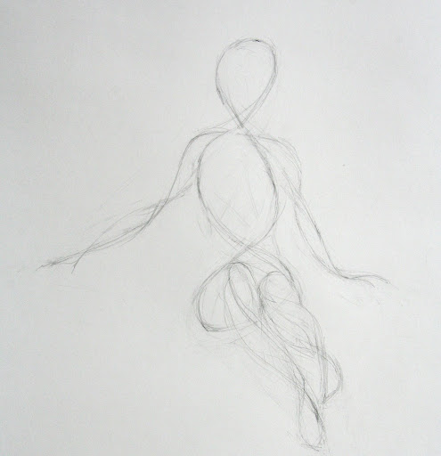 Afternoon Pose, Phase I
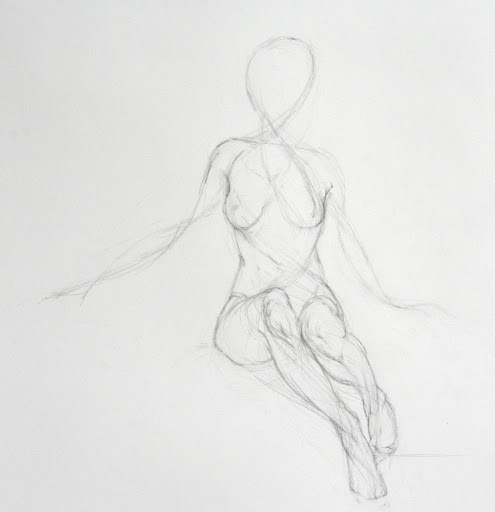 Afternoon Pose, Phase II
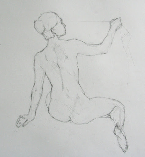 Morning Pose
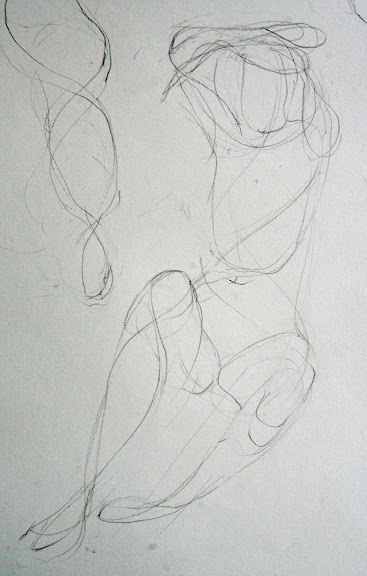
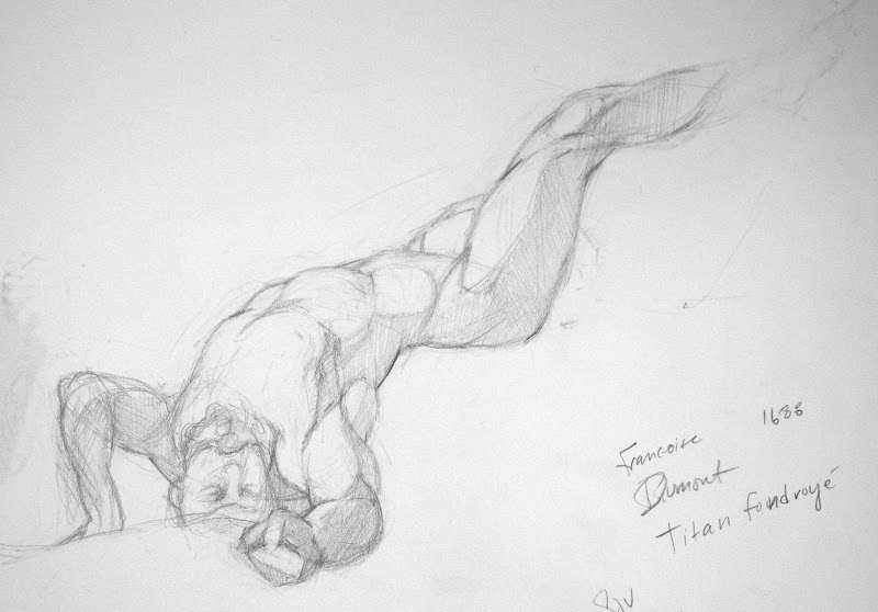 The figure has a clenched fist thrust directly at me... I don't know why I choose such a difficult view. But it made me interested to do more hand studies.


