Wednesday, February 18, 2009

Master Copy: Guido Reni's Samson

After Guido Reni's "Samson", 1618

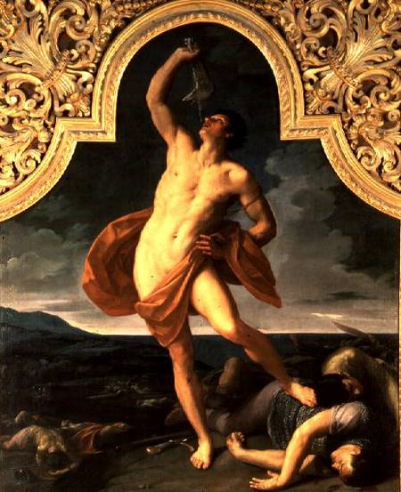
After diagramming my wax paper drawing yesterday, I felt inspired today to try drawing an actual person. No models available, but luckily I have a few books with some good figures represented (including my treasured book about Reni, an out of print, hardcover color catalog given to me by my husband this past Christmas).

This sketch took about 2 hours, and I did it entirely with the "movement curve" approach, not even a straight line block-in to start.

I notice I run into the same arc of experience when I draw: I start off, and after a good while I feel like the drawing is going well, and I allow myself to move into more details. Almost immediately I find problems, realize I need to back up to the bigger shapes and gestures... and then I spend just as much time adjusting the major landmarks as I did putting them down on the blank page!

However, once I've wrestled that together I start to understand the pose, and suddenly something shifts and all the various elements start to harmonize. It's a nice feeling.

Patience has been the key to developing my drawing ability. I would like to be able to draw more quickly at some point, though.

~~~ UPDATE ~~~
Below I've diagrammed some of the steps of my methods for how I constructed this drawing.

I started by making a mark at the top and the bottom, and would not allow my drawing to go above or below these points.

Then I drew a general gesture for the overall tilt of the main pose and a secondary line for establishing the non-weight bearing leg.

I noticed where the main weight is pressing, the ankle of the forward leg, and sketched a vertical plumb line to see what falls along that path. This is how I noticed that the raised wrist is not directly above the weight-bearing ankle, which helped me capture the general gesture. Not that I got it right at the first pass, but it helped me begin to visualize the pose on the page.

I looked for the theme (red), counter-theme (orange) and ornament (blue) to capture the gesture precisely (see my Studio Escalier notes). I spent most my time between this and the first stage, back and forth, adjusting it until it felt like the pose.

This looks wiggly and swoopy, but the lines are quite precise and intersect movement with structure. They map the paths of energy and tension that are defined by the structure of how the body is holding itself up. The axis where the curves touch the outside contour help me see the exact shape of the contour and how every part interrelates to every other part of the figure as a whole.

Once I feel I have everything working to describe the pose, I use this system to move into smaller and smaller contours of the body. Inevitably I find errors from the earlier steps - when the network of curves do not "work" within the bigger errors I have made, like the hand landing in a wrong spot on the torso would show me I've estimated the curve of the shoulder incorrectly.

Nothing on the body has these simplified curves though - these are curves of movement, not of structure. The structure is a network of many compound curves, complexity within the harmony of the whole.

As Ted Jacobs taught me, the shapes of the body are fan-shaped and non-parallel. This translates to everything - no two high points are directly across from each other on a form. No three intersections or axis line up in a straight line.

The most difficult part was the non-weight bearing leg. That's because the limb is supporting some weight, but the upward pressure of the supported toe versus the downward pressure of gravity on the bent knee were making a curve in opposition to the general curve of gesture - two curves canceling each other out make it tempting to see a straight line, but the straight line makes the limb look rigid and dead - there must be tension and vitality, even in counter-acting curves. So I found myself struggling with it a lot, but my goal was to show the tensions without deadening the movement.

I find I also have a tendency to make everything regular and even: the first time I sketch say two curves defining the outer contours of the leg, my drawing looks awkward and clumsy and un-life like. I often wish I could see immediately what I am doing wrong, but a the stage I am at now, I can see it is wrong but not how to fix it, and I just have to fiddle around till it feels right.

I think I would be faster and more efficient if I could start to see my errors and tendencies as I make them (or even before!).

I find when drawing and painting I must suspend a certain type of evaluative, critical looking in order to work, but I need critical looking to tell if what I have drawn is satisfying, so I am always practicing and refining the skill of how to switch this critical evaluation on and off at will. So I was pleased and thrilled to find this quote by a mathematician that exactly describes this phenomenon:

"When I am working on a problem, I never think about beauty. I think only of how to solve the problem. But when I am finished, if the solution is not beautiful, I know it is wrong."
- Richard Buckminster Fuller (1895 - 1983) architect/mathematician/engineer

Tuesday, February 17, 2009

Antique Bottle: Session 2

8 x 10, oil on panel

This is a new little painting I started this week, a smaller size and a less complex composition than the previous four painting, just so I can get some satisfaction of completing a painting in less time.

I started with just the bottle and the shelf, I wanted to keep it really, really simple. But it just looked too boring, and after fiddling around with some twigs I finally gave in and crumpled up a small piece of wax paper and suddenly the composition was a whole lot more interesting... and also a lot harder. I was originally aiming for a 1-week painting, but this might take 2 weeks.

I thought I would share my drawing process. I diagrammed it below, on the under-painting (I did make a pencil drawing first, but I corrected the drawing with the under-painting, so I'll diagram my thinking on the better drawing.)

To start, I lay in some straight lines, trying to accurately capture the biggest, most general angles, tilts and distances. I spend quite a bit of time on this, until it "feels" like the gesture of he subject. I might break the lines into smaller segments than these, but I try not to.

Then I move into finding the curves, the major lines of movement or tension that are supporting the subject. This little piece of wax paper was behaving like an arch, so I knew I would find elements of the arch showing up here and there in the contours. The arch seems to me to have three points of contact with the board (at least from this view), so I tried to discover how it was supporting itself on these three points.

The corners peaking at the upper right are also part of the structure, so I searched for their relationship to where the arch legs are supported.

All the folds and crumple paths along the wax paper are arranged logically for how the paper is supporting itself, or being supported. I look for the main curves of movement, and as I develop the drawing along with the panting, I'll look for the smaller and smaller incidences of how the paper is logically crumpled.

When drawing the figure I follow the same method, except drawing the figure is harder.

See the first post about this painting here

Monday, February 16, 2009

Antique Bottle: Session 1

preliminary contour drawing
8 x 10 inches, pencil on panel

Tuesday, February 10, 2009

Gallery Show: STUDIO Gallery


My painting Wax Paper and Ribbon will be showing at STUDIO Gallery on Polk Street in San Francisco March 11 to April 12. This is the first showing of a painting in my "wax paper" series and I am thrilled STUDIO is including my work in the show.

The opening is Sunday March 15, I will be there and I hope to see you.

Teaching: Drawing Workshop at Sharon Art Studio

I will be teaching "Classical Long Pose Figure Drawing", a two day workshop at Sharon Art Studio here in San Francisco.

I am thrilled to be teaching at this wonderful community center, they are a great organization and have a beautiful north-light drawing studio in an historic stone building.

The class is two Sundays, April 19 and 26th.

Click here for more info

Wednesday, February 04, 2009

Silver Globe Pitcher: FINAL

oil on panel
16 x 20 inches
Award: Oil Painters of America 2009 Western Regional Juried Show


I made a video slide show showing all the stages of the painting and some detail closeups. You can see the movie for this painting here.

More about this painting:
In 2008 I began a series of still life paintings using crumpled wax paper as my subject. I was drawn to the material because I can twist, and crush the wax paper into draped and spiraling shapes to create dynamic environments for the simple, antique bottles and pitchers I collect.

I am always on the lookout for interesting vessels to paint, and when I found a spherical silver water pitcher at a flea market, I instantly fell in love.

Certain objects call to me and must be painted. I have learned that collecting something not-quite-right, just because I "might use it someday" is rarely successful. Those objects languish on my shelf for years, always passed over. The objects I paint resonate with me deeply and demand to be painted immediately. I had a vision of the silver globe pitcher draped in a "shawl" of crumpled wax paper, with the shawl arranged as if a small breeze were filling and lifting it.

When I set up a new still life I spend several studio days crumpling paper and discarding it, moving objects around, trying to find the best shape and composition through my viewfinder. The wax paper takes gentle coaxing and twisting to arrange it in with the feeling I am envisioning.

The final arrangement must look fresh and transparent, like it just landed there, no matter how many discarded pieces it took to reach my vision.

I begin all my paintings with a detailed contour drawing in graphite pencil on wooden panel I have prepared myself with homemade gesso. I spend several days on the drawing, first on trace paper and then directly on the board. I find that if I spend the time needed on the drawing, the structure and believability of the final painting is more successful. I never rush the drawing process, even when I am anxious to begin painting.

Once the drawing is finished, I paint in many layers over the course of a month or more, first in grays, called a "grisaille", to establish values, and later in color. I use tiny brushes from start to finish, and work on a small area each day. I move slowly around the painting, bringing each section up to the highest degree of finish possible before moving to the next area. Silver Globe Pitcher took me over 120 hours to complete over the course of 2 months.

It is only the latest stages of my process where I get to enjoy the beautiful and most subtle effects of light and texture on the surface of the objects, like the turquoise tarnished area at the base of the pitcher, the transparent paper melting into the background, the pedestal of the pitcher peeking through the folds of paper. But it requires all the earlier stages of building a solid drawing and value structure in order to successfully render the beauty I see in the surface details.

Silver Globe Pitcher is a rare instance where I include a self-portrait in my painting. I wanted the self-portrait to be a discovery, so the viewer sees and appreciates the whole composition first, before noticing my tiny image reflected in the vase. That way, each viewer has a sense of having discovered something on their own, a small secret in the painting.

My self-portrait embedded in the painting allows each person to discover my own image peering back. The viewer can see the entire little studio where I worked on this painting, and have a sense of being able to get a glimpse into the experience of the painter.


See the previous blog post about this painting here.

Book Report: "Flow"


"Flow" is the state we get into when we are challenged to sharpen our skills to accomplish a task. The athlete, the scientist, the gardener, the mechanic, the artist, the chess player all feel flow when they are working at their best. Flow is the optimal state of human experience, meaning it's the state most fulfilling to us.

Reading the book has really inspired me - of course as an artist I relate to the state of flow while I paint, but also for everyday, non-art experiences: I am finding so often when I want to disengage and tune out and watch tv or hang out on the internet or otherwise waste time, that it's equally restful and relaxing to actually engage. There is fulfillment in the everyday contemplation of what is in front of us.

I am reminded of a quote by Thomas Moore:
"Simple gestures taking place on the surface of life can be of central importance to the soul."

Painting and drawing could be called "simple gestures" - really, it's just pushing colored mud around with a hairy stick - but anyone who has tried it understands that it can take you pretty deep - through a quagmire of wrestling with our deepest fears, and occasionally through that to a place of peace. To where time and self-consciousness stop and we can just Be, without evaluating or worrying.

Maybe all we have to do to access the soul is to set up a space with a few objects on a table and some lighting, and look.

Simple gestures.

Tuesday, January 27, 2009

Silver Globe Pitcher: Overpainting Stage 5


All of today's painting session was spent refining this area of the wax paper. I'm really enjoying all the transparent folds.

See the previous blog post about this painting here.

Monday, January 26, 2009

Silver Globe Pitcher: Overpainting Stage 4

16 x 20, oil on panel (detail)

I had a lot of fun with this left section of the the wax paper. The big chunky flap of paper in front was a huge lesson in remembering not to have "tunnel vision", remembering to compare the local value range to the entire painting. This area has a huge amount of information all within a few very short steps of value, so I had to be careful not to be tempted to exaggerate. Then the highlights are in another value stratosphere, making it all even more complicated!

I am thrilled to report that my recent video painting demo got a wonderful (embarrassingly wonderful) writeup on the blog Art Studio Secrets. In addition to the very nice things written, I am also flattered because the other artists profiled on this new blog are artists whom I have long admired: Alex Kanevsky, Carol Marine, David Kassan, and Paul Seaton.

See the previous blog post about this painting here.

Tuesday, January 20, 2009

Silver Globe Pitcher: Overpainting Stage 3

(detail)

Here's a sneak peek at my little self-portrait in the silver globe pitcher.

I thought I wouldn't get much done today with so much juicy politics to watch, but Obama's Inauguration speech this morning (9am my time) was so energizing that when it was over I was too jumpy to watch more on TV, and I was out in the studio painting all day. I did listen to live NPR dissection of the day's events all day.

I've been reading the book "Flow", which is all about how optimum human experience occurs when we focus on challenging work, so I particularly liked this part of the President's speech:

"...there is nothing so satisfying to the spirit, so defining of our character, than giving our all to a difficult task."

Who can disagree with that?

See the previous blog post about this painting here.

Friday, January 16, 2009

Silver Globe Pitcher: Overpainting Stage 2

Detail of work in progress

Detail of work in progress, previous stage

The handle and spout of the silver pitcher has been giving me some frustration, there's a lot of very close, dark colors, punctuated by very bright highlights. Everything depends on very accurate drawing at these stages, the slightest wavering of paint strokes makes for a wobbly pitcher handle. After much wrestling, I'm feeling like I'm closing in on it, though.

I've also been struggling with the swatch of wax paper that runs behind the pitcher. The crinkles up in the right corner catch the light and jumps out quite a bit, but if I paint them with too much contrast they look a) too eye-catching and b) dumb. It's been a lot of push and pull to get it to this stage.

For some reason the bottom pedestal of the pitcher I worked on last week was a breeze in comparison to these areas, even with all that semi-transparent wax paper overlapping the pedestal.

All these photographs are reducing the color saturation compared to the actual painting. My paintings are of course very monochromatic, but I use a full range of hues to mix my neutral colors, and in person you can see a lot more range of hues within the values. For the final photo I'll work harder to get a very accurate photo.

Mediums:
I still like working with the tubed Maroger quite a lot, but it has a tendency to dry fairly matte in the dark areas. So I'm going back to the linseed-based medium for the darks, especially the background. I'm sticking with the Maroger for the light areas.

See the previous blog post about this painting here.

Color Mixing

I thought I'd give a little introduction to the palette I use and how I mix my colors.

COLOR THEORY

There are many different color theories - models and philosophies for understanding how color behaves. I use a methodology of color mixing that I learned from my great and most influential teacher at RISD, Anthony Janello. Tony however might cry to see what I have done to his beautiful color system, as I use it to mix up mainly grays, while he is a high-chroma colorist. I can't find any of Tony's paintings online, but I did find a recent student of his who posted the kind of color studies I also did in his class.

As my approach has evolved it's become my own and I don't think any of my teachers would appreciate me crediting them with my color handling, as I basically create monochromatic paintings. But you could use the same fundamental color theory to make highly chromatic paintings, it's all in the proportions.

PALETTE

My palette is limited, essentially primaries: a red, a yellow, and a blue, plus a couple others that I've discovered save me time, plus white. I arrange my colors is roughly rainbow order, and I always put them in the same order. The specific colors I use evolves all the time, but right now I'm using these (as seen left to right on my palette above).

titanium white (two puddles in case the first gets contaminated)
magenta
cadmium red
cadmium orange (I use it as a yellow)
yellow ochre
sap green
cobalt blue
ultramarine blue
mars red (actually a rich brown)

A note on black: I don't use it because it makes more problems for me than it solves.

A note about "red" - the red we were taught in kindergarten to mix with blue to make purple does not work. Magenta is a "true" primary color, meaning you can use it to mix a secondary color. Magenta is my "red". Cadmium red is really an orange, and mixing it with blue makes mud.


MIXING

For purposes of vocabulary:
Hue is color
Value is light and dark
Chroma is intensity/brightness

Any swatch of color can be defined by it's hue, value, and chroma. When you mix any two colors together, the chroma/intensity is always reduced - a bright yellow and a bright red will make a slightly less intense orange. Different hues also have different values. So the complicated thing about color mixing is how to get the color/hue you want while also controlling the chroma and value.


Before I start painting I mix up a few puddles of dark paint and light paint for the areas I'll be working on and make some 5-step chains of puddles between the darks and lights. Mine are neutral (low chroma), but you could use highly chromatic/colorful chains, too.

To start mixing, first I choose the value puddle I want, and then if the paint mixture is too red, I mix in the complementary or opposite, green; if it's too purple I add yellow, if it is too blue I add orange.

Any two colors mixed together will lower the chroma/intensity. So any two colors opposite each other on the color wheel will essentially cancel each other out. I use this "canceling out" to mix subtle shifts between hue, value and chroma. Memorizing the color wheel is the most helpful thing you can do as a painter.


With this method I can mix subtle shifts of hue, value, and chroma. I essentially visualize the color space in 3 axis of dark to light, intense to less intense, and one side of the hue to the other - blue and orange for example. I picture my puddle of paint where it exists in my color model, and "push" it around the three axis: darker or lighter, bluer or more orange, more chromatic or less chromatic.

Different colors also have different values right out of the tube. So if I am mixing a dark neutral, and it is too blue, I don't mix in a high-value orange like a cadmium, because the value will lighten while the chroma decreases.

Which is why I like Mars red - I use it like a low-value orange. I use sap green for the same reason - it's a higher chroma green than what I can usually mix, an I use it to "cancel" with magenta, cadmium red, or mars red.

I use two blues for the same reason - both are high chroma, but one is much lower value, so I use ultramarine for low-value mixtures, and cobalt for high-value mixes.

After a while the system becomes intuitive and you don't think about it much while you paint. But I still sometimes get stuck and have to ask myself "what color is this paint?" to notice it is purple, and I better add in some yellow or I'll end up with a purple painting.

A note about paint quality:
It's always worthwhile to buy high-quality paint. The cheap tubes simply have more oil and less actual pigment, so you use more paint anyway.

A note about lighting:
Light is very very important. If you paint under a normal lightbulb, the yellow tint will distort your perception of all the colors. The more I paint, the more I find the only true light is indirect daylight (north light). At the very least, paint with a full spectrum, daylight, color corrected lamp designed specifically for artists for shining on your easel. However, you can shine any color light you want on your subject, as demonstrated with magnificence by Dan Thompson.

For more color theory:

Munsell is a great introduction for understanding hue, value, chroma, although I don't follow the methodology. I posted their chart above.

Handprint is an amazing site for understanding the science and practical mixing of color. It's focused on watercolor but much of the information applies to paint of any kind.

Book Report: Art and Fear


I read this book years ago, and I didn't realize how much it had influenced my thinking until I recently opened it to look up a quote to bolster my argument in a discussion, and found that I've lifted my own philosophy about talent and artistic training directly from the authors.

So, I re-read the book in full, and decided to write up a little book report and give them credit for their theory which I have been trumpeting as my own.

I don't agree with everything is the book, but it has some fabulous ideas that were very liberating to me at a time when I was terrified to make art.

"The prevailing view of artmaking today [is that] art rests fundamentally upon talent, and that talent is a gift randomly built into some people and not into others. In common parlance, either you have it, or you don't.... This view is fatalistic - and offers no useful encouragement to those who would make art.

"Artmaking involves skills that can be learned. The conventional wisdom here is that while "craft" can be taught, "art" remains a magical gift bestowed only by the gods. Not so. In large measure becoming an artist consists of learning to accept yourself, which makes your work personal, and in following your voice, which makes your work distinctive. Clearly these qualities can be nurtured by others. Even talent is rarely distinguishable over the long run, from perseverance and hard work."

"... our flaws and weaknesses, while often obstacles to our getting our work done, are a source of strength as well."

"Making art provides uncomfortably accurate feedback about the gap that inevitably exists between what you intended to do, and what you did."

"Your job is to learn to work on your work."

"Those who continue to make art are those who have learned how to continue -- or more precisely, have learned how not to quit."

I have learned the hard way (and I am sure the authors have learned this too) that this philosophy can raise ire. But I do think their words might resonate deeply with many people who want to make art but for one reason or another feel they are not "real artists".

All we can do is come up with a philosophy that helps us keep making art. So if this philosophy resonates with you, read this book, and then go forth and make art.

Also, I'll be teaching a drawing workshop for art-makers of all stripes soon, so if you think the philosophy would be helpful to you in the classroom, come to San Francisco in late April - details coming soon!

Friday, January 09, 2009

Silver Globe Pitcher: Overpainting Stage 1

Globe Pitcher, overpainting stage 1
oil on panel
16 x 20 inches
(work in progress)


The going is slow but I'm finally in the zone on this painting and starting to really enjoy it.

I'm experimenting with different mediums - my normal one based in linseed, a new one based on poppyseed oil, and a very nice big tube of Maroger medium my father gave me for Christmas. I didn't know your could buy it in tubes, I thought you had to make it yourself and it sounded complicated. So far I like the tubed stuff, it's a stiff golden brown gel that mysteriously liquifies and turns clear when mixed into the paint. I'm curious to see what it's like after it dries a bit. The poppyseed oil based medium dries too slow, completely wet even days later.

I've started looking for a studio to rent so I can have enough space to paint and draw a model. I'm looking for a north light studio with about 400 square feet here in San Francisco.

See the previous blog post about this painting here.

Thursday, January 01, 2009

Visualization

The model is posed or the still life is set up, your drawing paper or canvas is mounted on your easel, your brushes or pencils are prepared, and it’s time to start.

Stop.

Now, just look. Gaze at your subject, and look at how it really is, but in your mind’s eye begin to visualize. Visualize what your final drawing or painting will look like. See the light and feeling and gaze into it. Take time to record a very specific feeling and just look. You are looking at your subject but you are seeing your final artwork in your mind’s eye. You are visualizing the feeling of the final artwork.

Don’t make a mark until this vision of your artwork is detailed and specific. If you can observe yourself while you are visualizing, you will notice you are relaxing, losing your critical voice, detaching from your verbal brain, and your confidence and excitement for the work is building.

I first began to think about visualization some years ago when I heard an interview on the radio with a professor who experimented with teaching players to practice shooting basketball hoops through visualization. The group who practiced through visualization improved almost as much as players who practiced physically. The scientist described how he himself developed a visualization process, and realized if he visualized first he never missed a basket.

I realized that I already unconsciously do this when I draw or paint – I visualize the final outcome of my painting before I start. When I realized this, I started doing it consciously, slowing down and taking time to visualize. If while working I am feeling anxious and like the artwork is "getting away from me" I stop and visualize again. The image in my mind’s eye becomes more specific and detailed as I work, more specific and detailed than my painting will ever be; it’s a moving target on the horizon. But chasing an ever-refining intention pulls me further than I would ever get without a vision.

It actually works for just about everything. I recently sunk a pool ball with a perfect tap by practicing visualization (and I never play pool). It works for goals and dreams, too. So this year, instead of writing the detailed resolutions I usually write, I’ve just formulated a vision of what I want my life to look like, to feel like. It's still very specific, but not much about lists and plans. The more specific my vision, the closer I'll get to my goals.

Happy New Year!

Monday, December 22, 2008

Sketchbook: Master Copies

Sketches after Ingres, "Bather", 1808
and Carravagio, "Lute Player", 1596


Sketches after Rubens, "Descent", 1612
and "Apotheosis", 1691


Sketches after Reni, "Deianeira", 1621


Sketch after Robert Campin,
"Portrait of a Woman", 1420

I bought the beautiful book Sister Wendy's Story of Painting because I wanted to refresh my art history knowledge with a general overview. Sister Wendy (of PBS Special fame) has written an inspiring survey of art, with hundreds of high-quality color reproductions.

The format is similar to Eyewitness Guidebooks, in that the information is presented visually with lots of sidebars and with a storytelling style of writing, great for a general survey. She has included an illustrated time line for each major period of art history, which is great for visual learners.

Sister Wendy tells the history of painting in terms of the constant sweep towards and away from Classicism, the swinging between Northern and Southern European influences, and between Catholic and Protestant perspectives. After reading the book I feel like I could plot all of art history along these major axis.

As I read the book I put a sticky note on every painting I found especially interesting, and now I'm going back through all the bookmarked pages to do sketches. I've found when sketching from a heavy book, it's good to set it up in a cookbook stand. And try to keep the cat away from the piles of graphite shavings.

Thursday, December 11, 2008

Silver Globe Pitcher: Underpainting

Globe Pitcher underpainting
oil on panel
16 x 20 inches
(work in progress)

This is the completed underpainting for my most recent Wax Paper Series painting. I started this composition with sketches and a detailed contour drawing you can see in this previous post.

Using trace paper I transferred my drawing to the gessoed panel. I refined the drawing directly on the panel in pencil.

My goal was to get a very accurate drawing that described the gesture and energy of the crumpled paper, as well as a very precise geometry for the silver globe pitcher. Badly drawn round and elliptical objects in still lifes look wobbly and unconvincing, so I took a lot of time to make sure the silver globe is the correct shape. The pitcher needs to have a believable structure to make the whole painting convincing.

Contour drawing transferred from paper to panel

Once I was satisfied with the drawing (although I'm never satisfied with the drawing) I moved on to a transparent wash underpainting. Traditionally artists use a tiny brush to outline the contour drawing to "set" the graphite. I've never felt the need to do this, I find that this first wash layer of underpainting sets the graphite and I don't ever notice the pencil marks mixing with the paint in later stages. Most traditional artists would advise against this, though.

First layer of the underpainting

With the underpainting I "knock down" even the lightest lights. I've learned it's annoying and difficult to paint white paint over a white ground, so I cover every part of my surface with at least a light layer of umber paint. But I try to get a fairly full range of values so I can get a feel for what the whole painting will look like.

Second layer of the underpainting

Below I have finished the underpainting and started a small part of the opaque layer. The underpainting is transparent, meaning I use turpentine to thin the umber paint to show the white of the panel beneath. The opaque layer uses white oil paint.

Final stage of the underpainting

As you can see in the final underpainting above, there are some patchy "dry spots" especially in the upper left dark area of the painting. This is where the paint has started to "sink" into the gesso ground, and the more matte areas look chalky. This will be solved with later layers of medium-enhanced paint, so the background will look deep and dark.

So far I am really enjoying working on my hand-gessoed panels. The surface is silky and smooth but the paint really seems to "grab" it. It feels good to paint on. Which makes me happy, because gessoing the panels was a lot of work!

Below is a closeup of the beginning of the first opaque layer of painting - you can see where the upper areas of wax paper are more white and refined, that's the opaque layer:

Detail of first layer of opaque painting over transparent underpainting

To bring the painting to a convincing finish I'll have to work at least two more layers of opaque paint over this layer, probably several more in many places. At this stage I'm just laying down a "bed", so the general values and basic colors are correct. With these decisions solved I will be able to really focus on one area at a time without having to constantly back up and compare the values and colors to the rest of the painting.

See the previous blog post about this painting here.

Waterhouse's Mermaid

JW Waterhouse's "Mermaid"
and my copy done at a
ge 12

I was reminded of my early love of this painting when I listened to a podcast lecture about Waterhouse from the Art Renewal Center website a few days ago.

The painting came to my house on the cover of Smithsonian Magazine in the early 80's and I fell in love with it. My drawing of it was taped to my bedroom wall for all of my early adolescence.

I had no idea how the painting fit into art history until a few years ago, as Waterhouse and the Pre-Raphaelites, if mentioned at all, were only a small footnote in my art history studies in art school. It was painted in 1905, when a few other things were going on in the art world around that time.

Despite the sentimental and politically loaded subject matter that squarely dates the image, I certainly could have learned a lot about figure drawing in my youth if I had known of and continued to copy the masters of the 19th century academic painters.

An interesting tidbit from the podcast: Waterhouse married a fellow painter, a woman named Esther Kenworthy. According to Peter Trippi, the expert on Waterhouse interviewed in the podcast, Esther "gave up painting" once she married Waterhouse.

Friday, December 05, 2008

Head or Heart?

Just read this quote in an SF Chron article about a contemporary operatic composer named Jake Heggie:

Heggie had been taught in school to "write from the head." Modern composers tend toward abstract, dissonant sounds, not melodies.

"I tried," Heggie says. "It's not me. It's when I took the good things from school - skills in counterpoint and harmony - and wrote from my heart that my work started to flourish."

This really resonated with me as I have been struggling recently with pinpointing the difference between so-called "abstract" and "realist" art.

I could venture into deep water really fast here, but I'm curious what other people think.

Is so-called "Expressionism", art after 1910-ish, for lack of a term, "art from the head"? (That would explain those long complicated artist statements).

Is so-called "Realism", both pre-1900 and current movements, "art from the heart"? (That would explain why contemporary realist art is derided as sentimental so often.)

Our difficulty with terminology for these movements is indication of our problems conceptualizing them. But most people know immediately if they are looking at "modern art", and think of it as sharply distinct from "old masters art".

Is Expressionism more emotional than representational work? It's supposed to be pure feeling, right, pure expression abstracted/taken out of the eye's understanding of the world? But isn't Realism more sentimental - therefore more "emotional"? Abstractionists would say realism is a false sentiment. And realists would say abstractionists are cynical. And round and round.

Is one the work of the mind, the other the work of the eye?

A class I took about the science of visual perception in college has stayed with me these 15 years, I think about it all the time. The class taught me that what we call "seeing" involves much more than simply the light that hits our retina. The light rays our eyes perceive are processed at many levels of the brain, from simply noticing movement or flashing lights, up through recognizing the illusion of space and form on a flat surface.

Is abstract art just another level of this, art that is produced in a different area of the brain than representational art? Maybe an "abstract" level of the brain it took Freud and the horrors of the World Wars to make us aware of? Maybe a more word-oriented, idea-oriented part of the brain? I find I discuss theory with my abstract artist friends and I discuss technique and history with my realist artist friends.

I am scouring my art books these days for explanations of the moment when interpreting what hit our retina switched to expressing what hit our mind's eye.

Interpretive versus Expressive? Is that an accurate delineation? Expressing what? Is our experience of witnessing an emotional scene understood by our brains in an abstract or literal way?

Can we trigger emotions like awe and distress with abstract art? Does representational art now fail to trigger these feelings in many people, ever since our former concepts of "self" and "humanity" were destroyed by industrialization and world war?

Is art about feeling? 20,000 years of humans representing the physical and visual world have been recorded. Is art control over our experience of an uncontrollable environment?

Surely 20th/21st century life is equally traumatic and fulfilling as it was when we huddled around fires 20,000 years ago? Our lives are no longer "ugly, brutish and short", but is our despair deeper?

I've also been thinking about that blog post I linked to last week, and what has stayed with me is the author's frustration at having to defend the validity of a now-100 year old art form over and over. And I realized feeling attacked and misunderstood is also part of the abstract artist's experience. We realists have to deal with being called sentimental which gets old - and we get tired of having to defend the validity of a 1500 year old art form over and over....

Anyway, more posts with pictures coming soon. I've finished the underpainting and am waiting for it to dry another couple days. In the meantime I'm sketching from Ye Olde Master paintings. (I'm more in love with Guido Reni every day.)

Will post the results of both soon.

Tuesday, November 25, 2008

Gender Observations

I was looking though the latest issue of American Art Collector Magazine recently (which is a monthly catalog of all the contemporary realist art gallery shows in the US) and I started to notice I could often tell if a painting was done by a man or a woman instinctively, without reading the name.

I decided to test myself, by looking at the painting and covering the name and then guessing the gender of the painter, and was shocked to find I was correct most the time.

I have no idea what makes a woman's painting look like a woman's painting, do you? It was based more on a feeling than anything else, certainly not ability or subject matter, but just an approach. Whether still life, figure, or landscape, I could tell. Figure I'd say is the easiest to identify, landscape the most subtle, but all are discernible.

I've looked at this magazine a LOT over the last year or two, I pore over every page every month and make notes of galleries and artists to watch, and I think it's been helpful to train my eye to recognize trends and styles in the realist movement. I noticed a couple months ago I could recognize different areas of the country sometimes (different "schools of training" etc). I can also tell who has studied with or been inspired by whom (David Leffel and Malcolm Liepke have apparently huge followings because it seems every issue has a splashy, red-nosed New York-style sprite drinking a martini, or a still life with a spray of "silver dollar" willow receding into black with some scattered grapes...). I also feel I can tell if someone has studied the Florence School/Bargue/Sight Size method.

But I didn't realize till just this month that gender is so obvious. Every painting is pretty clearly executed by a male or female hand. Of course this isn't a scientific study, just a feeling, but try it and maybe you can tell, too.

It also brings me to my other gender observation. Is it possible to paint a female nude without SOME aspect of sexism? It seems to me to be nearly impossible to paint a female that does not reference thousands of years of art history and have some element of a female stereotype implicit in the image.

How does a woman paint a woman without referencing how men have always painted women?

Sunday, November 23, 2008

Silver Globe Pitcher: Contour Drawing

Contour drawing for Globe Pitcher
pencil on (wrinkled) trace paper

16 x 20 inches


After completing my small 8-inch value sketch, I began a full-size contour drawing of my subject at the actual size I will paint it. And I immediately ran into a problem. The proportions of my small drawing were not exactly the same as my 16 x 20 inch panel. And also, the composition I had sketched small, once blown up would require me to paint the pitcher huge, larger than it is in real life.

So even though the composition looked nice in the sketch, the larger scale made it look overwhelming, way too big. There's a lesson in here.

It's a change for me to paint this big. The previous paintings in this "Wax Paper" series are 11 x 14 inches and 12 x 12 inches. So 16 x 20 is a HUGE leap. It may not sound much bigger, but to me it's enormous. This is the problem with blogs... there's no sense of scale.

You'll also notice the left side of the crumpled wax paper has a new shape. I decided it looked better if it angled up at the left, instead of tapering down and to a point, running off the left into infinity.... So I crumpled up the wax paper on one side (gently) and altered the composition.

contour drawing phase 1

contour drawing phase 2

contour drawing phase 3


contour drawing phase 4


contour drawing final


I've drawn the final version on trace paper so I can transfer to the gessoed panel. I usually draw directly on the panel, but since I labored so hard to gesso them so perfectly, I was afraid of dinging or marring the perfect surface with a lot of erasing. So I nearly finalized the contour drawing on paper before transferring it.

As an final note, I'd love to draw your attention to this hi-LAR-ious blog entry by an abstract painter who says, in part:

"...what’s so hard about painting a realist painting nowadays, when even a no-talent can transfer images and paint textures straight from a computer to a canvas?"

To which I nearly choked, as you can imagine. Laurie Fendrich, I sure hope you find my link to your two posts on the superiority of abstract painting to realist painting, so you take a good look at my blog here and see that realist painting takes quite a bit of study and work, even "nowadays".

Post # 1 in which Ms. Fendrich describes her irritation at having been "duped" to admire the "abstract" work of a 3 year old

Post # 2 in which Ms. Fendrich has to respond to the tempest of comments she recieved on her first dip into the abstraction-versus-realism fire pit

Oh, and especially note the parts about how the Old Masters used optical devices, implication being that anyone with a lens and a grid could have produced the masterworks of art history.

Le sigh....

----

See the previous blog post about this painting here.

Silver Globe Pitcher: Value Sketch

value sketch for Globe Pitcher
graphite pencil on paper
about 6 x 8 inches

I am working on drawings to prepare my next painting. It will be much larger than my previous paintings, so I am trying to plan out the composition and values before I start. I started by spending some time on this small value sketch. It helped my visualize a feeling for the final painting.

I find my paintings work best if I spend time at the beginning imagining the finished piece as clearly as possible. I try to imagine the feeling it will have. I love the feeling of calm, cool overhead light resting on eye-level objects. I want the painting to feel like you are really seeing them and feeling the quiet.

The sketch only approximates this, but it helps me crystallize the feeling in my own mind.

sketch phase 1

sketch phase 2


sketch phase 3


sketch phase 4


sketch phase 5

sketch final