Saturday, July 25, 2009

Hudson Fellowship Day 19

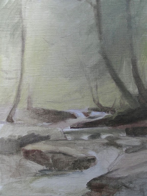
Katerskill Lower Falls Color Sketch
9 x 12
oil on linen

We had a huge thunderstorm last night and as a result the falls were the highest and fastest I have seen them. Recently they'd slowed to almost a trickle in some places. I feel like this section of the falls has become my own studio. I've walked over every one of the rocks here many times now and I know several bends of the river pretty well. When hikers decide to wade in the pools and climb on the rocks, I feel like strangers have wandered into my studio and are touching my props.

Above: Block-in line drawing and first part of color wash.

Above: Thin color wash, consistency of watercolor.

Above: Refining blocks of color and shapes, adding details.

Above: Added details and adjusted colors and values.

Friday, July 24, 2009

Hudson Fellowship Day 18

Kaaterskill Boulder and Pool (work in progress)
9 x 12 inches
oil on panel

The background is still not done, but I made a lot of headway today working on this painting I started a couple days ago. I'm finding I've had to re-learn what I have already learned in my studio work:
  1. Slooooow waaaaay doooooown.
  2. Mix up puddles of the main colors and values with a palette knife before working with the brush.
  3. Look, look, look... only put down one single stroke and then look back again at the subject.
I know all this so well from my studio work, but somehow outdoors I feel I should be able to get away with slap-dash dabbling. Anyway, it's starting to sink in: I have to be calm and slow and look, even outside. It seems simple, but between the mosquitoes buzzing in my ears, the cold breeze chilling me to the bone, and tourist hikers snapping my photo every few minutes, I have apparently been distracted from everything I thought I knew. Glad it's starting to come back, had a lot of fun today.

PS: For more about this year's Hudson River Fellowship, visit the official blog at:

Thursday, July 23, 2009

Hudson Fellowship Day 17

Kaaterskill Boulder with Falls
9 x 12 inches
oil on panel

Eight more hours spent on the boulder study today and I think it's done.

Wednesday, July 22, 2009

Hudson Fellowship Day 16


Kaaterskill Boulder with Falls (work in progress)
9 x 12 inches
oil on panel

I spent the day at the Kaaterskill lower falls again and worked more on the above painting that I started yesterday. It wasn't raining, so it was a much easier day! I also began another painting below:

Kaaterskill Boulder and Pool
(work in progress)
9 x 12 inches
oil on panel

Having fun, planning on working on both more tomorrow. Now, sleep....

Tuesday, July 21, 2009

Hudson Fellowship Day 15

It's raining pretty steadily today, but I decided to go to the lower falls (Kaaterskill Clove) and see what I could get done. It worked pretty well, I just set up my new huge plein air umbrella and worked under that for about 3 1/2 hours. With my ipod playing and my raincoat keeping me dry it was even cosy! Benefits of rain: no mosquitoes and no tourists. That and the wet rocks look so pretty and shiny!

I just did an underpainting today. This was all on the advice of a fellow painter here, who says he does a thin color underpainting using the oil paint thinned to the consistency of ink or watercolor.

Progression is below:

Above I started with a line drawing to block-in the layout using a small round synthetic brush, and a paper towel corner dipped in turp for an eraser.

Above I used the burnt umber thinned with turp to lay in the basic lights and darks.

For the underpainting I used turp-thinned paint and kept the values light and the colors reddish. Everything is just a tint.

This is the underpainting as it stands so far. My plan is to continue working on it for a couple more sessions and see how far I can develop the painting in on-site. You might recognise this as the same boulder I drew back on Day 2.

Yesterday evening we went out to do another sunset study. This one again suffers from being too light. Not sure I'm cut out for the lightening-speed approach this requires to capture the hues, values and chroma.


Here's a shot of several of my fellow painters finishing up their studies just after the sun has set. That's Hunter Mountain beyond us, you can see the cut trees from the winter ski trails.


Monday, July 20, 2009

Hudson Fellowship Day 13/14

"Hudson River from Olana"
9 x 12 inches
oil on panel

Today I went back to Olana today to complete the painting I began last Thursday. Luckily the weather was similar to the previous session. I adjusted the composition and refined the colors and added more detail overall. I also adjusted the shape of the river quite a bit, I think in this version it sits on the plane of the earth more accurately.

Last night I arrived from my lovely weekend off refreshed and excited to paint so I ran out and did this sunset. We've grown to quite a crew of sunset sketchers, there were about 10 of us set up on a high flat driveway area perfect for sunset viewing. Jake said he'd been there all day and saw a black bear running - fast - not far away. I don't think I'll go up there alone!

"Sunset Color Study II"
6 x 8 inches
oil on panel

For my first sunset study I went too dark but on this one I over-compensated and went too light. The hue, value and chroma of each stroke would be hard enough to evaluate if the subject were not also constantly moving and changing! It's a frantic 90 minutes of painting, but also pretty exciting. Random excalamations of dismay erupt from one or another painter at regular intervals.

Thursday, July 16, 2009

Hudson Fellowship Day 10


"Hudson River from Olana"
Color Study Stage I
(work in progress)
9 x 12 inches
oil on panel

Today was rainy in the morning so we drove to Olana, which is the home Frederick Church built for himself on a 250 acre property. He bought the land for the views of the Hudson River and he designed the landscaping to create ideal compositions. Everywhere you look is an amazing scene for a painting. His house in incredible too, a Moorish-inspired castle, full of artifacts from Church's extensive world travels and lots of his paintings.

We did a tour of the house and after that the sun was shining again so we decided to stay there and work on the grounds. I had my supplies along so I set up my easel and worked for 4 hours on the above study. I'm hoping to go back to Olana and work on it more, the above is just a start.

Also, last night a few of us decided to try sunset studies, below is the result of my first attempt - one hour of ever-changing sunset glory that just about drove me mad. A ravenous swarm of mosquitoes sure appreciated us standing still with hands encumbered by painting tools, and right at dinnertime!

"Sunset Color Study I"
5 x 7 inches
oil on panel

Afterwards I learned from my instructor Edward Minoff that my values (light/dark) are way too extreme and I need to significantly lighten the clouds and everything in the distance. He showed me his study and I could see what he meant.

I can't wait to try both again, but I'll be away from the fellowship this weekend to go visit my husband. So I won't be posting for a few days, back on Monday.

Wednesday, July 15, 2009

Hudson Fellowship Day 9

"Ship Boulder"
graphite pencil on toned paper

Tuesday, July 14, 2009

Hudson Fellowship Day 8

I'm trying to pick a composition and commit to one scene (or maybe 2) so I can focus my studies towards making a fully developed painting. Having a hard time choosing though, everywhere I look there's something to potentially paint.

This was my atempt today but I don't think I'm going to pursue it. It's too complicated to understand what's going on.

The fatigue is starting to get to me. Not getting enough sleep, plus hiking/scrambling around in the gorge, plus sitting and working for hours in the cold, are all starting to wear me out! Going to try for 9 hours of sleep tonight... my goal is try to sleep at least as many hours of the day as I paint!

Check out the Grand Central Academy Blog which is documenting more sketches from the Fellows, so you can get a closer look at what's on that long table.

Monday, July 13, 2009

Hudson Fellowship Day 7

Trees with view of Hudson Valley
ink and white guache on paper

cloud studies, pencil on paper


Sunday, July 12, 2009

Hudson Fellowship Day 6

Where I worked from 9am to 6pm today

"Two trees with exposed roots"
approx 9 x 12 inches
ink and white guache on toned paper

"Waterfall and pool"
approx 7 x 12 inches
ink and white guache on toned paper

Day 4 boulder sketch, more details added

Saturday, July 11, 2009

Hudson Fellowship Day 5

falls study
ink and guache on toned paper
approx 9 x 12

A closeup-of the upper region of the composition I sketched yesterday.

Friday, July 10, 2009

Hudson Fellowship Day 4


Composition study/equisse
India ink and white guache on toned paper
approx 8 x 10 inches

I worked with pen and ink today for the first time and loved it! A diluted ink wash creates controlled values much faster than graphite pencil. I started with a rough graphite-pencil block-in, and then refined the contour drawing with a dip-pen and ink. Then I diluted the ink with water (on a plastic palette) and used a brush to lay in the washes, building up the layers slowly to reach the values I wanted.

Study/etude of boulders and falls
India ink and white guache on toned paper
approx 6 x 10 inches

Every couple of days we all meet as a group and show our sketches on a long table. The work as whole is stunning... absolutely everyone here can draw incredibly well and it's both inspiring and daunting to see the row of studies. The instructors Edward Minoff and Travis Schlaht give anyone who asks a detailed critique about how to focus our drawings to be useful studies for a painting we'll do later at our studios. Jacob Collins apparently arrives tomorrow...

To see a nice quick overview of the work from previous years go to this page of past Fellows and mouse over each name to see an example of their work.

As for painting... yes, I am itching to begin painting in color! But on the other hand, doing these drawings has only emphasized how complicated nature can be, and I know I'll be grateful for having done all the line drawings and value studies when I start grappling with color.

Thursday, July 09, 2009

Hudson Fellowship Day 3

Lower Kaaterskill Falls "equisse" sketch
approx 9 x 12 inches
graphite pencil and white charcoal pencil on paper

I spent another day at Kaaterskill Falls. I like the boulders, the trees with exposed roots, and also the small waterfalls, so I found a composition with all three. In the above sketch I was just trying a compositional block-in. I tried to limit myself to 3 simple values, to help me break down the scene.

Water study, approx 9 x 12 inches

Earlier in the day I did the above sketch, trying to understand how a waterfall behaves.


Thumbnail/croquise
approx 4 x 5 inches

This was my first thumbnail sketch. It's tiny but the scene is complicated. I wanted to do a quick sketch and then move on to do about 4 or 5... but I ended up spending an hour and a half on just this one.


Wednesday, July 08, 2009

Hudson Fellowship Day II

View of Katerskill Falls with fellow sketchers at the bottom


Boulder with small waterfalls
graphite and white charcoal on toned paper
approx 9 x 12 inches

Tree roots with glimpse of waterfall
graphite and white charcoal on toned paper
approx 9 x 12 inches

I worked most the day lower down the trail, well below the falls. The river has boulders and fallen trees making miniature waterfalls all along it.

After 7 hours of drawing and light hiking I was very done for the day.... but had to wait for my more intrepid fellows to wrap it up before I could get a ride home. My fellow landscapers are a hearty bunch. Luckily a short rainfall came along and sent enough packing for me to catch a ride. (And luckily I was well prepared for rain after yesterdays' deluge.)

I definitely want to go back to the falls another day and work there again. But next time I'm taking my own transportation!

PS: The Grand Central Academy has it's own blog and they are updating the blog with posts about the Landscape Fellowship as well, lots of cool photos of our locations:

Tuesday, July 07, 2009

Hudson Fellowship Day 1 - sketches

Drawing in the the Catskills

You are forgiven if you can't tell what the above sketch is meant to represent.... it has elements of a boulder and moss, but I got lost in the details and everything just became this amorphous organic mass. Anyway, before I could pull it back together thunder began to roll and I and my 25 fellow Fellows began a rain-soaked dash down a slippery mountainside.

The afternoon was salvaged when the sun came out and I was able to spend a couple hours sketching on the banks of a flat, wide creek with miniature waterfalls stretching across it.

So to catch up anyone who doesn't know what I am doing: I'm participating in a 1-month landscape workshop with the Hudson River Fellowship which began yesterday in upstate NY. The Fellowship is following the study of landscape using pre-Impressionist techniques, the same method we use for studying the figure: Breaking down the elements of form, value, color and composition into individual steps before attempting a painting that incorporates all of them.

So we are beginning with studies and thumbnails, and we are using the terminology that the European-trained American landscape painters used in the 19th century:

croquise: thumbnail composition, as little as 5 fast lines
etude: study of a detailed element, contour only or value drawing
equisse: compositional study, fleshed-out thumbnail
grisaille: monochromatic "wipe-out" painting done with burnt umber
pochard: a color study done outdoors - not concerned with drawing, just color notations

With all these elements the goal is to bring them home to the indoor studio and assemble a complete landscape painting.

More about the 19th Century American painters of the Hudson River School


Excerpt of Asher B Durand's Letter on Landscape Painting
(I've heard these exist somewhere in audio format but I can't find them, if anyone knows where they can be found please let me know, it would be great to listen to while painting!)

Monday, June 29, 2009

Bottle Collection FINAL

"Bottle Collection"
oil on panel
18 x 24 inches


I said to a friend recently, a long painting is like reading a good novel - you want to finish it but you're sad when you're done!

This painting took over 3 months, and it's my longest and largest still life yet. Posting photos of paintings online tends to make every piece seem to have the same scale, but this one is significantly larger than any I have done before.

I won't be able to make a movie of this one, but here's a little slide show of all the stages of drawing and underpaintings. You can also click here to see it larger.


Teaching

I've just finished teaching a 6-week drawing class to 5 students, we met once a week on Sundays for 4 hours. We worked from my statue of "Winged Victory" with pencil on paper and I introduced them to the concepts I have learned from my teachers over the last few years. We all had a great time! I thought I'd share my class handouts I gave them, and also the notes I wrote up for my private painting student.


I'm hoping to teach more in the fall, if you are interested sign up for my mailing list by entering your email address in the right-side column to subscribe to my email announcements.

Tuesday, June 23, 2009

Oil Painters of America Juried Exhibition


My painting Silver Globe Pitcher has been accepted into this year's Oil Painters of America 2009 Western Regional Juried Exhibition!

The show will be held at Howard/Mandville Gallery in Kirkland, Washington, August 8 through August 30, 2009.

Tuesday, June 16, 2009

Plein Air in Utah

I just spent 5 days in Utah visiting my good friend and fellow painter Janell for a plein air painting trip in her hometown of Park City. The weather was unusually rainy/cloudy/windy for Utah in in June, but we managed to paint between raindrops.

Utah is just incredibly gorgeous and I spent most the 5 days with my mouth agape while admiring the dramatic displays of alternating mist and sunlight rolling off the mountains.


It was very, very cold. I actually had a single HAILSTONE land in my pochade box. Do I get some sort of plein air badge for that?

This pretty little streak of sunlight disappeared as soon as it was too late to change my painting, and only made intermittent appearances for the duration of the session. I spent the time between episodes of sunshine practicing painting the purple sage.


My amazing dad knit me these fingerless painting mittens from the softest green wool. From this angle you can't see, but they even have an intricate cable braid down he back of the hand. Far too nice to use for painting, but he insisted it's ok if I get paint on them.

It was all good practice to get ready for my upcoming month of outdoor painting in upstate NY.

Friday, June 05, 2009

Dust and Lint Solution: Wet Sanding

NOTE: This started as a brief addition at the bottom of the previous post, but then I ended up describing more details in an email to someone... then realized it's worth devoting a whole new post to wet sanding.

The issue is dust and lint that falls onto the painting or is deposited by linty brushes or rags. It doesn't seem so bad when the paint is wet, but the surface of the dry painting seems to show the impurities more as the paint film dries. 

I usually spend time at the beginning of a painting session blotting up any stray lint on the previous dry layers with a piece of semi-sticky tape, and then again at the end of the day using a tweezer in the still-wet layer, but I still end up with lots of debris. It might not matter for some painting styles, but for detailed glazing on a smooth panel it can be a big problem.

So I got a tip to try wet sanding and it worked really well for me. Here's what I did:

Materials:
  • 1200-1500 grit wet/dry sandpaper
  • linseed or other painting medium oil
  • small bowl for the oil
  • clean, lint-free rag of synthetic material - a microfiber eyeglasses cleaning cloth works great! (cotton rags and paper towels have too much lint)

I used 1500-grit "wet/dry" sandpaper, moistened with a bit of linseed oil. I rubbed any area of the surface that was imperfect: too much medium, or a piece of embedded fiber or dust. It worked really well, I was amazed how the imperfections were healed by the process - most debris lifted right out and left the colors of the painting intact. Small unintentional drips or ridges sanded right off easily. I had to do a bit of touch-up painting in a few areas, but the process was a huge success.

I did the wetsanding on fairly-dry areas - maybe a week of drying. Dry to the touch, but you could probably still gouge or dent the surface if you tried. I was also willing to repaint whatever I messed up. (I wouldn't try it for the very first time on a masterpiece you thought was done and no longer have reference for, in case a little repainting is necessary.)

I was actually surprised how much I could rub and disturb the surface, and still the colors of the paint would remain. In some places the surface fogged up a tiny bit but was pretty resilient. I did leave a very thin layer of oil to restore the gloss in some areas (although I know some people say not to do that and just wait till varnishing.)

Also, it's not sanding like you sand a piece of furniture - I used a tiny folded square of sandpaper bent over one fingertip and pressed very VERY gently and rubbed in a very small area, only in areas that needed it.

Once I sanded I had a yucky layer of wet oil and loose lint, so I needed to find a lint-free way to wipe that off. I found what worked best was a microfiber eyeglass-cleaning cloth I bought at the local hardware store. I could wipe firmly enough to wipe off the wet oil and dust, without leaving additional lint dust like a paper towel or cotton rag would have. 

Of course, a linseed-oil soaked rag is not good to leave around (serious fire hazard), so I washed it in natural turp and then soap and water at the end of the day... so it adds some steps to my normal cleanup.

One more tip: An accomplished painter I know just recommended using "shop cloths" as studio rags. They are extra heavy duty blue paper towels on a roll, I found them in the hardware store. They are amazingly lint-free. I had previously been using well-washed flour-sack dishcloths, and they seemed pretty lint-free but I now suspect they were adding to my dust problems - I seem to have a lot of very tiny white filaments flying around my studio. I'm going to try the shop cloth for a while for wiping brushes while I paint and see if that helps reduce the dust in the first place. (But I still would only use the microfiber eyeglass-cleaning cloth to actually wipe the surface of the painting.)

Let me know if you have any additional tips for cleaning the surface of your painting or dealing with dust in the studio.

Thursday, June 04, 2009

Figure Study

figure study
graphite pencil on paper
cropped detail, 18 x 24 inch paper

This is a recent study of a 3-hour pose. This was the last session of my Tuesday figure drawing with Michael Markowitz's 23rd St Studio. The next series of classes starts up while I am away for the month of July doing landscape painting in upstate New York but I'm hoping to resume in August.

Update on the "Big Still Life" a.k.a Bottle Collection:

I got a great tip for dealing with dust that has already dried into earlier layers of my painting, and spent some time today wet-sanding the surface. It was deeply satisfying to get all the grit and imperfections out of the painting and now I have a surface like glass!

UPDATE Jun 5: I made a new post here about the wet sanding process.

Web Design Tips for Artists

I look at a lot of artists web sites, and a lot of them are unnecessarily difficult to navigate. I thought I'd write up the common design problems I find, based on the opinions I developed as a web and interface designer for 11 years.

If you are an artist and you want your artwork to be seen, make sure your site follows these guidelines:

Navigation
  • Number One Rule: Keep it Simple
    Create one neat row of buttons down the side or across the top. Every page should show all the buttons to get to every other section of your site. The navigation buttons should never shuffle, move, or disappear.

  • If you are not sure how to solve a navigation problem, look at other websites. Chances are someone else has solved the problem already, and there is probably even a standard way users are expecting to navigate. Don't re-invent the wheel.

  • A button to get "Home", that says "Home" and nothing but "Home" should be on every page, in a logical place like the upper left or right corner.

  • Your name is your logo. If it clicks, it should go back to your home page. It should not open my email program and begin to compose an email to you.

Gallery
  • Make it as easy as possible for a visitor to see your artwork. The gallery should be no more than one click from the home page.

  • Gallery should be a page of small thumbnails of each image. Do not make the thumbnails tiny square crops of the larger painting. The thumbnail should be the whole painting.

  • If the user clicks a thumbnail, the painting should expand to a size big enough to comfortably see the painting. Between 500 and 1000 pixels on the long side.

  • When the image is big, the user should be able to click "Next/Previous" buttons to see the rest of your paintings. Don't make the user go back to the Thumbnail page to see the next image.

  • The "Next/Previous" buttons should be big enough to click easily, and should not move. Do not make your visitor reposition the mouse over and over to click the Next button.

  • You can separate your artwork into different galleries or categories, but let the visitor scroll though ALL your images with the Next button.

Flash
Why sites made completely in Flash are a bad idea
  • Search
    Search engines cannot read the text in an all-Flash website, so your site will not be catalogued and presented in search results as often and as well as it could be.

  • Bookmarks
    The user can't bookmark individual pages to save paintings they like. Allow users to find you again!

  • Back button
    Most users use the back button a lot while they navigate. Since an all-Flash site is embedded on one browser page, the back button takes the user not to the previous page within your site as they expect, but back to your entry page or completely out of your site to the previous site visited.

  • Images are too small
    I don't know if it is a template that Flash site builders are following, but you all make your images too small, and don't allow the user to make them bigger. The "zoom" feature is annoying because the visitor is forced to peer at the image through a keyhole.

  • Difficult to update
    Flash sites are the most stale sites out there. That's because they require a lot of work to update, a lot more work than a non-Flash site.

Miscellaneous Tips
  • Frames=BAD
    For about 10 minutes in 1994 a software engineer somewhere must have thought frames could be a useful navigation tool. They were wrong. Don't Use Frames Ever.

  • Web design is not print design
    Things that may look pretty in print, like tiny grey text and icons, simply do not work on a web page. Above all your site should be Clickable, Visable and Usable. Attractive is good, no one wants a goofy site, but you CAN make a clean and attractive site with buttons a user can easily click.

  • Branding
    Your name is your brand and it should be on every page and in the title bar of the browser of every page. Even better, type your name in text (not a graphic) at least someplace on the page (even the copyright), so a visitor can copy and paste your name. Make it easy for visitors to see, remember and record your name.

  • Location
    Say where you are! Don't share your address online of course, just include your city, state and country. Visitors to your website are coming from everywhere, orient them to your geographic location.

  • Email launching
    Don't make your "Contact" button launch my email program and compose an email to you. The Contact button should go to a Contact page.

  • Launching browsers
    Don't launch multiple browsers/tabs as the visitor clicks around your site, keep your site all within one window.
Final Word
Don't attempt to "be creative" with web site design. Your artwork should be what makes your site unique. Visitors who like your art will remember the art, not the decorations and cute buttons. Clean, professional, and organized are more important to communicate than "arty". Sometimes a few tasteful design elements work, but only if you are, or you hire, an experienced professional designer. Otherwise, just keep it simple.